Introduction
The specter of looming depression now sits on our immediate horizon.[i] But, in speaking about the secular crisis of capitalism and the position of China within this global crisis, it is essential to cut to the core of the question. On the one hand, this entails laying out a consistent theoretical framework in order to understand the basic laws of motion of the capitalist system, in order to fully grasp how this system might be overcome. At the same time, focusing only on the necessarily abstracted character of the system as a whole risks sacrificing the ability to apply such theory to specific instantiations of this system and its core dynamics, whether these be popular movements or simply moments in history.[ii] Communist thinking has, for many years, been heavy in theory, light in application and almost weightless in practice.
One of our project’s major goals is to connect the recent renaissance in communist theory, which has largely remained at a high level of abstraction, to an analysis of actual events in the real world. Thereby, we hope to re-develop a form of applied communist thinking that neither reduces itself to social democracy upon contact with reality, nor flees into the cloud of pure philosophy in order to retain its fidelity. We see this reconstruction of applied theory as a necessary step toward rebuilding a global communist practice worth the name. Our starting point, of course, is the China question, because we see in China the confluence of all the major questions and crises that will determine the future of capitalism.
Throughout the lifetime of our project, we have always placed strong emphasis on the collection of good data and the cultivation of good sources as a foundation for our arguments. With regard to China, this is absolutely essential, since so much of the immediate historical record is clouded by false data and the rosy proclamations of state propaganda, reinforced by shoddy scholarship obsessed with minor factional battles half-hidden in the arcane heights of the bureaucracy, but relatively unconcerned with what real life was like for regular people. In our historical writing, we have tried to utilize an underexamined subset of more thorough ethnographies alongside economic and demographic datasets that suffer from the fewest distortions. Throughout, the use of empirical measures has been essential.
We consider such empirical measurement to be equally essential in determining the key trends of the capitalist system in the present, as predicted by Marx: a long-run tendency toward mechanization of production, increasing class polarization accompanied by the creation of a growing population that is surplus to the needs of production, the general concentration of capital ownership into larger and more powerful units, and of course recurrent economic crisis. In examining this final point, it is common for Marxists to claim to have derived from Marx an “accurate” way of measuring trends in the profit rate, the decline of which is central to Marx’s argument (in Vol III of Capital) about how and why capitalism experiences both periodic crises (i.e. “business cycle” crises) and why such crises actually cycle around a deeper, more long-term crisis (i.e. a “secular” crisis), evidence by the way in which each periodic crisis produces a “recovery” but each recovery is less substantial than the one that preceded it.[iii]
There is, however, a problem with such attempts at empirical measurement and the many debates that arise from these attempts about how to best or most accurately measure the properly “Marxist” rate of profit. The problem is simply that this rate is, in Marx, unmeasurable in any directly practical way since it exists only in terms of total social value—which necessarily appears in the form of prices. Instead, value is defined by the social practice of representing labor time in money prices.[iv] This has created one of the longest, most agonizingly dull debates in the history of communism, about the so-called “transformation problem.” The ostensible issue in the debate is how, exactly, Marx gets from the idea of “value” and the quantities he calculates in value terms, which exist only at the scale of the entire social system, to the actual prices that are recorded in conventional statistics, which originate in corporate balance sheets and national trade records. There’s no reason here to bore our readers with the ins and outs of this lengthy debate. In our consideration, the debate is essentially over, now that the whole of Marx’s theoretical opus has been recovered and carefully reconstructed by an entire generation of Marxologists.[v] There is, in Marx, no transformation problem.[vi] The existence of such a problem was based on a misunderstanding of Marx’s logical method in Capital, and this misreading was further encouraged by the fragmentary nature of the later volumes.
What this means, for our purposes, is that the use of empirical data to prove Marx’s essential point about long-term tendencies in capitalism is essentially liberated from the additional task of hewing as closely as possible to the technical methods that Marx used to demonstrate his ideas in value terms, which only operate for the (by definition uncountable) total value of society as a whole. For many, this may be a scandalous thing to say, and if any of our readers are thrown into a rage at the mere mention of such heretical notions, we happily encourage them to go drown themselves in the bottomless gulf of text that constitutes the entirety of the debate over this “transformation problem.” We are more than content to take the debate as settled, and value as incalculable, so long as this does not leave us to float away in that opposite direction: into the long sleep of pure critique, which whispers through the dreams of all young communists in grim, guttural German, claiming that the Marxist system is incomplete. Complete or not, it’s concrete, and it can and should be grounded in reality through the attempt to measure not the core dynamics themselves reckoned in value terms, as Marx models the system, but instead the directly measurable results of these core dynamics, which should make the long-run trends of capitalism evident in the empirical data available to us.[vii] Regarding crisis, trends in profitability remain the central concern, alongside measurements of mechanization, unemployment and the concentration of capital.
Summary
What follows is a lengthy piece, with lots of intricacies about the exact methods used, alongside detailed anatomies of our results. It is, in the end, fairly boring to read closely, and a skim of the data visualizations paired with a read-through of the final section will be enough to grasp the gist of our argument. But we’ll also take some space here to lay out a quick summary of our major points. Overall, we identify a clear decline in the profitability of the Chinese economy over time, and particularly since either 2008 or 2010, depending on the measure. At the same time, the trend in Chinese industry specifically has been slightly different. In all measures, the early 2000s are marked by a brief rise or at least stagnation in profitability. But if we just measure the profitability of the industrial sector, the rise in profitability in this decade is more pronounced. Regardless, however, all the measurements converge in the 2010s. Profitability clearly declines, even in industry, in these later years, beginning in either 2010 or 2011. It, however, does not decline quite as far or as fast as that in the entire economy, relative to its previous trend.
In addition to this, we identify a few key contextual trends in output and investment that are important to understanding the Chinese economy in recent decades. In terms of output, the Tertiary Sector has been increasing its share more or less consistently since the 1990s, first at the expense of the Primary Sector, and, in recent years, at the expense of the Secondary Sector as well.[viii] As of 2019, the Tertiary Sector composed the bulk of national output (53.9%) and the Secondary Sector composed the next biggest share (38.9%), all while the Primary Sector had shrunk from about a quarter (26.5%) in 1990 to less than a tenth (7.1%) by 2019. Below, we break these trends down further, but the most salient point is that Industry still composes the largest single share of output (33.6% in 2018) when compared to all other subsectors, even though it has been shrinking in recent years (its average since 1990 is closer to 40%). But the “Other” sector, which includes many otherwise uncounted services like Health and Education, has been growing rapidly since the mid-2000s, and composes the second largest share (at 22.5% in 2018).[ix]
In terms of investment, we find that fixed asset investment in the entire economy has been rising consistently for the entire period but finally peaks in 2015 or 2016 and then begins a multi-year decline. Investment in residential buildings and fixed asset investment in real estate more generally both follow the exact same pattern, so this is not a case of industrial investment declining in favor of speculation in real estate. In fact, we find that investment in residential buildings has actually been declining as a share of total investment in fixed assets for about thirty years. Any housing bubble that exists cannot be said to have only grown at the expense of investment in other fixed assets. Instead, it’s likely that the housing bubble is part of a much larger asset bubble, which has included speculation and rapid building-out of all kinds of fixed capital. In recent years, this investment in fixed assets has peaked, and the peak has been most pronounced in Manufacturing and Real Estate, though it’s also evident in Mining. The only sectors that have not experienced a decline are Transportation and Warehousing, Utilities, and Agriculture, Forestry and Fishing, all of which compose much smaller shares of both GDP and overall fixed asset investment and are, therefore, not capable of making up for the decline elsewhere.
In our decomposition of the Rate of Profit, these trends in output and fixed asset investment become apparent in changing trends in mechanization and the intensity of the exploitation of labor. Mechanization, or, more accurately, the ratio of the wage bill to capital sunk in plant, equipment, and other non-wage costs, has tended to increase since the 1990s, slowing a little in the mid-2000s, but then increasing even faster in the 2010s. The slowing in this ratio in the 2000s was caused by the influx of cheap migrant labor from the countryside into the coastal export hubs, which enabled more labor-intensive methods of production to prevail in these years. In the aftermath of the 2008 crisis, however—which tended to coincide with less and less favorable demographic trends leading to labor supply issues—production began to be mechanized at a faster rate.
In the end, we periodize profitability and its related trends into three loose decades: the first, from 1993-2000, is a period of “Transitional Stagnation,” capped by the restructuring of the industrial belt inherited from the socialist developmental regime. The second, from 2000-2008, is the period of “Export Production,” which saw the restructuring completed and the rapid growth of the sunbelt export industries. The third, from 2009-2018, is a period of “Stimulus and Stagnation,” during which the post-crisis stimulus buoys profitability briefly, after which it undergoes a general decline before stabilizing around a new, lower norm.
To see these trends laid out visually, scan ahead to the figures. For more detail on the theory and methods used throughout, we will now pick up where we left off above.
Profitability
While it makes no sense to try to measure “the rate of profit” in the pure Marxist sense (i.e. in terms of total social value) in China, it nonetheless makes perfect sense to attempt to measure the rate of profit in the looser terms of conventional profitability, because we can, a) assume that its tendency bears some relation to the global aggregate profit rate, likely moving generally in tune with it over long periods of time and b) argue that the conventional profitability of national industry is in and of itself an informative factor with regard to economic crisis. For Marx, there is a single rate of profit, which exists at the scale of total social capital only. The profitability of individual firms is determined by their competition over shares of the total social surplus value, since some firms are able to make above the prevailing rate of profit and others are forced to make less. A similar logic prevails in sectors of industry, and in different national fractions of industry. The potential national divergence of “rates of profit” (more accurately: divergent abilities to capture total social capital) is an important component in understanding the emergence of trade wars and, in more extreme cases, military conflict. Not only does the rate of profit tend to fall over time, but the distribution of surplus value across all the world’s industrial firms—divided according to their many sectors, countries and localities—is itself a turbulent process, and is the driver of territorial transformation under capitalism as new, more competitive industrial complexes rise and old ones fall to ruin.
With this in mind, we can use domestic measures of industrial profitability to confirm our hypothesis that Chinese production was, comparatively, more profitable than other potential sites for industrial investment at the turn of the millennium—the reason that China was such a major locus for global industrial relocation in those years, outcompeting neighboring states in Southeast Asia—and that this profitability has in the last decade peaked and begun to stagnate.[x] Trends in profitability can then be seen as the driving force behind factory relocations (both to cheaper provinces within China, and to other countries) as well as the changing composition of investment and employment within the domestic economy. This is at least what we would expect, because it seems to tie together several trends already evident: as industrial returns decreased, more money was funneled first into massive stimulus-led construction bubbles, and now also into services, which tend to be far less productive and substantially harder to mechanize (i.e. to make more productive). Throughout, speculation and financialization grew, creating stock market bubbles, a ballooning shadow banking sector, and an intricate infrastructure to facilitate grey-market capital flight into “secure” assets (like real estate) overseas.[xi]
It is possible to claim that profitability experienced a rise in China after the turn of the millennium, even while claiming that the rate of profit itself has experienced a secular decline for two reasons: First, the decline of the rate of profit is itself cyclical, as countervailing tendencies push it back up for brief periods, before it continues its decline. In this process, each peak tends to be lower and/or shorter than the last. Second, local increases in profitability do not contradict the claim that the rate of profit tends to decline, since this rate is not local but global, and only applies to the whole system in its entirety. Marx makes clear, for instance, that some industries are able to capture more in profit than the average rate, while others make less, this is the simply the heart of competition—and this of course does not change the fact that the average rate is still the average, or that most firms likely make close to that rate. Conceptually, we can extend the same notion to entire industrial sectors and to national fractions of capital. In fact, the conclusion is a necessary one if we take into consideration the reality of international labor arbitrage and historically-produced inequalities in the cost of labor. Again, this unevenness was the primary driver of the geographic expansion of capitalism across the world, and now drives its continual reconstruction of the territories immanent to it.
But how, exactly, should profitability in China be measured? Ideally, we want to grasp both a broad measure of the national profit rate, derived from conventional business statistics, and a measure more specific to industrial enterprises (or, ideally, maybe just manufacturing). The national measure will gauge the trends in all sectors for China as a whole, while a specifically industrial measure will help us focus in on the productive core of the economy without the potentially divergent effects of high profitability among, say, real estate firms, caused by rampant speculation and the bubble in asset prices.
For Marxists who do attempt to measure a Marxian “profit rate” at the national level, the practice is generally to use the classic profit-rate equation, but substitute measures from conventional business statistics for each of its value-denominated elements. The traditional equation is as follows:
Where S = Surplus Value, C = Constant Capital, and V = Variable Capital.
This equation differs from the standard rate of return (ROR) used in business statistics, which is often used to capture the return on investment. The measure of ROR usually takes the current value of an investment, subtracts from it its initial value, and divides the resulting sum by this initial value. This is a good measure for individual investors, but ROR only captures one limited dimension of profitability in a given year and it fails to really portray the magnitude of profits relative to total investment accrued in things like plant and equipment. It therefore gives a very poor idea of how corporate profitability as such fares over time. When economists attempt to compute larger economy-wide ROR measures it’s common to scale this up by using some larger measure of the capital share in total output, but the essential method is the same.
Variations on rate of profit measure (ROP) derived from Marx—but, again, fundamentally different from what ROP is in Marx’s model since they’re only calculated on fragments of total value—is more appropriate, since it gives a sense of the magnitude of profits to total costs, and the equation can be decomposed into both the rate of exploitation (i.e. S/V, also called the rate of surplus value), and the organic composition of capital (i.e. C/V). The rate of exploitation in Marx measures the overall social rate of surplus value extraction, and, therefore, if conventional statistics are substituted the meaning changes somewhat. Using output or profit as the numerator and the overall wage bill for a given country or industry as the denominator, we just get a comparison of their relative magnitudes over time. This is significant, however, because if the total profits or output are increasing but total wage costs are not, it indicates either more intensive work for diminished pay (relative to output) or a change in the production process itself, whereby firms are opting for more labor-intensive types of production. These changes in the production process, insofar as they are derived from technical sources (i.e. new machines, new infrastructure, etc.), should be picked up in the measurement of the organic composition of capital. Using conventional statistics, C/V can be converted into some measure of materials costs + fixed capital divided by the wage bill.
But selecting the correct stand-ins to use for this equation is not an easy matter. In this equation, S represents total social surplus value, and the business statistics stand-in is usually some measure of the value of total output or simply net profit for the year; and V represents variable capital, which means money spent on workers, so the stand-in is usually the sum of wages or some combination of wages and expenditure on benefits to capture a more complete measure of the total wage bill.[xii] For C, a measure of capital stock is usually used. There is much debate on exactly what kind of measure of capital stock is best (how to calculate depreciation, whether to use historical v. current costs, etc.), but there are even more severe problems in the Chinese case. The most salient is the fact that there simply exists no official measure of capital stock. In conventional national accounts, capital stock is usually measured as the sum of the nominal values of all the fixed assets in use in the economy. Since measuring profitability requires understanding the relative magnitude of capital tied up in fixed assets in a given year as compared to the magnitude of yearly returns, the complete absence of any capital stock measure creates a major problem.
Many have attempted to solve the capital stock issues with their own measures. The most common method has been to use the National Bureau of Statistics’ (NBS) measurement of “accumulation of fixed assets” to build a perpetual inventory series—basically, since the new assets being added each year are recorded, you can take these, subtract some measure of devaluation or enterprise closure, and then add the remainder in a compounding fashion every year. This will build a capital stock measure bit by bit, but it does depend on having some sort of starting measure for at least one year (though if you go back far enough this starting point may be small enough to be negligible in the end, often the figures are drawn from some initial data gathered in the 1950s).[xiii] A more complicated variant of this method is used by Li Mingqi, the best known Marxist scholar to attempt an empirical measurement of the Chinese profit rate. Li, however, has only published a chart of his results, and has not made either his rate of profit or capital stock figures publicly available.[xiv] Very few attempts, overall, have provided an accurate, updated capital stock measure for recent years that is publicly available. There are, however, two papers in Chinese that offer a fairly robust model for how to calculate the stock using a perpetual inventory series, including depreciation and their own final year by year calculations. The first, by Shan Haojie, only runs to 2006. [xv] The second, by Wang Wei, extends a similar method to 2016.[xvi] But each of these attempts result in a capital stock measure that is suspiciously low relative to GDP. This means that, while their trends may be accurate, they produce actual profit rate measurements that are absurdly high (because the numerator S is inflated relative to C in the denominator).
One exception is the capital stock measure provided by the most recent version of the Penn World Table (PWT),[xvii] which is calculated according to a similar perpetual inventory system, using “investment data by asset.” In some cases the PWT records nine asset categories, but for most countries (and for the construction of the capital stock series), four assets are used:
structures (including residential and non-residential), machinery (including computers, communication equipment and other machinery), transport equipment and other assets (including software, other intellectual property products, and cultivated assets).[xviii]
The PWT is an aggregate database designed to be able to compare different countries’ macroeconomic indicators by converting all national currency values to a standardized international US dollar value using purchasing power parities (PPP, i.e. how many goods could be purchased with a given amount of currency). Previous versions of the PWT have been a major source for Marxists attempting empirical measurement of the profit rate, and an Extended Penn World Table (EPWT) was composed by Adalmir Marquetti and Duncan Foley, which includes a gross profit rate calculated for all available countries in an old version of the database.[xix] The main drawback of the EPWT is that it only extends to 2009, while the most current version of the PWT (v9.1) extends through 2017. That said, the current version of the PWT includes far more opaque transformations of its values for the sake of international comparability, and provides few detailed country-by-country explanations for where, exactly, its measures are derived from. What it gains in scale, then, it may lose in detail.
The Variables
Faced with these problems, the most robust solution to measuring profitability across Chinese industry is to iterate the procedure using several different sets of variables capable of standing in for measures of S, C and V. This can be done at the national level using a few different data sources. But problems are posed by national measurements of output (like GDP) and capital stock or total assets, since these can often include things like residential housing stock, speculative investment, and other forms of non-productive activity that move in the opposite direction as industrial profitability (since poor returns on investment in productive industries will encourage funds to flow to more speculative sources). This means that countervailing tendencies to the fall of the profit rate are exaggerated in such measurements. At the same time, the recording of things like housing or construction bubbles in national statistics can be informative in their own right, so such measures are not useless. They will be used here, but must be supplemented. So, in addition to these nationwide measures, it will help to try to zoom in on the profitability of industrial enterprises as such.
Two main sources will be used. First, the Penn World Table (PWT) and its Extended Penn World Table (EPWT) offshoot. These values will be recorded in standardized international USD. Second, data drawn from the Chinese National Bureau of Statistics (NBS), which are recorded in RMB. In addition to these main sources, we will reproduce, for comparison, all other measurements of the rate of profit for the Chinese economy for which public data is available (basically all but the work of Minqi Li).[xx] From these other sources, we will also derive a more thorough measure of the wage bill’s share in total output, producing our own composite measure of the wage share to use throughout. Before digging into the data, we’ll go through each element of the equation S/C+V to explain which set of variables will be used as stand-ins, and at which scale they operate.
S – Output, Net Profit, Value Added
The stand-ins for S are the most varied. This is because no category in business statistics really comes close to the basic idea of surplus value, and, regardless, total surplus value is not something that, in the Marxist sense, could ever conceivably be measured in this way. It is only understandable at its properly systemwide, social scale, with the money measurement of national output, individual industries’ average net profits, or an enterprise’s value added all hinting at different dimensions of the movement of total surplus value. Nonetheless, we’d expect such measures to roughly follow the same trends over the long term, although they will express divergences more extremely. We certainly expect profit rates to go up in certain places or certain industries, even while they might be generally descending. But, again, this is simply a matter of understanding such divergences and fitting them into the larger picture of global profitability.
Output
The first stand-in used will be national output, basically the GDP measures from the PWT and the NBS. Traditionally, GDP (Gross Domestic Product) measures try to capture the market-conventional “value” (i.e. price) of all the finished goods and services produced within a country’s borders—whereas GNP (Gross National Product) adds to this income produced by that country’s citizens overseas as well. The raw price data used for GDP calculation is gathered in different ways in different countries, but there are three common methods to conduct the calculation itself. The first, used in the US, is the “expenditure” approach, which calculates GDP as: household consumption + investment + government spending + net exports. The second is the “income” approach, based on the notion of “factors of production” that exists in conventional economics. This method calculates GDP as: wages paid to workers + profits earned by business + taxes on production + the consumption of fixed capital.
Finally there is the “production” approach, the main annual measure used in China, which calculates GDP as: the sum of real value added across all the sectors of the economy.[xxi] The measure of real value added is, at root, a way of calculating the remainder obtained after subtracting the price of intermediate inputs from the price of total output. In China, this is measured separately for essentially all industrial sectors, and these measurements are summed to produce the national GDP measure. This method is used to produce both the quarterly GDP estimates, as well as the official annual measure. Occasionally, however, China also produces a GDP figure calculated according to the expenditure approach. The essential difference between these two methods is that the expenditure approach calculates the input costs and projects forward, while the production approach calculates the final costs and projects backwards (subtracting intermediate expenses).
There is no need here to go into the exact details of how GDP data is gathered and how the figure is calculated.[xxii] One invariable objection to the use of such figures is the issue of inflated figures. Problems of output exaggeration have historically originated largely from local governments, where there is a strong incentive to inflate the figures delivered to the central statistics agency. At lower levels of reporting, this can create major distortions, and recent attempts to reign in over-reporting have led to apparent “downturns” in production (as in Jilin and Inner Mongolia), which are in reality just the deflation of the statistical bubble. Since local reporting of figures is a component in the calculation of the national output, this leads many researchers to suggest a standard deflation of the raw GDP figure, usually by 1-2% for most years. In addition, certain years that saw extreme downturns (particularly those farther in the past, such as in 1998) have figures that are fundamentally questionable, not reflecting the severity of the downturn on the ground. That said, there have been substantial efforts in the past two decades to correct for these problems at the national level, and the NBS does modify the local output measures it receives with weights derived from harder-to-fake variables like freight traffic, electricity consumption and night lights satellite imagery. The exaggeration of the GDP measure is itself therefore often exaggerated in the press. Though it is undoubtedly inflated to a certain extent, the more basic inflation behind GDP growth in China has to do with the high share of investment in GDP—a topic that we will discuss below.[xxiii]
But for our purposes, even extreme inflation simply doesn’t matter, since we’re not interested in the exact price-sum of output. Instead, we are looking for trends over time. Wage data will be calculated as a share of output, so it will include the same inflation. Capital stock, although a separate measure (see below), should be equivalently inflated at the local level—fixed capital formation, the basis of many capital stock reconstructions, also tends to be exaggerated by local officials. What all of this means is simply that the trends should be clear regardless of the inflation. So long as capital stock is not being inflated to an extent wildly different than output, the figures will still capture the relative weights of each component in the equation accurately.
The first GDP measure we will use is from the PWT, standardized into international USD for easy comparison. Originally derived from the NBS, this GDP measure has not been corrected in other ways, and it is useful because it can be compared without modification to the national capital stock measure, also found in the PWT.
The second GDP measure we will use is simply the same figure, but as recorded directly by the NBS, in units of 100 million RMB. This measure is used independently because it will compare well with our two measures of capital stock, from Chinese academic sources, which are also denominated in units of 100 million RMB.
Net Profit
The major issue with GDP is not inflation, but instead the way in which the value-added calculation includes all sectors of the economy. Though it seems as if this would be more comprehensive (and it is), the problem is that sectors being buoyed by extreme speculation (real estate, finance, etc.) are included alongside traditionally productive sectors like manufacturing, logistics and agriculture. Though it is nonsensical to try and cleanly apply a definition of which individual firms are productive of value versus which are non-productive—for the same reasons laid out above with regard to value measurements in general, which can only be understood at the properly social scale—it is nonetheless clear that FIRE (finance, insurance and real estate) industries, for instance, will include a greater sum of non-productive activities, and will tend to grow in a speculative fashion precisely when profitability in the productive sector declines. To approximate trends in the productive sector alone, it is common to calculate separate measures of profitability just for manufacturing.
In Chinese national statistics, measures are provided for net profits of industrial “enterprises above designated size” (规模以上企业), which includes the vast bulk of industrial enterprises. Prior to 2011, the “designated size” was any firm making more than 5 million RMB from its annual main business revenue. After 2011, the bar was pushed up to 20 million RMB. This statistical redefinition will affect the raw output numbers,[xxiv] but it should have no effect on the trends we are reviewing here because the relative proportions will still be comparable in the same way in each year since they are all measures derived from the population of enterprises above designated size—i.e. if the redefinition causes total output to drop in 2011 compared to 2010, the wage share derived from this output will also drop, as will the various measures we can use for fixed capital stock for these same enterprises.
The one key difference, however, is that the net profits measure will produce a much lower rate of profit in absolute terms. This is because GDP or Value Added (see below) are measures of the total output after the subtraction of intermediate inputs but prior to this output being divided into wages, capital costs, debt repayments, taxes, profits, etc. Net profits, however, only capture this profit portion of output. They are not full output measures and are therefore qualitatively different than the others. This is still informative—possibly more so—because we are not under any illusion that it is possible to faithfully replicate the “Marxist” equation to calculate a true rate of profit in value terms. When trying to use conventional business statistics to trace out patterns in profitability in order to approximate what may be the deeper, unobservable trend, it absolutely makes sense to use both output and profit, and the profit figure provides a somewhat “purer” picture of the relative magnitudes. That said, it’s important to keep in mind that two qualitatively (albeit slightly) different things are being measured here.
Value Added
While the Net Profit variable records the aggregate sum of enterprise-by-enterprise profits as they appear on firms’ balance sheets, the NBS also calculates a separate Value Added measure for Industry as a whole—it is this measurement that, alongside other sectors, is used to calculate national output. This measure can be used as a more expansive alternative to the Net Profits variable, since it includes a greater number of enterprises. But, more importantly, the measure is simply a different way of capturing output using the value added approach, which subtracts the price value of intermediate outputs from total output. It is an output measure, not a net profit measure (see above). We’d expect this number to be larger in absolute terms, but to follow an essentially similar trajectory.[xxv]
C – Capital Stock, Total Assets, Fixed Assets, Non-Current Assets
Capital Stock
As mentioned above, the most difficult variable in the Chinese case is the stand-in for Constant Capital. Usually, a measure of capital stock is used, but not such measure exists for China at the national level. Those that have tried to produce such a measure generally use the perpetual inventory system (see above), and it appears that this is the method adopted by the PWT, though this is somewhat opaque. The capital stock measure we will use in conjunction with GDP is therefore the one derived from the PWT, and is provided in international USD comparable to the GDP measure. This offers one attempt to measure the profit rate at the level of the entire domestic economy.
Two other capital stock measures will be used, in addition to that taken from the PWT. The first comes from Shan Haojie, and uses the perpetual inventory method to “count up” from a base year in the 1950s. Shan’s method and estimates seem to be among the most widely cited in Chinese-language literature on calculating the rate of profit, as well as all later attempts to calculate the capital stock. Shan’s measure, however, ends in 2006. The second capital stock measure comes from Wang Wei, Chen Jie, Mao Shengyong, who utilize a method similar to Shan in order to calculate capital stock through 2017.
The major problem with these latter two sources, as mentioned briefly above, is that the perpetual inventory estimate seems to systematically produce a capital stock measure that is smaller than it should be. Most countries’ capital stock in a given year, even after deflation is taken into account, is higher than their GDP in that same year. This makes sense, given that capital stock is essentially an artifact of past years’ GDP growth, one component of which was fixed investment. Throughout other countries’ national statistics, as evidenced in the PWT, the capital stock measure almost always sits higher than the GDP measure. This is true of the PWT capital stock measure for China. It is unclear, however, why this is not the case in the Chinese-language papers that calculate capital stock.
That said, there is no need to try to “correct” these measures, because there is no reason to believe that this method seriously disrupts the trend in capital stock growth, which is compared to the trend in GDP. A mysteriously small capital stock measure will produce the same trend in profit rate, but at a much higher absolute value (which means that it shouldn’t be used for apples-to-apples comparison with other rates on the same y-axis, even while the trends, severed of their anchoring to the y axis, can be compared). If one wanted to attempt to solve the mystery, we suspect that it may have to do with the fact that the Chinese academics’ calculations of capital stock, since they derive more or less purely from the fixed asset formation measure that is released by the NBS, are not incorporating some key element of total assets that is included in other countries’ capital stock. We don’t, however, task ourselves with solving this mystery.[xxvi]
Total Assets, Fixed Assets and Non-Current Assets
That said, alternate measures do exist within Chinese national statistics. While the NBS does not record capital stock directly, it does record various measures of the assets of industrial “enterprises above designated size.” This allows for the formulation of industry specific stand-ins for constant capital, which, for Marx, is the sum spent on plant, equipment and inputs in the production process—essentially all costs other than those expended on labor or various sorts of non-productive rents. The business statistics notion of an “asset” is essentially the same, though it is subdivided into several categories. The first, tangible versus intangible, captures the difference between actual goods and materials versus ownership of intellectual property like copyrights. Here, we will only be using measures of tangible assets.
But tangible assets can be further subdivided into current and fixed assets, and a third slightly more expansive measure of non-current assets (including fixed) can be produced by subtracting current assets from total assets. Current Assets are defined as any asset that is assumed to be either sold, consumed or used up in the normal production process within the year of measurement. This is a more broad category than is ideal for our use, because it includes things like cash, stock inventory that might be sold, and certain types of short-term investment. Nonetheless, current assets will be a useful measure to use, if just for comparison with the others. Fixed Assets are property, plant and equipment that will not be used up within a single year’s production cycle. This is closer to the stand-in measure we are looking for, but it crucially does not include many of the intermediate products used up in consumption (which are included in inventory and therefore measured in current assets, however). Non-Current Assets are a more expansive category that includes fixed assets and other sorts of long-term investments, and can be roughly estimated by subtracting current assets from total tangible assets.
We will use the measure of Total Assets, Fixed Assets, and Non-Current Assets for industrial “enterprises above designated size” in conjunction with the other NBS variables (i.e. with Industrial Net Profits and Value Added), because they’re all measured in current year RMB and can be easily compared. That said, we’d expect the total assets measure to falsely deflate the measure of profitability (since it includes more irrelevant assets that will nonetheless be recorded as a weight against profits) and both fixed and non-current assets to falsely inflate the measure of profitability (since neither include raw materials). Non-current assets might be the most accurate, simply because its few additional non-liquid assets in excess of fixed capital will help to fill in for the missing raw materials. Nonetheless, we’d expect all three to follow the same rough trend, and we’ll simply chart them side by side to give the viewer a sense of the error margin alongside a sense of this trend.
Finally, since the value of capital stock decreases over time, it is necessary to attempt to measure this rate of depreciation and apply it to the capital stock measurement every year. The PWT includes a value for depreciation, calculated as the share of the total capital stock that depreciates in a given year. This depreciation share will be multiplied by whichever depreciation measure is in use for each year. Shan and Wang et. al. offers alternate measures of depreciation, but their weights seem a bit high by comparison to other options, so we will use the PWT weights exclusively. In the end, depreciation tends to be a small fraction every year, so exactly which weight we use has only a small net effect.
V – The Wage Share
Marx defined Variable Capital as that portion of the total capital that is given to workers. This includes pay in the form of wages or salaries, but it also includes things like employer-provided health or social benefits (i.e. a health plan paid for directly by the employer, but not taxes on production that might be used for national health systems, which is simply a cost included in the calculation of net profit or output). There has been much debate on exactly how to capture this total value in the American context.[xxvii] But in the Chinese case, a measure of the total wage bill will suffice, since things like employer-provided health insurance or retirement plans are not nearly as common—instead, the best of these policies are implemented via the social insurance system, payments into which are subtracted from net profits in the same way as a tax payment would be.[xxviii]
That said, there is no single reliable measure for the total wage bill over a long time period. There are, however, several good measures for different time periods, each of which calculate wages as a share of total output. The PWT contains a wage share measure for all years in its database, but prior to 1993 it just uses a duplicated figure, likely derived from some planning era standard that never matched reality. A far better alternative exists, however, for the years 1978-2004, produced by Bai Chong-en and Qian Zhenjie, who compose several measures of labor share drawn from multiple sources.[xxix] The one used here will be their “aggregate” labor share, calculated up from sectoral values—this is chosen because it loosely matches the production method of calculating GDP by counting up from sectoral value-added. The share values and the trend evident in the Bai and Qian data tend to match the PWT data after 1993, and follow them particularly closely later on. This allows us to append the PWT values for all years after 2004 without producing any harsh breaks in the continuity of the data. The PWT values are also retained for years prior to 1978, though these will not be examined by us below for obvious reasons.
So, to recapitulate: the wage share data we have compiled for our measurements uses the PWT values for the years 1952-1977, then the Bai and Qian values for 1978-2004, and then again the PWT values for 2004-2017. These are originally calculated as shares of GDP, but they can loosely be transferred to our industry-specific measures as well. Though it would be more accurate to use Bai and Qian’s values for industrial labor share instead, these data are only recorded through 2004 and they cannot be combined with the PWT. In terms of the overall trend, this is not a problem, since the industrial labor share and aggregate labor share follow the same pattern. In terms of calculating the organic composition of capital and the rate of exploitation (see below), we should expect the stand-in for V to be slightly inflated (the aggregate share sits an average of 10% higher than the industrial share in all years after 1990, meaning that industrial workers’ share of total industrial output tended to be lower than all workers’ share of all output), and the consequences of this will be explained below.
The Calculations
We will calculate the rate of profit (ROP), using each of these stand-ins, such that we ultimately get seven different ROP measurements—four will be for industry specifically, and three will be for the entire domestic economy. These will then be compared to six different ROP measures covering various years, drawn from six different sources (4 available in English, 2 only in Chinese). These cover all the major attempts to calculate the Chinese ROP save that of Minqi Li, who has provided graphs but no publicly available data for his measurement. Following from our analysis of the nature of the transition to capitalism in China, we argue that something like a capitalist ROP only really makes sense from the turn of the millennium onward. That said, profitability was an important factor for enough of Chinese industry throughout the 1990s that including this decade will also be informative. We will therefore calculate all our values from 1990 to either 2017, 2018 or 2019, the most recent years for which data are available (depending on the measurement). However, some of the NBS data only extends back to the mid-1990s or the year 2000, so measurements using these variables will be more limited.
We will then decompose the ROP measures into approximations for the Organic Composition of Capital (OCC, calculated as C/V), which captures the relative weight of non-human inputs into the production process (plant, equipment, raw materials) and the Rate of Surplus Value (ROSV, calculated as S/V). Because we’re using stand-ins, we aren’t literally calculating these terms as Marx intends them. Instead, we are just looking at the relative magnitudes of some of our variables, with the OCC being the capital stock to wage bill ratio and the ROSV being the output or profit to wage bill ratio. This decomposition allows us to track what relationships underly the overall trends in the ROP. The OCC is generally used to calculate trends in the mechanization of production, since it will rise as workers are replaced by machines. Marx predicts a tendential rise in the OCC over time under capitalism. The ROSV, also called the Rate of Exploitation, is used to calculate trends in the severity of exploitation of labor—i.e., how much value is extracted from workers versus how much they are returned in the form of the wage. Here, it will not really show us surplus value, but it will give us an impression of how much profit or output is produced per dollar spent on workers. For each of these, the absolute values are not as important as the change over time, since we are trying to see the underlying drivers of changes in the ROP.
We’ll start with an introduction of our other sources measuring profitability, which will be used for comparison, then move on to our own measures of ROP, and finish with our measures of OCC and ROSV:
The Extended Penn ROP
The first is the ROP measure already calculated in the Extended Penn World Tables (EPWT), derived from an earlier version of the PWT. This is a pre-made measure calculated by the EPWT creators, Marquetti and Foley, and it only extends from 1995-2007.
Maito
The second is the ROP measure calculated by Esteban Maito, which is the most common measure of the Chinese profit rate referred to by Michael Roberts. In a 2014 paper, Maito uses his ROP measures for various countries around the world to argue that China has been central to global profitability in the past few decades.[xxx] But Maito’s ROP measure for China is simply an aggregate of the following two other measures we use for comparison below (Bai et al 2006 and Qu et al 2013). That said, his data is included here for comparison and listed as his own calculation for two reasons: a) his is the most common citation, aside from Li, for the calculation of the Chinese ROP and b) he inflates the measures he takes from his two sources by about six percentage points, likely in the conversion from Rate of Return to Rate of Profit.
Bai et al 2006
The main source Maito draws from for the years 1978-2005 is a paper by Bai Chong-en, Hsieh Chang-Tai and Qian Yingyi from 2006, which calculates the “rate of return on capital” (ROR).[xxxi] This is a slightly different calculation than the ROP, but it gets at the same basic idea. The authors essentially calculate the ratio of output to capital and then multiply this by capital’s share in total output (they then modify the resulting figure to capture changes in price over time, depreciation, etc.), with the basic equation being: CapitalShare * (Output/Capital).[xxxii] The missing value is the cost of labor, which does not appear in the denominator but is indirectly accounted for as the inverse portion of the capital share. In general, this rate of return measure will follow the same pattern as the ROP, but it will produce a lower figure—this is possibly why Maito inflates the numbers as he does, in an attempt to jump from ROR to ROP.
Qu et al 2013
The second source Maito draws from to fill in the remaining years from 2006-2011is an extension of the work of Bai et al by Qu Honbgin, Julia Wang and Sun Junwei, published in an HSBC research report.[xxxiii] These authors use the exact same ROR calculation method as in the previous paper, and extend it to 2011. Maito takes these figures and applies the same inflation as he did to the figures from Bai et al. For our comparison, we distinguish between the two measurements, but they can be seen forming a single series in the final graph.
Wu et al 2020
The most recent available measure of the Chinese Rate of Profit comes from a paper (currently only available in Chinese) published in 2020, by Wu Xiaohua, Shi Ying and Chen Zhicao.[xxxiv] The authors offer an attempt to calculate the ROP in the Marxist sense (at least as interpreted by authors like Roberts, Carchedi and Maito), rather than the ROR. Their measurement extends from 1994-2018, and alongside the ROP they include measures of the OCC and ROSV. However, the “appendix” that explains their methods in detail is missing from the online version of their paper, so the exact original source of each of their measures is currently obscure. That said, they cite the 2008 paper by Shan Haojie mentioned above with regard to capital stock.[xxxv] It’s likely, then, that they use Shan’s methodology to extend the capital stock measure, using this as a stand-in for Constant Capital (C) in the ROP formula. They then explain in a footnote (to Figure 1, showing their measurements) that their data does come from the NBS, so it’s likely that they use official GDP data or some aggregate value-added measure (i.e. possibly one excluding certain sectors) for Surplus Value (S), and they likely use NBS employment and average wage bill data (which is calculated by sector) for Variable Capital (V). Their Wage Bill column, however, tends to lie about 10 percentage points below the Wage Share we use, based on both the PWT and the two papers cited directly above. It’s possible, however, that this could be due them using the wage share of a single subsector, such as industry, which (as explained above) tends to be lower than the overall national wage share.
Zhao and Liu 2017
One additional measure of the Chinese Rate of Profit, albeit slightly less recent, can be found in another Chinese-language paper published in 2017, by Zhao Lei and Liu Hebei.[xxxvi] Zhao and Lei use a different perpetual inventory series (adding onto it themselves) in order to obtain the capital stock, and they offer their own OCC and ROSV measures, alongside ROP. In addition to the primary ROP measure (S/C+V), they calculate three variant ROP measures, based on the methods used by Gérard Duménil and Dominique Lévy, which add fixed capital and inventories one by one to the denominator, and include a variant that subtracts particular types of taxes.[xxxvii] We will only use their primary ROP measure, which is most comparable to our own measures. The latter three all simply deflate the ROP value, but all tend to follow the same pattern.
PWT 9.1, Rate of Return
The PWT 9.1 does also include its own measurement of the rate of return, similar to that used by Qu et al (2013) and Bai et al (2006) above. We will compare this ROR to our ROP measurements at the end, in its own chart. It will not, however, be used in calculating the mean rate of profit between all measures, since it would unfairly depress that measure, since it is on average quite low.
Original ROP Calculations
These preceding measurements of ROP and ROR will be compared to our own seven measurements. The first is a national measure drawn from the PWT 9.1 GDP and Capital Stock figures, and we get the same result if we substitute NBS GDP in RMB (since this essentially just undoes the PENN conversion to international USD). The subsequent four are industry-specific measures that utilize net profits, value added and various combinations of asset measures for industry, and the final two are more limited variants using NBS GDP and alternate capital stock measures as calculated by Shan (08) and Wang et al (17):
1) PENN9
First, we calculate National ROP using the variables from the PWT 9.1. This uses the PWT rgdpna and rnna figures for GDP and Capital Stock, respectively, since these are closest to pure national accounts measures (converted to international USD but not strongly distorted by the PPP modifications used elsewhere in the tables).
The PENN9 equation is as follows:
2) Net Profits / Fixed Assets
This is first in a series of ROP measures using Net Profits of Industrial “Enterprises Above Designated Size.” In the second half of the denominator, all our measures use the labor share multiplied by value added of industry, rather than by net profits, since the wage bill has already been subtracted from the net profits figure. The differences between measures 2-4 are what stand-in is used for C (see above) in the ROP equation. This one uses Net Profits and the Total Price of Fixed Assets:
3) Net Profits / Non-Current Assets
The second in the Net Profits series, we use the same equation as above, but this time calculate the Price of Non-Current Assets instead of fixed assets alone:
4) Net Profits / Total Assets
The third in the same series, we use the same equation again, but this time using the Price of Total Assets:
5) Value Added
In addition, we calculate one variant of the ROP using the Total Value Added of Industry. This is an industry specific measure, like the ones used for net profits, but it is conceptually more similar to the measures using GDP, since its numerator is a value-added figure, which means it records a broader measure of output. This ROP could feasibly be calculated using any of the Capital Stock measures used above, giving the same spread to the ultimate value. But since the spread is already evident, we’ll just choose Total Assets, since this matches the somewhat expansive definition of output used in value-added measures and brings the final line down into range for proper comparison with the others, while also including data for the 1990s.[xxxviii] If we were to use Fixed or Non-Current Assets, we’d expect an identical spread with the highest estimate using Fixed Assets producing a profit rate line just under twice that produced by using Total Assets. This is the equation that will be used:
6) NBS GDP and Shan 08 Capital Stock
This is the first of two measures using alternate capital stock computations produced by Chinese scholars. This measure only extends to 2006. As mentioned earlier, these capital stock measures are unaccountably low compared to GDP. This means that these ROP measures will come out much higher than the others, and will therefore be visualized separately. Also note that they already have depreciation applied, so no depreciation weight is added to the equation here:
7) NBS GDP and Wang et al 17 Capital Stock
This is the second of the two measures using alternative capital stock computations. This measure is more recent, and extends to 2016. It uses the same basic method to calculate capital stock as used in Shan 08, which can be seen by the fact that the two resulting ROP figures ultimately track one another closely. Similar to that above, the capital stock measure is already depreciated and is unaccountably low, producing an inflated ROP. The equation is the same, changing only the Capital Stock value.
OCC and ROSV Calculations
We also want to decompose each of these ROP measures into OCC and ROSV and then measure the changes in these variables over several different time periods in order to determine which of these might account for the major trends we see in the ROP. We will produce two measures of OCC, but since we use a single labor share, applied to each output or profit variable, all the ROSV values will come out the same, so we will just provide one of our own. These will be compared to the ROSV and OCC measures found in Wu et al (2020) and Zhao and Liu (2017). Each of these will be provided for four time periods. Since we are mostly interested in trends after the destruction of the socialist-era industrial belt, which marked the completion of China’s transition to capitalism, our summary figures will begin in the year 2000 and end in 2017, the last year for which all the data is available. Although some of our own ROP measures, as well as the ROP from Wu et al (2020) extend past 2017, we take 2017 as the final year in these summaries simply so that all the changes over time can be equally compared. The first three change-over-time summaries simply look at the trends in five (2000-2005), ten (2000-2010) and seventeen (2000-2017) year increments, and the final measure zooms in on the seven year period following the global economic crisis (2010-2017). Visually, we’ll separate the first three measures of ascending time from the final measure by a vertical dashed line.
Our original OCC measures are as follows:
1) PENN9:
2) Industrial Value Added:
3) Wu et. al. 2020 premade measure for comparison
And, using any of our output/profit measures, we can calculate ROSV as:
Visualizing the Results
With all of these calculations completed, we can now visualize the results. First, let’s just look at the overall movement in our major variables over time. Here are the variables taken from the PWT:
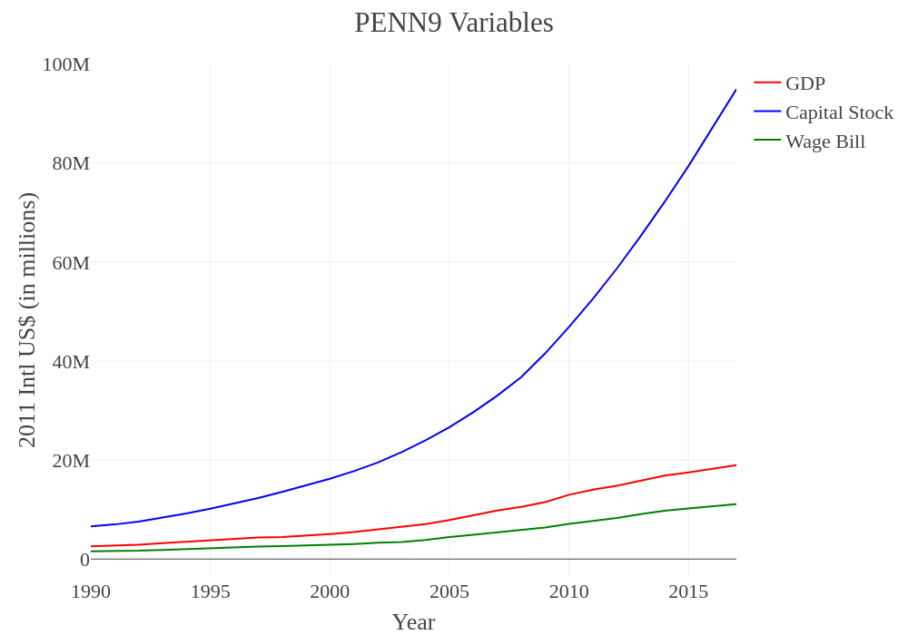
We can see here that, especially from the early 2000s onward, the total value of capital stock skyrockets relative to all other values. The depreciation value has not been added to this chart, but a similar, albeit more subdued, trend would prevail even if it had been applied. The smoothness of the curve seems to imply that the capital stock data has been interpolated rather than directly gathered, and the process appears to be more mechanical than what would be produced by the perpetual-inventory method.
Now we can look at the same thing for the variables drawn from the NBS, with the capital stock measures computed by Chinese scholars added alongside:
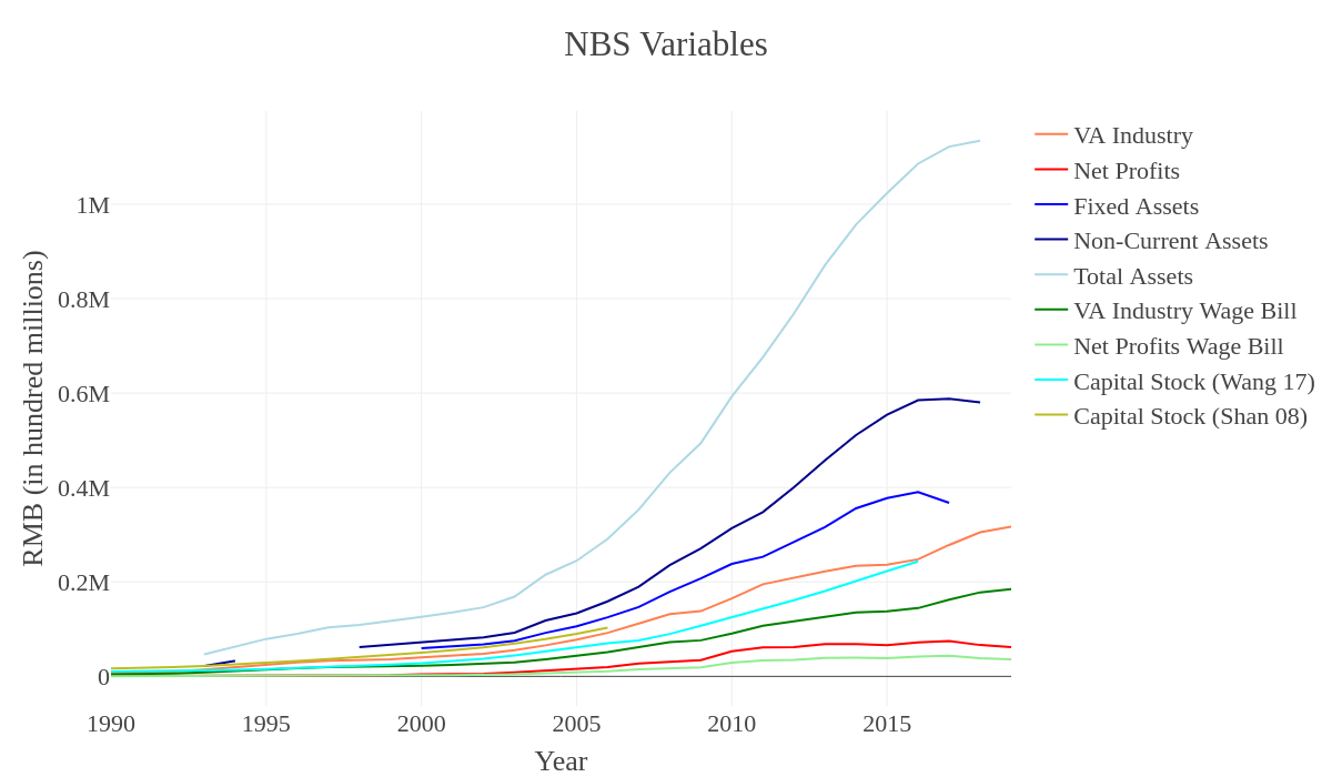
We see again that the various capital stock stand-ins (Total Assets, Non-Current Assets and Fixed Assets) lie substantially above the other variables, with Total Assets in particular rising disproportionately higher after 2010. The exception is the two capital stock measures produced by Shan and Wang et al, which not only lie below all the various measurements of industrial assets, but even (in the case of the longer series) fall below the Value Added of Industry itself. This is extremely unusual, and indicates that these capital stock perpetual inventory series may be deeply flawed. To put the problem into perspective: these supposed measures of the total price of economy-wide “capital stock” lie well below the total price of the fixed assets of the industrial sector alone, as recorded by the NBS. This is yet another reason to portray the ROP measures derived from these capital stock estimates separately.
It’s also worth noting that in the final few years visualized here the Value Added of Industry ticks upward, while the Net Profits of industrial enterprises declines slightly. This is a notable difference in and of itself, and it will ultimately produce divergent end-year profitability trends between the three Net Profit ROP measurements and the Value Added of Industry ROP. The difference could be caused by a number of things. Value Added generally records gross output (including not just sales but also growth in saleable inventory and taxes that are paid) minus intermediate outputs used up in the production process (i.e. raw materials, semi-finished goods, energy costs). Value Added counts compensation paid to employees as a component of output, alongside taxes (often understood as “net return to government”) and the gross operating surplus (“return to capital”). Profits, by contrast, are simply the final measure of return to capital, once all costs (including wages, taxes, land or equipment rent, debt repayment, etc.) have been subtracted.
So a divergence between the two could signal a growth of the overall wage bill relative to the other components of value added (taxes and operating surplus), or it could signal a growth of taxes instead. At the same time, though, this divergence might indicate speculative activity inflating the broader measure of “output” by counting rents on, for instance, oversized stock or real estate asset portfolios built up by the “industrial” firm. This became fairly common practice in the midst of the infrastructure boom following the ’08 crisis, so we would expect some of these returns to be counted in our output measures. That said, the opposite could also be true: it’s possible that net profits are being depressed by costs not yet subtracted in value added, as debts become due. All these options are purely speculative at the moment, and we can’t come to a hard conclusion here. That said, we will look at some general trends in capital formation, real estate and the overall value-added composition of GDP in order to provide context.
But first, it will be helpful to also zoom in here on Net Profits specifically, since that variable alone gives us some sense of profitability trends, though no sense of the magnitude of profits to costs:
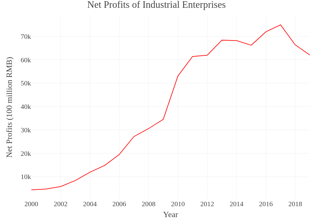
It’s important to recall that none of these figures have been normalized, so they’re all capturing total growth in the economy. What that means is that the net profits here aren’t being shared across the same number of firms, but instead that we see a total growth of firms (not visualized) and a total growth of profits accompanying that. Nonetheless, the growth of economy-wide industrial profits increases steadily through the 2000s, then jumps sharply after the stimulus in 2009-2010, before reaching a new plateau of slower growth through the 2010s and a more recent sharp decline from 2017-2019.
Now, let’s contextualize Value Added by looking at the overall trends in the composition of Chinese GDP. First, we can break GDP down into the value added of Primary, Secondary and Tertiary sectors, respectively, from 1990 to 2019:
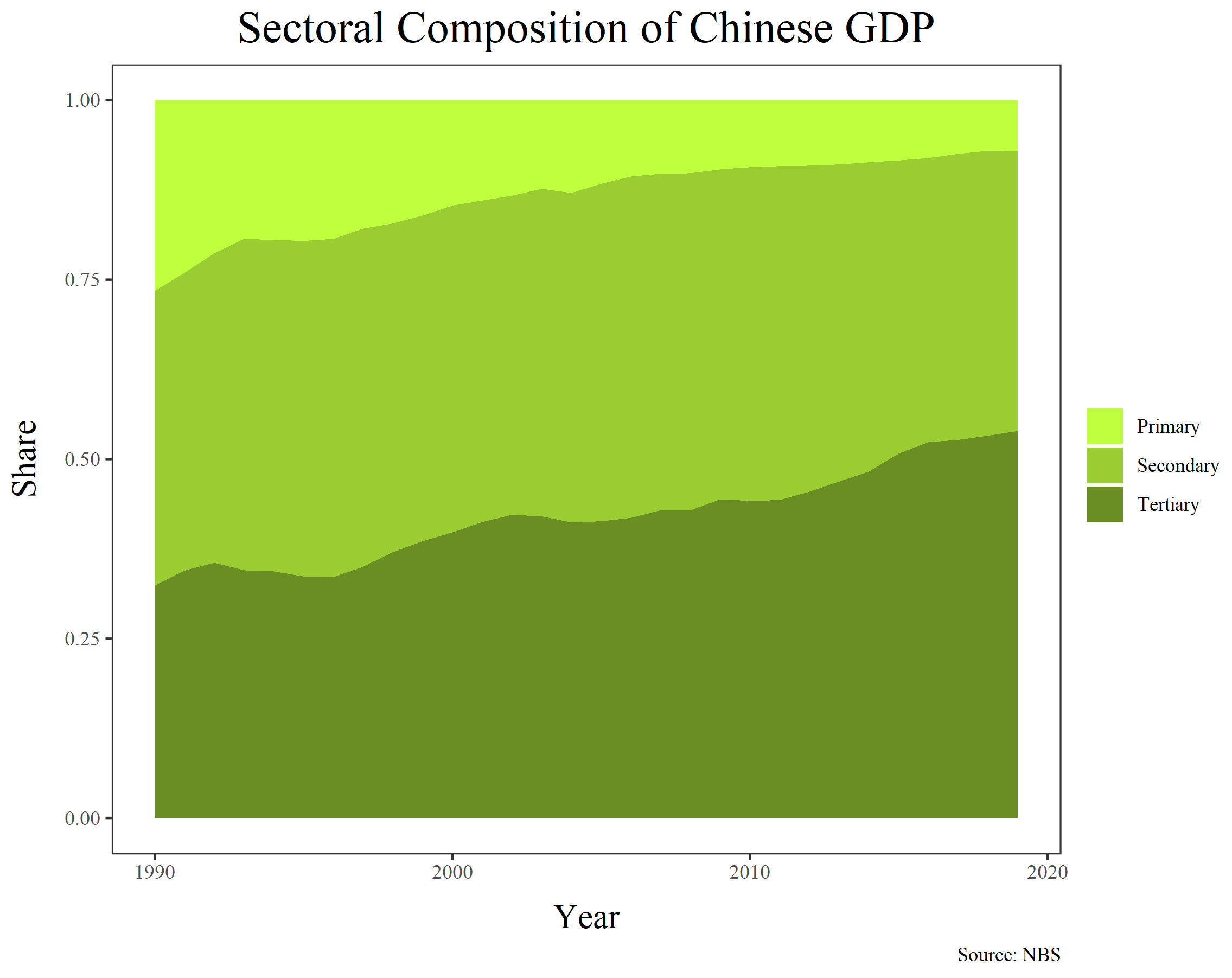
The most salient trend here is the continual shrinkage of the portion of GDP composed by the primary sector (which includes agriculture, forestry, mining and other extractive industries). But it’s worth noting that this shrinking share is not matched by growth in the share composed by the secondary sector (which is mostly manufacturing and construction). Instead, the symmetrical growth is in the tertiary sector (services, real estate, finance, etc.), which has seen its share grow not just at the expense of the primary sector, but in the most recent years also clearly at the expense of the secondary sector as well. It will help to show the same chart, but now with a more detailed sub-sectoral breakdown:
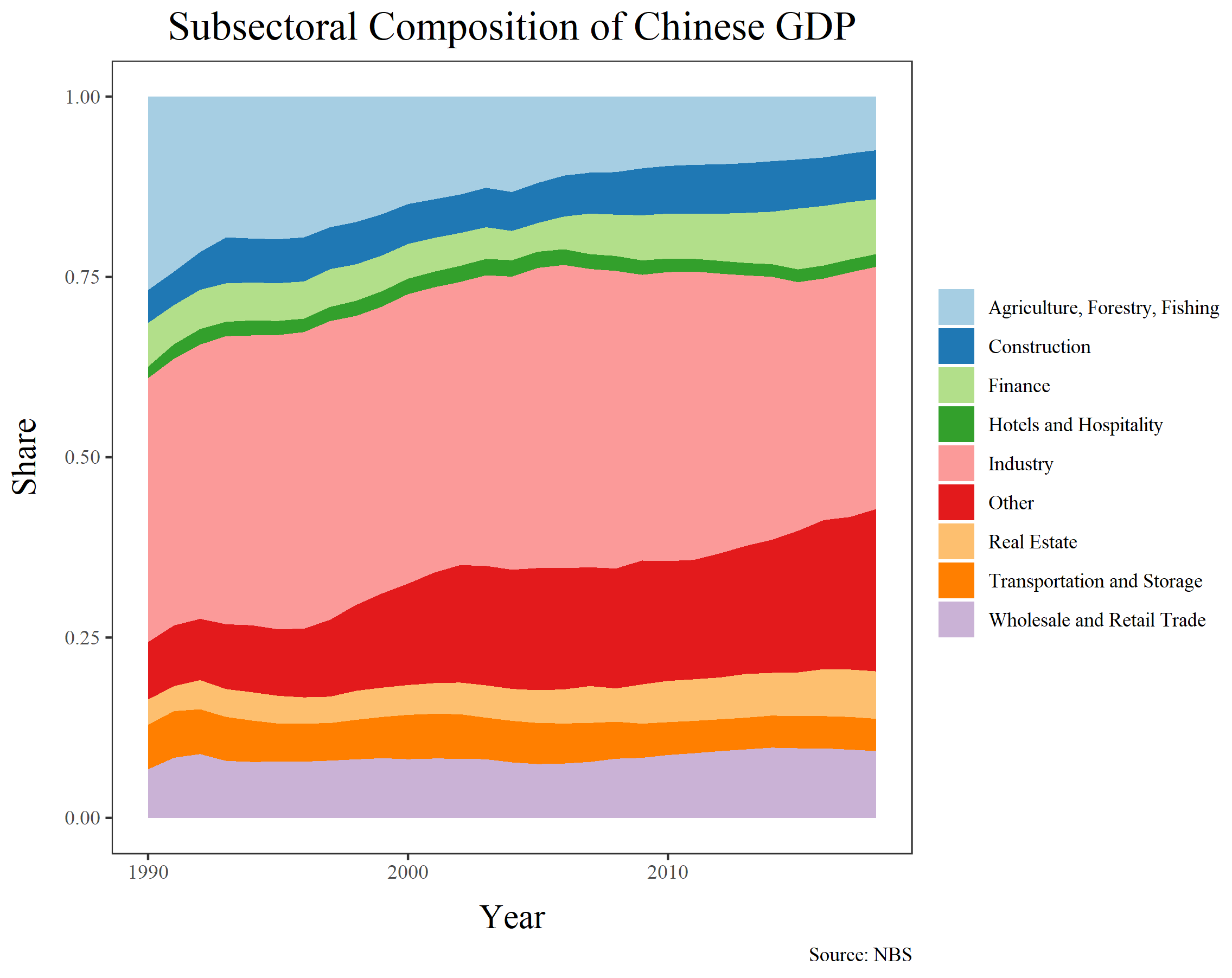
Here, the shrinking share of industry in total GDP is even more visible, alongside the shrinking share of agriculture. It’s noteworthy, however, that construction’s share undergoes only the most modest, barely-visible increase throughout the post-crisis years. One would expect that the infrastructure-oriented stimulus might have increased construction’s share in output more substantially. Instead, it seems that finance and real estate both increased their shares in this period, albeit modestly. The biggest, growth, however, is by far in the “Other” category. At first, this category seems a bit mysterious, since it’s such a large chunk of output by the end of the series. The name seems to hint that it might count various forms of illicit or shadowy output, such as that derived from land sales, grey market banking services, or stock market manipulations. But in reality the category is more mundane. It certainly does pick up some otherwise uncounted forms of speculation, but the bulk of the classification is likely just otherwise uncounted services. The largest of these, based on the NBS’ own employment series and on the normal structure of rapidly growing upper-middle-income economies, would almost certainly be Healthcare and Education. In addition, a huge portion of China’s booming e-commerce services would be picked up here, alongside other tech sector output and profits raked in by media conglomerates. Many of these sectors are certainly speculative and/or unproductive, but in a form that’s largely consistent with what you’d see in any other country.
How else might we be able to track some of the changes in our basic variables? The above gives us a sense of the overall distribution of output, and we will be measuring that in three different respects when estimating profitability: through overall GDP, through the value-added of industry, and through the net profits of industry. In addition to the overall anatomy of output, though it will also be helpful to look at the trends in investment in fixed assets and capital formation, and to compare these with trends in the Real Estate sector specifically. This will not only provide further framing of these output trends, but also let us flesh out the context and trends in constant capital formation in China, which may differ from the simple sectoral breakdown of output we see above. In particular, we’d expect to see the effects of the infrastructure-led stimulus in fixed asset investment data, even if it doesn’t appear as clearly in output.
Overall, China tends to have a much larger investment-to-GDP ratio than seen in other countries, even at the height of their own developmental booms. But there are multiple ways to measure this. The NBS offers one variable, “Total Investment in Fixed Assets”, which tends to be a particularly large share of overall GDP. This is because the measure includes not only investment in new long-term assets like plant and equipment, but also the purchase of used equipment or facilities, as well as mergers and acquisitions (which were substantial in much of the 2010s), the purchase of raw materials and other inventory items, and real estate investment. In contrast, a second, more limited variable is found in “Gross Fixed Capital Formation.” This figure is the one more commonly used for international comparison, and it is the one translated into dollar terms by the World Bank. It excludes land purchases, mergers and acquisitions, and the purchase of pre-used equipment or facilities, but it still includes purchase of new inventory items (raw materials, unfinished goods and other intermediate warehoused goods). Let’s compare both back to back, as a share of GDP:
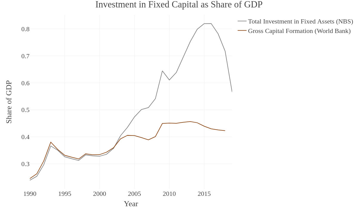
The divergence between the two is clear, as is the enormous magnitude of Investment in Fixed Assets relative to GDP (upwards of 60% for the past decade, and peaking at above 80%). It’s also notable how the two measures once followed one another quite closely, but then diverge in the early 2000s at the beginning of the foreign investment and export-processing boom. Both, however, show similar trends, even if the trend in the larger measure is more extreme: more or less consistent growth through the 1990s and 2000s, followed by a second peak (in fixed asset investment) or a plateau (in fixed capital formation) in the early 2010s, which is then capped by a decline. In the case of Investment in Fixed Assets, this decline is dramatic, and marks all years from 2016-2017 onward. In the case of Gross Fixed Capital Formation, the decline is more modest, and it begins as early as 2014-2015. Long prior to the most recent coronavirus crisis, then, it was apparent that investment in productive facilities was already slowing substantially.
But since fixed asset measures often include real estate and residential construction, we’ll want to see how much of this growth was simply due to real estate speculation. There are a few variables to examine in this regard. First, we can look at Investment in Residential Buildings specifically, and compute it as a share of GDP (so it’s comparable to the Total Investment in Fixed Assets measure used above)—this will show whether or not real estate investment for non-industrial use has been eating up more or less of total output over time, and whether this follows a similar trajectory as fixed asset investment overall. Second, we can look at Investment in Residential Buildings as a share of Total Investment in Fixed Assets—this will give us a sense of whether real estate investment has been a greater or lesser portion of all such investment over time. Finally, we can contextualize these measures by comparing them to the trends in the overall share of real estate value added in GDP—this will show whether or not output is following the same trend as investment:
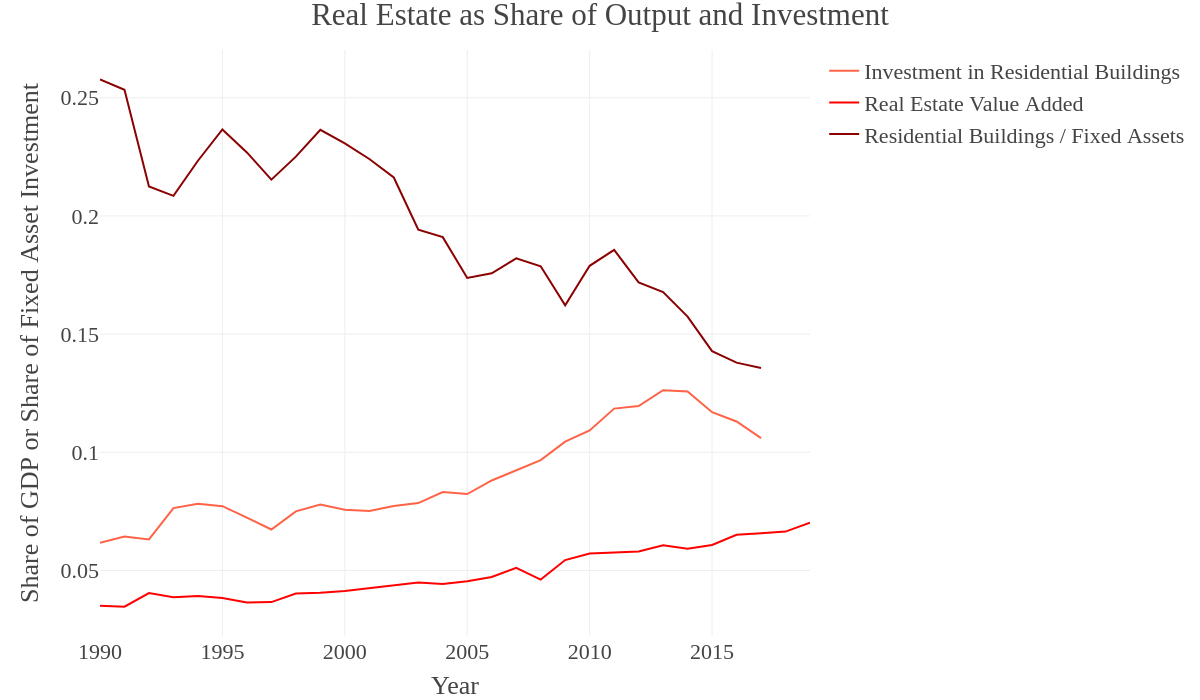
From this figure, we can first see that a dominant trend is the overall decline of investment in residential buildings as a share of total investment in fixed assets. On the one hand, this seems to go completely against the popular media image of China building expansive ghost cities and encouraging rapid urbanization in the interior. But these media portrayals have always been a bit overblown, and almost always have failed to correctly portray the scale of China’s earlier urbanization boom—the one which created the current megacities along the Chinese coastline in the first place, much of which laid its foundations in the 1990s and early 2000s. Meanwhile, the trend is clearly driven by the fact that investment in industrial capital formation would have been so much lower in the 1990s, and then increases throughout later years, necessarily pushing down the share of residential buildings in all fixed asset investment. By the 2000s, we therefore see a decline, but (as is apparent from the other variables) this decline is not due to a general decline in investment in residential buildings or real estate output (as shares of GDP). The trend line only picks up again once, briefly, in the wake of the ’08 crisis when stimulus funding was pumped into large national infrastructure and urban development projects while industrial development slowed in the midst of widespread factory closures and relocations. This peaks in 2011, after which the descent continues.
Aside from this, we see a general increase in Investment in Residential Buildings as a share of GDP, but this trend peaks in the same years as the peak seen in the previous Figure, showing Total Investment in Fixed Assets and Gross Fixed Capital Formation. It appears to follow essentially the same trend as these aggregate measures, meaning that recent years have not seen proportionally more residential construction relative to overall investment in fixed assets. But the value added of the real estate sector has seen no reversal of its generally upward trend. This means that, even while investment in residential buildings has fallen, the sector overall continues to be lucrative. In part, this might simply be a signal of more unprofitable real estate investments being wiped out (and this would be consistent with the state’s recent attempts to crack down on some of the most speculative activity in the sector). But it’s also equally likely that the decline in residential investment as a share of GDP will ultimately produce a similar decline in real estate value added—we’d just expend this decline to come later.
Finally, let’s place the residential construction in full context. Let’s look at all the major segments of investment in fixed assets in the Chinese economy, as shares of GDP. Here, we’re using the broader category of Real Estate to capture residential buildings plus other, non-residential transactions. Remember, these figures all follow the standards used by Total Investment in Fixed Assets, which means they include simple land purchases, the purchase of old equipment and machinery, and mergers and acquisitions:
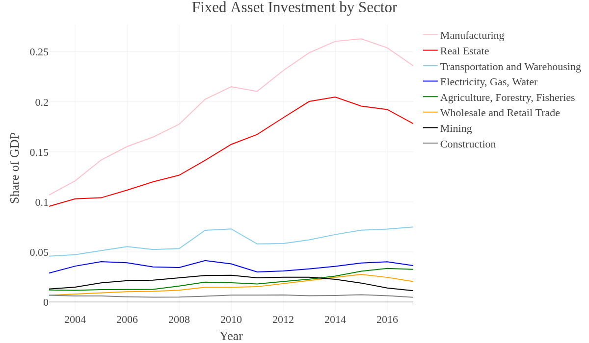
Here, we see without any ambiguity that manufacturing and real estate follow the same trend, and these compose the two largest portions of fixed asset investment. It’s no surprise, then, that they also peak in 2014 or 2015, and then begin to decline in subsequent years. What is interesting, however, is that these two largest sectors are not strongly affected by the ’08 crisis or its aftermath. Investment in fixed assets in manufacturing increases between 2008 and 2010, before declining slightly and then fully recovering until its peak in 2015 or so. Real estate goes through the entire period with no pause whatsoever, until its peak (which hits about a year earlier). If we look down to the bottom of the chart, however, we do see the effects of the post-crisis stimulus: Transportation, Warehousing and a general Utilities sector (Electricity, Gas, Water) all see a clear boom following 2008. This makes perfect sense, if we presume that stimulus money funneled into roads, rails, the electrical grid and other utilities projects would wind up recorded in these sectors.
A few of the minor trends are also worth noting. Construction sees no boom, and is generally flat throughout the period, and quite low. This is almost certainly because of the way the figure is calculated: a construction firm employed to build new factories will have the fixed asset of the land and factory counted as investment in fixed assets in manufacturing, not construction. The same for a road: it will be counted in Transportation, not construction. What sort of fixed assets, then, are counted in construction? The actual construction company headquarters, their yards for scrap and storage, and possibly their worker dormitories (though even these are usually temporary and likely uncounted). Meanwhile, mining has seen a net decline, despite the intensification of extractive industries in certain provinces in this period. Agriculture, however, has actually seen an increase in fixed asset investment. So has wholesale and retail trade. These patterns are consistent with recent trends in rural areas (which have seen more pressure to consolidate ownership into more capital-intensive farms) and urban consumption, respectively.
ROP and ROR
Now that we’ve established the general context of output and fixed capital in China, we can move on to a comparison of all the ROP and ROR figures. Note that the ROR figures have been smoothed by their original authors, but the ROP figures calculated here have not, since they are not particularly volatile (smoothing provided very little change, when performed). Also remember the qualitative difference between the ROR figures, the Net Profit figures and the value-added ROP figures—on the chart, solid lines are used for standard value-added ROP measures, dashed for ROR, and dotted for ROP calculated with net profits. Using Net Profits in the numerator will produce a much smaller absolute number, but this does not indicate “lower” profitability among industrial enterprises, because these figures can’t be compared to those derived from output measures. Instead, compare the Value Added of Industry line to those using GDP, and we see that they exist within essentially the same range. In addition, two additional ROP measures follow in a subsequent chart, since these are disproportionately higher due to their use of the low capital stock measures derived from the Chinese-language academic literature. Finally, the PWT 9.1 Rate of Return measure will be visualized separately as well, since it, like the two ROP measures just mentioned, will not be used in the attempt to find an average trend. This ROR measure seems to sit particularly low, and the PWT is not particularly clear about what variables, exactly, they are using to calculate it, but the trend itself is more or less identical:
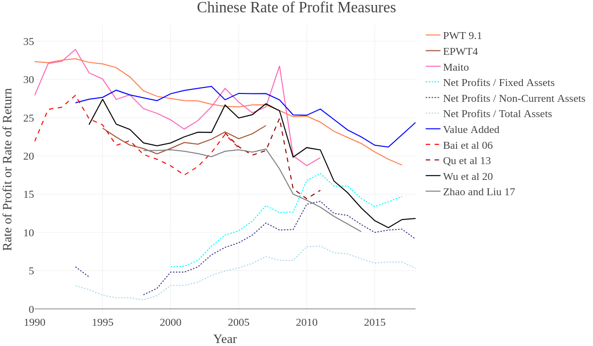
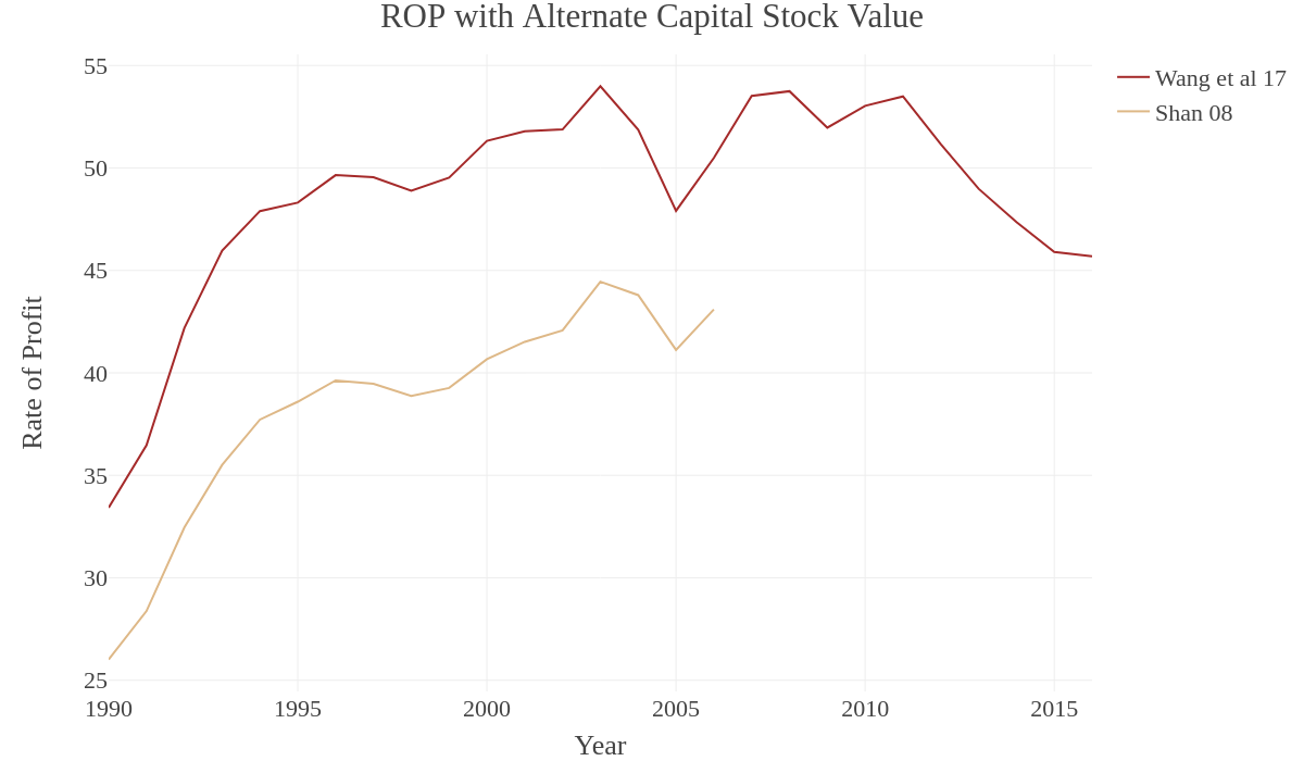
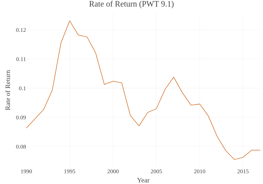
First, we should note that our NBS measures don’t show the early 1990s at all, and some (fixed assets and value added) only have data from 2000 onward. This means that earlier trends may be hard to spot. But where the 1990s are included, the decline in profitability has more to do with the decline of the old socialist-era industrial belt, for which it makes no sense to measure “profitability” in the way intended here. In the late 1990s and the early 2000s these were restructured through a combination of mass factory closures, consolidations and privatization, after which point “profitability” can be measured in the conventional sense.
But overall, this is the picture provided: slowly falling “profitability” in the late 1990s, prior to the restructuring of the socialist-era state-owned enterprises, followed by either a flattened or increasing rate of profit throughout the 2000s until the crisis in 2008, which is picked up as either stagnation or a brief dip in 2008-2009. Then the rate of profit increases again briefly in all measures except PWT and Zhao and Liu, peaking in 2011 before dipping in the most recent years at a much faster rate.
There are a few key differences that we can note here:
First, the ROR variables that Maito draws from, although smoothed, seem to exaggerate the spikes and the troughs, particularly before and after the 2008 crisis.
Second, the ROP measure from the PWT and that computed by Zhao and Liu are the only ones that seem to not display any real recovery of the profit rate over the 2000s, at best depicting it as increasing very slightly in the middle of the decade. In general, the PWT ROP measure is muted with regard to either increases or decreases, simply showing a mild decline. This may be a result of the PWT using a mechanical capital stock measure that interpolates too much data, producing the overly smooth growth curve seen in Figure 1 above. It doesn’t seem to involve any substantial changes to the GDP figure itself (via normalization to international USD for some hidden parity modification), since the result is the same if the GDP data from the NBS is substituted. But there appears to be no such muting in the EPWT measure of ROP, based on an earlier version of the PWT and possibly using a different capital stock measure, which shows a different trend. This is reason enough to suspect that the PWT may not be giving as clear a picture as we would otherwise hope. Zhao and Liu offer a similar picture, but one which seems to better capture the trends, at least.
Third, the spreads between different NBS industrial capital stock stand-in variables are basically as we would expect them to be, with fixed assets exhibiting a very slight upward divergence from the others over time. This divergence is produced by the slightly different final-year trends in the raw variables visible in Figure 2. Similarly, the difference in the final-year trends in Value Added of Industry and Net Profits produces a marked difference in the final-year ROP measures for the two, with Value Added showing a much sharper uptick between 2016 and 2018. But this uptick, albeit more restrained, is also seen in the Net Profits ROP calculated with fixed assets and in the ROP as calculated by Wu et al. Why is it so exaggerated in the Value Added variant? This could be because this more expansive measure of output is picking up more speculative uses of sitting capital, such as land purchases or acquisitions of other firms, the purchase of used plant and equipment sold by relocating or shuttered firms, etc. It could also be picking up generally rising wages in remaining industries (remember, value added is usually composed of surplus operating capital plus compensation to workers and taxes paid). None of the more speculative activities would be picked up as strongly in the more limited measure of net profit, and rising wages would tend to, in fact, depress that measure.
Finally, the two alternate ROP calculations derived from the unaccountably low capital stock measures provided in the Chinese-language literature follow one another and broadly mirror the patterns seen elsewhere: rapid growth followed by stagnation in the 1990s, slower growth in the 2000s, then a dip following 2011. The measures appear to mirror the Maito and ROR measures, and that seen in Wu et al, but with less substantial decreases in “profitability” in the late 1990s. The major difference is simply the high absolute value of these measures, explained above.
In order to make the overall trends more clear, we’ll now finish our ROP measurements by producing a few versions that visualize the average of various combinations of all our measures. This requires a little manipulation, however. Missing years in certain series (particularly the net profit measures) will create a problem if the series are divergent in the surrounding years, creating artificial spikes or dips in the mean. This is only an issue for the early years, where some industrial asset data are missing, and for the final year or so, where we only have a few measures still recorded. We solve the problem by interpolating data for these measures to be used in the calculation of the mean. The interpolation for the net profits measure is simple: since the total assets series is the most complete, and since the Net Profits ROP measures follow the same trend, we can use this series as a weight to calculate the missing years of the others. In any cases where a single year is missing at the beginning or the end of the series, we can just transpose the nearest available value (the year before or after), making sure that a sudden absence doesn’t jar the mean. That said, we don’t have to fill in all the missing data. Some series end early, but they end at a time when there are a number of other measures available and they’ve all converged around similar values, meaning that the mean won’t be skewed by their sudden absence.
The final chart shows four different mean measures. All are simple means. All exclude the overly high measures derived from the Shan and Wang et al capital stock series, for obvious reasons. The ROR values (from Bai et al and Qiu et al), however, are kept, as are all three net profit measures. While it may seem unreasonable to include all three of the net profits variations here, since that will drag the overall measure down, there are a few reasons to keep them. First, as can be seen from the chart below, the overall effect they have in depressing the series is actually minimal, and is by far the strongest in the 1990s. All the measures essentially converge toward the end, and by the mid-2000s the version including the industrial measures and that excluding it are actually very close in absolute terms. Second, including three net profit measures effectively weights the overall series a little more, helping to emphasize the trends in industry and effectively rebalancing what is going to otherwise be an average skewed in the opposite direction. Without this, the simple fact that there are so many variations in the calculation of the national profit rate, by so many authors, would mean that these national measures would skew the rate upward. Third, as mentioned earlier, the net profits measures are lower mostly because they’re just qualitatively different. We’re not particularly interested here in the absolute value, since we’re not seeking to compare this rate to that seen in other countries (and therefore don’t need to match methods). What we are trying to average is the trend between all these lines. Including the net profit measures allows us to do this, regardless of any depression they may cause in the absolute value of the final line. Including all three makes sure that their trend is properly weighted (alongside the industrial value added ROP) against the national measures, of which there are far more than three.
Now let’s quickly cover what each line in the following chart shows: The first is simply the average of All Measures. It is visualized as a solid line. This includes all the national measures, and all the industry-specific measures, and is calculated as the mean of all, using interpolated data for the missing net profit years and for the final year. As is clear, this means that the overall measure is dragged down a bit by the generally lower absolute values of the industrial series. But the effect is fairly minimal, and this line follows the trend seen in the second measure. This second measure is the average of All National Measures, meaning it excludes the all industry-specific ROP measurements—using net profits, or using value added. It is visualized as a dashed line. The third measure is the mean of all the industry-specific measures, excluding the national ones. The fourth and final measure is the same as the third, except it does not include the measure using the Value Added of Industry. Think of this final one as simply the average of those three dotted lines in the first chart. Both the third and fourth, since they are mostly or exclusively driven by the trends in the qualitatively different Net Profits ROP, are visualized with dotted lines:
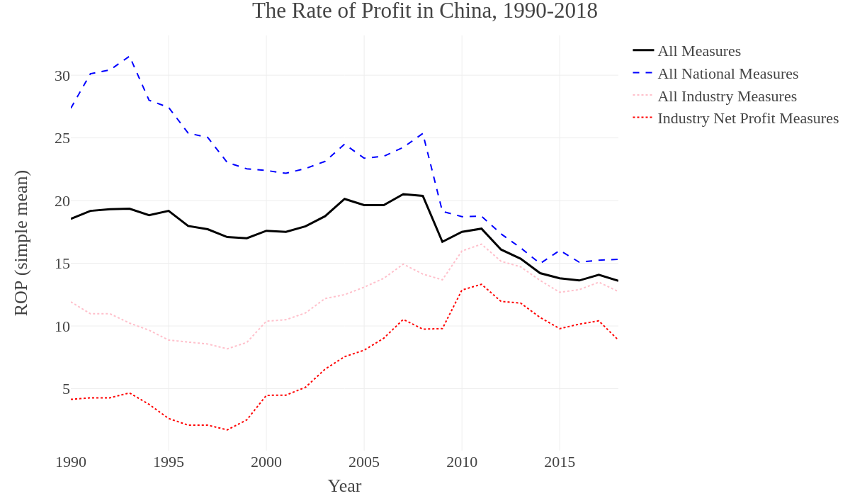
Summary Variables and Comparisons over Time
Now we can begin to break down the ROP and compare the magnitudes of its component variables. First, let’s look at the Rate of Surplus Value (ROSV), also known as the Rate of Exploitation. This is the magnitude of total profit, GDP or value-added (as a stand-in for S) relative to the magnitude of total wages (the equation is S/V). In the original, this measures the amount of total social surplus value extracted relative to the value of variable capital (i.e. the total social value given to workers via the wage). With our stand-ins, this captures something like the intensity of exploitation of workers in the economy as a whole, with exploitation understood in the specific economic sense rather than the general one—in other words, how much profit are they producing relative to how much they are being paid, not how “hard” or “bad” the work is, though certainly the two often bear some relation to one another.
Since we use a single Wage Share measure, which is simply multiplied to our various stand-ins for S, there is no need to produce multiple ROSV figures, since they’ll all come out the same. Instead, we will simply compare our national ROSV measure to that found in Wu et al (2020) and Zhao and Liu (2017):
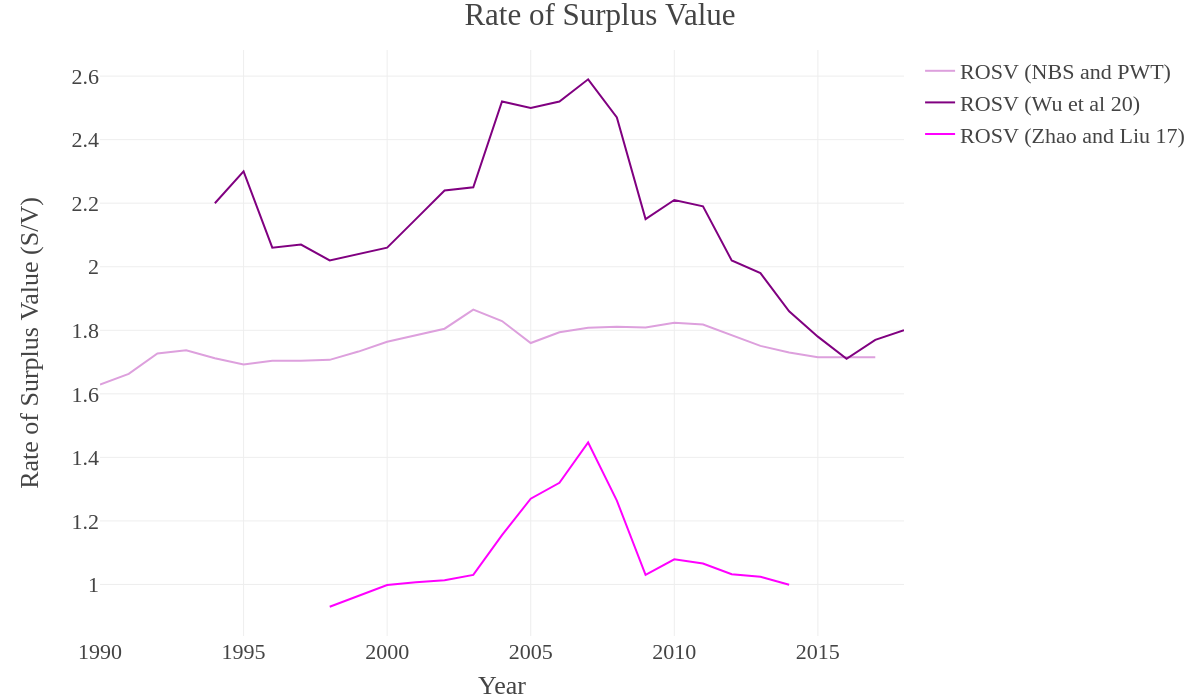
All three show the exact same pattern, just at different absolute values and levels of exaggeration. Though our own ROSV appears flat relative to the others, a closer look shows it rising from the 1990s to peak in the early 2000s, plateauing until 2010, then declining. The pattern is more or less identical to the others if the figure is rescaled to only show our ROSV calculation. The main difference between all three measures is the exact year in which ROSV peaks—the highest measure (Wu et al 2020) shows two peaks, one in 2004 and one in 2007; the middle measure (our own) has only one real peak, in 2003; and the lowest measure (Zhao and Liu 2017) also only peaks once but in 2007.
Overall, though, the ROSV takes the shape of a bell curve over time, showing a rapid increase in exploitation after the late 1990s which peaks, dips and then plateaus in the mid-2000s. After about 2010, the ROSV drops substantially, sitting at least as low as it did at the end of the 1990s, with a potential new plateau forming from 2015 onward. This chart would seem to signify a rapid increase in labor-intensive production as a share of national production from the late 1990s through the mid-2000s. This is associated with the influx of cheap migrant labor from the countryside into the cities in these years, which were marked by the rapid growth of the export sector. This increase, however, then drops off after 2010, likely due to the gradual replacement of more labor-intensive production with capital-intensive methods.
But in order to tell whether or not this is the case, we’ll need to look at the Organic Composition of Capital, which measures the relative magnitudes of the total share of output spent on fixed capital versus that returned to workers via the wage (i.e. C/V). This captures general movements in the technological composition of production, with a rising OCC tending to follow greater mechanization of production—i.e. when more money is being spent on more advanced equipment, machinery and facilities, or when workers are laid off and replaced with machines, the OCC measure will rise.
It’s possible to calculate the OCC for the national economy via the PWT 9.1 measures, as well as for industry specifically via Value Added. While it’s possible to also do so for Net Profits, it makes less sense because the wage bill has already been excised from the Net Profits measure (this is why in the Net Profits ROP measure we used the wage share applied to Value Added of Industry). For the Value Added of Industry, it’s also possible to calculate the OCC using various asset measures as a stand-in for C, and we’ll use Total Assets to be consistent with the method used in calculating the ROP. These will be compared to the OCC as calculated by Wu et al (2020) and Zhao and Liu (2017):
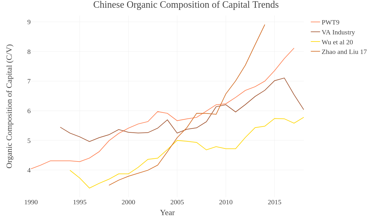
All four OCC trends are nearly identical. There is some slight divergence in the 1990s (likely due to how the two were affected in different ways by the measurement of socialist-era industries), and there is a difference in exactly where each identifies a plateau in the 2000s, but the overall trend is the same, with three stages: a more conflicted picture of the 1990s, a flattened OCC through the early- and mid-2000s, and then a rapid increase in OCC starting sometime in the late-2000s that continues throughout the early 2010s. The major difference here is what happens after 2015. The PWT measure shows a continual increase, essentially continuing the post-2010 trend. The Value-Added measure shows growth slowing, peaking in 2016, and then dropping dramatically. Meanwhile, the Wu et al (2020) measure shows a pause, a slight decline, and then a minor increase. What accounts for these differences in the late 2010s? Is this simply a difference between rising OCC in the general economy, but some sort of correction to that trend in industry specifically?
The OCC is calculated as C/V, and V, in our two measurements, is calculated by multiplying our sole wage share series (see above for where it comes from) by the relevant output variable (i.e. either GDP from the PWT or Value Added of Industry from the NBS). There are two major factors in the reversal of OCC in the Value Added measure, then:
First, as we saw in the summary of NBS variables, Industrial Value Added trends upward at a faster rate in the years after 2015, even while Net Profits of Industry trends downward. That means that this is not simply a difference between Industry and everything else—something is causing a divergence between industry profits and value added. Meanwhile, GDP is only growing slowly in these years. What that means is that the V in C/V will tend to grow larger more quickly for Value-Added, relative to C. In this respect, understanding the recent decline in OCC in Industry depends on exactly what is causing the divergence between net profits and value added. As mentioned above, it could be the result of some form of speculative activity. But it could also be the result of rising wages, which would imply a rising wage share.
This leads us to our second potential cause. In these final years, we have to admit that only the wage share variable (and subsequently, the V in C/V) for Wu et al (2020) is a completely robust measure. The PWT wage share series ends in 2017, but it has some minor issues prior to this. Beginning in 2015, the series freezes at 58.3%, and this figure is duplicated for 2016 and 2017 with no changes. Since we have no figures past this, we have also duplicated this final-year figure for 2018 and 2019. That means that the wage share is unrealistically frozen in all our measures from 2015-2019, though OCC only extends through 2017 (PWT) or 2018 (Value Added). That said, the oscillation of wage share is generally minimal year to year, so this doesn’t create a major issue in the ROP measurements, since V is only one portion of the denominator and we might expect it to increase by maybe a percentage point at most. But the effect in OCC will be more visible. With slower GDP growth (and ending in 2017, rather than 2019), the OCC from the PWT will continue its trend, since this means that V will grow more slowly, while C (capital stock) continues its upward trend. But with faster growth in Value Added, the V in this measure will grow more quickly, while C (Total Assets, in this case) plateaus.
It’s difficult to say decisively whether the fall in OCC after 2015 actually appears in the data or if it is instead an artefact of issues with the PWT, on the one hand (particularly their capital stock measure), and our interpolation of wage share for missing recent years, on the other. The measure from Wu et al (2020) hints that there was a real slowing of OCC growth in these years, however. So it’s most likely that we’re seeing a mixture of poor inputs and a real trend. In the future, a better wage bill series will have to be compiled for more detailed comparison. For now, we can still compute overall summaries through 2017 (the last year for which data exists in all the measures), since these will reduce the influence of the final years in question.
We will now compare the trends in ROP, ROSV and OCC after the year 2000 to see if we can quantify some of the trends that appear visually on the charts above. We’ll look at four time periods. The first three are 5-, 10- and 17-year segments starting from the year 2000. The third zooms in on the final years of our data, emphasizing the period after the economic crisis (2010-2017) to pick up only the most recent trends. Since the ROP and OCC will be slightly different for the PWT and Value-Added measures, we’ll produce two separate plots, but recall that ROSV is the same for both. To these will then be added the measures from Wu et al (2020), with their own distinct calculation of ROSV:
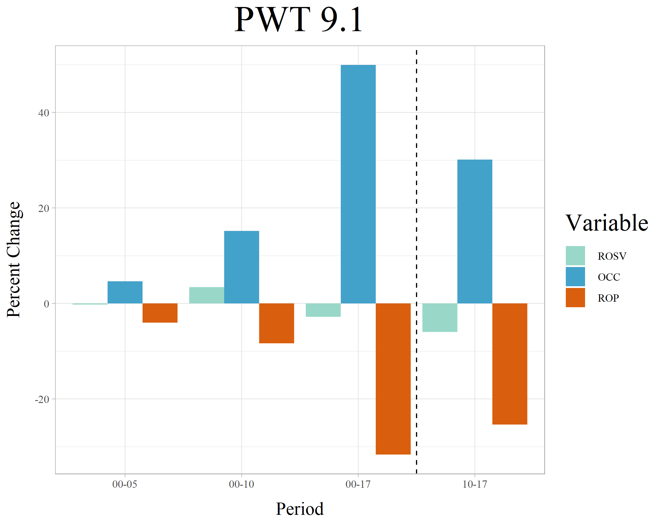
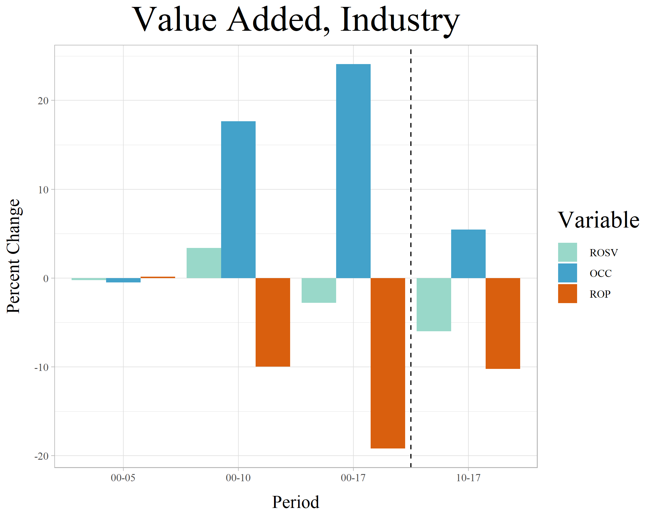
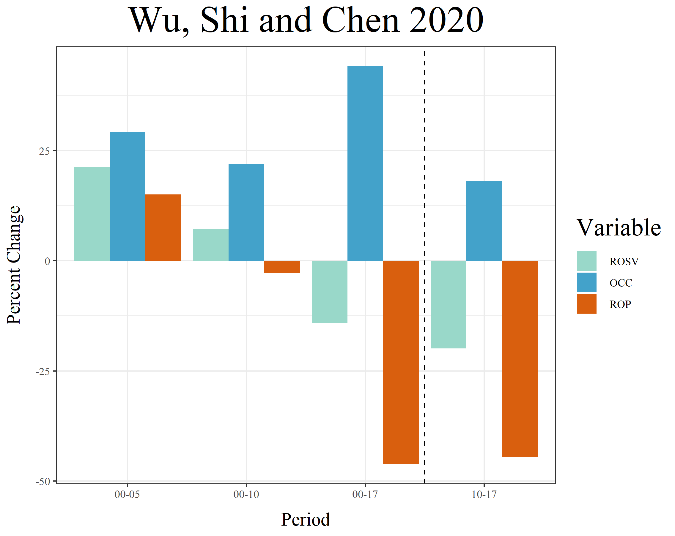
There are a few stark patterns in each of these plots, and the three seem to roughly match. Both the PWT and the Value Added figures show the early 2000s as a period of nearly flat growth in all our variables. This makes sense, with the restructuring of socialist-era industry being completed in these years, which also saw blows to output from dips in the global economy following the US tech bubble bursting and, regionally, the outbreak of the SARS virus in 2002-2003. The industry-specific measure is particularly flat here, while the national accounts measures are a bit less flat because they at least pick up trends in other sectors. That difference is more evident in the Wu et al (2020) measures, which show all three growing in these first five years. The period from 2000-2010, by contrast, sees simultaneous growth in ROSV and OCC in all three plots, as well as dips in ROP. While the rising OCC will tend to drive down ROP, a rising ROSV can temper that trend—this is evident in Wu et al (2020) figures for 2000-2005, where the rapid ROSV growth ensures that ROP grows despite rising OCC.
For the final years, 2010-2017, the push-pull effect of OCC and ROSV on the ROP are even more clear. The ROSV falls more substantially, and the OCC grows, causing the ROP to dip. The main difference between the two measures is how their trends compare in these later years, particularly in 2017 itself (which sees the Value-Added measure OCC fall suddenly and its ROP rise). But, in general, we can conclude that the rapid growth in OCC in the whole period, but particularly from 2005-2010, combined with stagnation or decline in the growth of the ROSV in that same period, has been intensifying the decline in ROP, both for industry specifically and for the economy at large.
Periodizing Profitability
Once these factors are taken into account, it becomes possible to divide the profitability trends into three rough stages, each of which matches a “short” decade. Let’s combine our own more theoretical and contextual understanding of the era with all of the above material into a coherent narrative of each of these three short decades, fundamentally defined by trends in industrial profitability and mechanization:
Transitional Stagnation
1993-1999
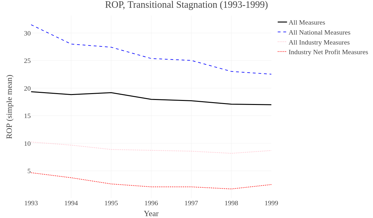
In this period, the ROP equation is measuring something fundamentally different than it does later, since it includes variables that originate from the old state-owned enterprises founded during the socialist developmental regime. This means that the base-level statistics are qualitatively different, since these enterprises did not historically keep balance sheets in the conventional sense, and both inputs and outputs were measured in pure magnitudes, which were then assigned a money “value” after the fact and purely in accord with the mechanical accounting methods of planning authorities (i.e. these monetary “values” were not market prices, since they were not used in exchange and were not formed or affected by it). Over the course of the 1990s, however, more of these enterprises began to participate in the market to differing degrees, and their efficiency began to be measured increasingly in the terms of capitalist profit and loss, at which point it became clear that many of them were severely unprofitable.
Around the year 2000, a massive restructuring was undertaken in which the profitable portions of these enterprises were consolidated into large conglomerates (集团 – jituan), which were then crafted into stock-market-listed firms that met international corporate standards.[xxxix] The unprofitable remainder firms were liquidated and their facilities, land and bad debts were diverted to a series of asset-management companies, to be dealt with over time. So this period captures the industrial stagnation of the later transition to capitalism, in which the move to marketization had been made but the old socialist-era industrial structure had yet to be dismantled—with its expensive wages, pensions and other social benefits acting as a massive drag on economy-wide profits. Obscured is the divided geography of this period, in which the stagnation was concentrated in the northeast, home to the old industrial belt. Meanwhile, even in this period of apparent declining profitability, the sunbelt industries of the southern coastal provinces were beginning a period of rapid growth, undergirded by high rates of exploitation and high rates of profit enabled by their capital-poor but labor-intensive production regimes.
Export Production
2000-2008
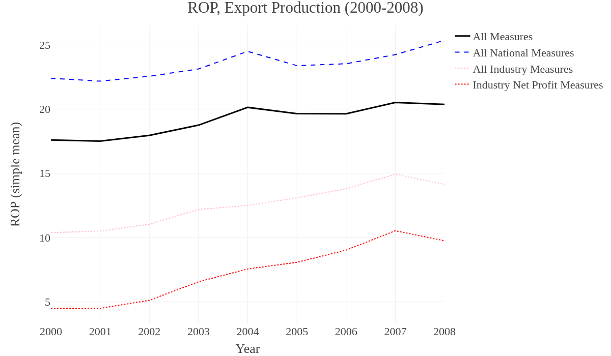
In this period, the old state-owned enterprises were rapidly liquidated, leaving only their profitable remainder in the form of massive new conglomerates. This process of liquidation took place in the first years of the decade, creating a brief period of stagnant or slowly growing profitability. At the same time, a new industrial structure had taken shape in the coastal cities, defined by production for international export markets. Many firms operating in these industrial hubs were internationally invested, and their low cost of labor (compared to the global standard, but also compared to the previous benefits offered to socialist-era workers) clearly allowed for higher profits. It is no surprise that in this period of massive GDP growth and the rapid rise of new industrial cities like Shenzhen, profitability would also be rising (or at least falling more slowly).
These new territorial complexes were built and staffed by migrant workers from the countryside. In retrospect, these years saw the peak of an unprecedented influx of cheap labor not seen in China before or since. Such migration had existed in more limited and local forms in the late 1980s and throughout the 1990s, but by the new millennium the floodgates had opened and ruralites poured into the cities in full force. On the one hand, they were pulled by the attraction of new jobs, with the notion that they’d work for maybe a decade, remitting their wages back home where they’d be used to build a nice house in the countryside and/or send children to better schools. But, on the other, this pull was only really attractive after the collapse of the rural economy (signaled by the bursting of the TVE bubble in the late 1980s and the battles that took place over price fluctuations for cash crops in the same years).[xl] Thus, a massive and effectively dispossessed population of surplus rural labor was made available for work in the new export factories in the coastal cities. This drove up the rate of exploitation nationwide in these years, and the rate of profit tended to follow, either rising (in most measures) or nearly flatlining (in 3 of the 9 measures) as its secular tendency to decline was stalled by these countervailing dynamics.
This new export-oriented industrial structure begins to dominate around the middle of the decade, with a high rate of exploitation prevailing for the bulk of this period and stagnant or slow growth in mechanization. The slow growth in mechanization occurs because of the ready availability of extremely cheap labor, meaning that more labor-intensive production methods actually prove cheaper than capital-intensive alternatives, even if the option to mechanize exists. This produces either a flattening in the decline of profitability or an increase, when measured by national accounts or the total value-added of industry. When averaged across all measures, all show an increase in this period. But the industry-specific averages show the strongest increase. One divergence between the averaged measures can be seen in the latter half of the decade. While the industry-specific averages simply increase until 2008, others (including the individual Value Added measure of industry) see a bumpier picture in the later decade, with a decline around 2005 before growth is recovered into 2008. Regardless, the picture is of generally increased profitability in the new millennium. This helps us to understand why so much of both domestic and global production was moving to the region in this period. In addition to the traditional ability of multinational firms to exploit inequalities in global labor arbitrage (i.e. their imperial power, in the classical sense), the labor-intensive production regime offered particularly high returns.
Stimulus and Stagnation
2009-2018
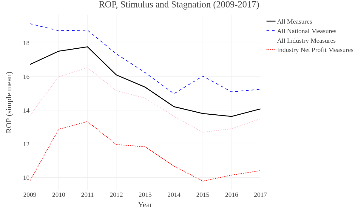
The decade ends, however, with the global economic crisis and its immediate aftermath. The full brunt of this crisis doesn’t strike China in 2008, but instead in the first months of 2009 when the depressed consumer demand in the high-income countries begins to reverberate into Chinese export hubs, which see massive waves of factory closures and workers having no jobs to return to after the end of the Spring Festival. Chinese elites respond with an enormous, rapid stimulus, poured primarily into large infrastructure projects. The construction boom allows for a build-out of both basic road, rail and other civic infrastructure, as well as the continuation of the real estate bubble—which is not limited to residential construction but also sees a number of companies buying up land.[xli] The combination of industrial consolidation and growing real estate assets begins to drive up the OCC after 2008, but the massive influx of cash helps to buffer against a more severe immediate decline in profitability while also creating the conditions necessary for a short-lived boom driven by the construction industry—visible in fixed asset investment in transportation and utilities, while also undergirding continual growth in investment in fixed assets in industry throughout this period (see Figure 2.6 above).
This brief recovery in profitability, however, peaks sometime between 2011 and 2012. It becomes evident that during the stimulus there was only a limited recovery of the old export industries in their traditional hubs. Many companies used the shock to justify liquidation, relocation or consolidation of their factories in places like the Pearl River Delta. This process begins in 2009 and 2010, but it essentially continues for the next decade. Some firms relocate to the interior or overseas while others see a rapid process of industrial upgrading defined by consolidation and mechanization. Others are simply shuttered and their investors pivot into less labor-intensive lines of production for higher-value-added commodities. This is epitomized by the pattern seen in the Pearl River Delta, where textiles were gradually replaced by low-end consumer electronics, and then, after the economic crisis, both began to be much more rapidly superseded by higher-end electronics. The result in some areas, such as Dongguan, was a stark clearing out of old industries with far fewer stepping in as replacements. In other areas, such as neighboring Shenzhen, higher-tech industries eagerly moved in to fill the gap left by the factory closures, assisted by preferential policies designed by local and provincial officials.
From 2011 through 2015, however, investment in fixed assets in the Manufacturing sector was still increasing steadily (alongside Transportation and Warehousing and, in fact, Agriculture). Thus, the much slower growth of net profits and value added in these years was paired with an unabated increase in fixed assets. The result was a period of more rapidly declining profitability after around 2011 or 2012, accompanied by a plummet in the rate of exploitation (ROSV) and a sharp increase in mechanization and consolidation (OCC). The decline in profitability is picked up in all our measures for these years, including those calculated using the net profits of industrial enterprises. On the surface, this general industrial stagnation is disguised by the pivot into high-tech lines of production and the flood of shiny new infrastructure. Declining profitability in the core of the economy always appears to the public as its opposite, at least at first. This is because the spectacular character of speculative development is combined in these years with the shuttering of sweatshops in old industrial hubs and the desperate attempt by investors to climb up the value-chain. This produces a new generation of billionaires who are held up as exemplars of the increasingly post-industrial order. But speculative activity can only buoy the economy for so long, eventually leading to burst bubbles and strangled growth rates as the productive core fails to recover.
At the start of a new decade, we are beginning to see both. But it remains to be seen whether or not the Chinese economy can fairly be said to be entering into a new period, in terms of trends in profitability. In several of our measures, the profitability decline seems to at least be slowing in recent years, and in one (Value Added of Industry) it actually increases sharply for the last two years—though this could be an artefact of an interpolated wage share, or of speculative activity within industry, as explained above. In another measure (Wu et al 2020), this same increase is visible, but is muted, hinting that another plateau of profitability may have been reached. When we average-out all the values, it seems a plateau is more likely than a substantial increase, and this means that the 2009-2018 period is defined by sharply falling profitability followed by stabilization around a new, lower rate. In this respect, it appears to be the inverse of the trend seen in the 2000s, though the profitability of industry specifically remains higher at the end of the series than where it began (the same it not true, however, of the national averages).
What accounts for the stabilization of the profit rate at this new, lower normal in the years after 2015? First, we finally see a decline in the growth rate of fixed asset investment in general and in manufacturing. The peak lies in the same years as the stabilization of the profit rate, around 2015-2016, and is matched by a peak (a bit earlier in 2014) in investment in residential buildings and the real estate sector more generally. The only sector that still sees growth in fixed asset investment in recent years is Transportation and Warehousing (Agriculture grows, then stabilizes at a higher rate). Overall, this means that the OCC is growing more slowly. That said, we’re almost certain to see a substantial decline in 2020, given the severity of the most recent crisis. The following months and years will give us hints at how much this crisis may or may not have inaugurated a new and even more tumultuous period for Chinese industry.
Data for all the ROP and ROR measures has been compiled here, and metadata explaining the variables is available here.
Notes
[i] The immediate crisis seems to have been triggered by the “exogenous” effect of the coronavirus outbreak, but there are two things wrong with this appraisal. First, as we explore in our article Social Contagion, such outbreaks are themselves not exogenous. Instead, they are the way that capitalism’s contradictions manifest in seemingly “natural” disasters, a microbiological counterpart to the larger crisis of mass extinction and climate change. Second, most of the periodic crises that we think of as “economic crises” are in fact only moments in a larger-scale and more general crisis only visible over long periods of time. These cyclical crises thus oscillate around a general downward trend. This means that even if all the cyclical crises are apparently triggered by exogenous or isolated events in one industry, such as finance and real estate (’08) or oil (’73), these triggers are little more than the final weight collapsing a house of cards that would have fallen just as easily from any other strain. Thus, the current crisis and impending global depression have long been predicted by those attentive to economic crisis. While the pandemic has added a certain suddenness to the crisis (which may allow a minor recovery before descending back into the trough), the crisis would have arrived regardless.
[ii] We’ve detailed our own theoretical framework in our journal. As regards the laws of motion of capitalism as a whole, we use China’s economic history as our test case, illustrating our major points in the sequential articles “Sorghum & Steel” and “Red Dust,” in Issues 1 and 2 respectively, available here: <www.chuangcn.org/journal>
[iii] There is no shortage of Marxists utilizing empirical sources, often to great effect. Attempts to return empirical rigor to Marxist theory have, in recent years, been most consistently associated with Michael Roberts (often working alongside or parallel to Guglielmo Carchedi), whose popular blog is probably the most-cited source of Marxist empirical work. Similarly, Andrew Kliman has offered detailed interventions into questions of how, exactly, national statistics might be used in Marxist analysis. Makoto Itoh has drawn from substantial empirical sources to reconstruct an elaborate theoretical system (based on that of his mentor, Uno Kōzō) and to provide a currently unparalleled account of Japan’s position in global capitalism. Anwar Shaikh, who doesn’t have the easily-shareable social media presence of someone like Roberts, nonetheless offers what is probably the most systematic attempt to re-integrate quantitative methods with a serious and positive reconstruction of Marx’s project in his 2016 book, Capitalism: Competition, Conflict, Crises.
[iv] Paul Mattick, Theory as Critique, Haymarket, 2018, p 153.
[v] This debate was most recently reinvigorated and ultimately concluded in a series of larger theoretical conflicts triggered by the release and translation of previously unavailable primary texts. The early stages where therefore marked by their partial nature. As theorists in the ‘60s and ‘70s first began to dig into these less accessible texts, and to return to the work of older Marxists like Rubin and Grossman, such readings were often defined by a lopsided emphasis on particular fragments of the “new” texts, which then went on to bolster distinct factions in the political environment of the time. A few individuals, however, began a more systematic return to these texts in these years. Given the linguistic advantage, as well as their proximity to the remaining lineage of the Frankfurt School, German scholarship became the natural core of this effort, epitomized by the “Neue Marx-Lektüre” (or “New Marx Reading”) and, more broadly, “value-form theory” or “value critique.” At the same time, equally important debates had long been taking place in Japan, as theorists like Samezō Kuruma argued against the intentionally distorted reading of Marx put forward by figures like Uno Kōzō. In the anglophone world, scholars like Moishe Postone and Paul Mattick (Jr) developed similar ideas in dialogue with the Germans, and in francophone Marxism, groups like Theorié Communiste built on the heritage of ultra-leftists like Jacques Camatte to argue in roughly parallel lines. In a spare few places, such as among the Italian Autonomia, this theoretical revival existed in synergy with a vibrant popular communist movement of a new character. The normal case, however, was for it to be a largely academic affair that only engaged loosely, if at all, with the few disappointing mass movements that took shape in this period of widespread reaction.
[vi] For two much more detailed arguments in favor of this claim, see: Fred Moseley, Money and Totality, Haymarket, 2018; and: Paul Mattick, Theory as Critique, Haymarket, 2018.
[vii] Conceptually, if we understand that Marx is engaged in an act of modelling, in the scientific sense, the insanity of trying to “directly measure” the components of the model itself are self-evident. It’s a given that the model is an abstraction. Any statistician who goes searching in the wild for the literal line of best fit would rightly be considered mad. That said, the exact nature of the “reality” of abstractions, including whether or how we can understand such things to “effect” more directly observable results, especially in social and, to a lesser extent, biological systems, is the matter of much debate in the philosophy of science, not to mention the entire German Transcendental tradition within which Marx himself was trained.
[viii] As we have explained elsewhere: Chinese government data is organized around a three-sector categorization modified from that used in Western economics. The “primary sector” (第一产业) includes agriculture, forestry, fishing and aquaculture (but not other extractive industries normally included in Western definitions of the primary sector). The “secondary sector” is comprised of construction and “industry” (工业) in a narrow sense including manufacturing, mining, mineral extraction and power generation. The “tertiary sector” consists of the rest of the economy, officially divided into “circulation” (流通部门)—including transportation, logistics, telecommunication, “commerce” (商业) and food services (饮食业)—on the one hand, and “services,” on the other, the latter being an amalgam of everything else. Though we don’t endorse this as a Marxist approximation of what the “service sector” is, in particular, this method of categorization is still useful, approximating other models of industrial composition. For a detailed breakdown of China’s three-sector structure, see: 国家统计局统计设计管理司,《国民经济行业分类》,GB/T 4754—2011.
[ix] Details about exactly where this data comes from and any potential issues with it are covered below. For now, we’ll just note that all these summary statistics about employment and investment come from the National Bureau of Statistics, while the profit rate measures come from various sources.
[x] We’ve made these arguments in a few places, but they are most systematic here: “Red Dust: The Transition to Capitalism in China,” Chuang, Issue 2: Frontiers, 2019. <https://chuangcn.org/journal/two/red-dust/>; and here: “Scenarios of the Coming Crisis,” Chuang, 22 June 2016, <https://chuangcn.org/2016/06/scenarios-of-the-coming-crisis/>
[xi] For one good overview of the relevant data, see this article from 2018 which we translated: Jiang Xia, “The Harsh Winter of your Employment Safeguards the Economic Growth of the Nation,” Chuang, 24 June 2019. <https://chuangcn.org/2019/06/harsh-winter/>
[xii] For a general overview of how the attempt to measure a “Marxist” profit rate is undertaken, see the work of Michael Roberts. For his most recent measures, see: Michael Roberts, “US rate of profit measures for 2018,” Michael Roberts Blog, 4 November 2019, <https://thenextrecession.wordpress.com/2019/11/04/us-rate-of-profit-measures-for-2018/>; for an overview of his method and his historical measures, see: Michael Roberts, The Long Depression, Haymarket, 2016; and for a manual of how to replicate his methods, see: Anders Axelsson, “Short Manual for Downloading ROP-statistics from Bureau of Economic Analysis,” 2016. <https://thenextrecession.files.wordpress.com/2016/10/short-manual-for-downloading-rop-data-from-bureau-of-economic-analysis-1.pdf>; finally, for an explanation of the details in how the wage bill ought to be calculated given the division of variable capital into wages and non-wage benefits, see Andrew Kliman, The Failure of Capitalist Production, Pluto Press, 2011.
[xiii] A summary of all the major existing attempts to do this, up to 2008, can be found in: Wu, Yanrui, “Measuring China’s Capital Stock,” Productivity, Efficiency and Economic Growth in China, Palgrave Macmillan, 2008. pp. 6-27.
[xiv] See his two books: Li Mingqi, The Rise of China and the Downfall of the World Capitalist Economy, Pluto Press, 2009; Li Mingqi, China and the 21st Century Crisis, Pluto Books, 2016.
[xv] Shan Haojie, “Another Estimate of K – Chinese Capital Stock, 1952-2006”, The Journal of Quantitative and Technical Economics, No. 10, 2008. pp.17-31. Figure 2. [单豪杰, 中国资本存量K的再估算:1952~ 2006年, 《数量经济技术经济研究》 2008 年第10 期]
[xvi] Wang Wei, Chen Jie, Mao Shengyong, “Reevaluating Chinese Capital Stock According to 10-Year Classifications: 1978-2016” in The Journal of Quantitative and Technical Economics, No. 10. 2017. Figure 7. [王维, 陈杰, 毛盛勇,“基于十大分类的中国资本存量重估:1978~2016年”, 《数量经济技术经济研究》2017年第10期]
[xvii]Feenstra, Robert C., Robert Inklaar and Marcel P. Timmer (2015), “The Next Generation of the Penn World Table” American Economic Review, 105(10), 3150-3182. <https://www.rug.nl/ggdc/docs/the_next_generation_of_the_penn_world_table2013.pdf>, data available for download at <www.ggdc.net/pwt>
[xviii] Ibid, in the “User Guide to PWT 9.1 Files, p. 3: <https://www.rug.nl/ggdc/docs/pwt91_user_guide_to_data_files.pdf>
[xix] Aldamir Marquetti and Duncan Foley. “The Extended Penn World Tables (EPWT)”, 2011. Data available at: <https://sites.google.com/a/newschool.edu/duncan-foley-homepage/home/EPWT>
[xx] At the moment, we’re aware of only one other measurement of the profit rate in China in English that is not included here. That’s the work of Mylène Gaulard, included in Roberts and Carchedi’s World in Crisis collection, which looks at such measures across a number of countries. Gaulard’s methods are opaque, no figures are published aside from a single chart of the ROP, no clear sources for the data are given (especially the capital stock measure which doesn’t exist in NBS statistics), and several of the sources and presumptions made by Gaulard are simply flawed or outdated, such as using data from prior to the restructuring of the Northeastern Industrial belt to make now-false generalizations about the character of Chinese industry.
[xxi] There are two important caveats to this: First, the sectors themselves change with the 5-year economic census, which used to result in sometimes substantial upward revisions to GDP when previously uncounted sectors were discovered. This is less of an issue now, since the NBS surveys more regularly and more widely than in the past. Second, the level of detail provided by certain sectors is greater than others, but the best data is available for the sectors that compose the bulk of production and reliable estimation methods are used for others.
[xxii] For these details, by far the most intricate explanation of how data are gathered and calculations performed is provided by: Tom Orlik, “Chapter 2: National Output”, Understanding China’s Economic Indicators: Translating the Data into Investment Opportunities, FT Press, 2011.
[xxiii] Meanwhile, it’s worth pointing out the more fundamentally nonsensical ways that GDP is counted in the first place, not just in China, but in the US and essentially everywhere else. John Smith, in his book Imperialism in the 21st Century, illustrates how GDP embodies imperial power itself, since products produced for a US headquartered company, even if they are produced in China, will have the vast bulk of the profit derived from them counted in the US and thereby added to US GDP. So anyone claiming that Chinese GDP is “falsely inflated” has to face the fact that US GDP is inflated as well, albeit in a different fashion.
[xxiv] For a detailed look at these output numbers and the effect of the statistical redefinition, see our post: “The Changing Geography of Chinese Industry: Data Brief,” Chuang, 5 August 2019. <https://chuangcn.org/2019/08/the-changing-geography-of-chinese-industry-data-brief/>
[xxv] This is confirmed by a quick check of our numbers: regressing Value Added onto Net Profits or vice versa both produce clear linear relationships, visible in scatterplots and formally verifiable by linear regression models. That said, it seems that the very tail ends (i.e. extremely high or low values of either) may stray slightly from the linear model.
[xxvi] For anyone interested in pursuing the problem, the first step would be a detailed comparison of the Chinese capital stock papers with the OECD’s own handbook for calculating capital stock. From there, it can be determined whether the divergence lies in the method or in the NBS fixed capital formation measure. The OECD handbook can be found here: <https://www.oecd.org/sdd/na/1876369.pdf>
[xxvii] See Andrew Kliman’s argument in The Failure of Capitalist Production, Pluto Press, 2011.
[xxviii] It’s also simply not an issue in China, since so many industrial enterprises just do not pay their legally mandated social insurance contributions. See our translation on the topic: “Left to Rot: The Crisis in China’s Pension System,” Chuang, 2 March, 2020. <https://chuangcn.org/2020/03/left-to-rot/>
[xxix] Bai Chong-en and Zhenjie Qian, “The factor income distribution in China: 1978-2007”, China Economic Review, Volume 21, 2010, pp. 650-670. See Table 4.
[xxx] Esteban Maito, “The historical transience of capital: the downward trend in the rate of profit since XIX century,” Universidad de Buenos Aires, 2014. <https://mpra.ub.uni-muenchen.de/55894/1/MPRA_paper_55894.pdf>
[xxxi] Bai Chong-en, Hsieh Chang-Tai and Qian Yingyi, “The Return to Capital in China,” NBER Working Papers, December 2006. <https://www.nber.org/papers/w12755.pdf>
[xxxii] The authors actually calculate it in a different form, but it’s the same equation just reversed: (CapitalShare/(Capital/Output))
[xxxiii] Qu Hongbin, Julia Wang and Sun Junwei, “China Inside Out: Return on Capital, Perception vs. Reality”, HSBC Global Research, 3 April 2013. <https://www.research.hsbc.com/midas/Res/RDV?p=pdf&key=UcM1nM5Nd4&n=366143.PDF>
[xxxiv] Wu Xiaohua, Shi Ying, Chen Zhichao, “An Analysis of the Trends in the Profit Rate and the Impact of Technology in the Chinese Economy,” Journal of Fujian Normal University (Philosophy and Social Sciences Edition), No 2., 2020. pp.81-90. [吴晓华,时英,陈志超, 中国经济中的利润率变化趋势及技术影响分析, 2020年第2期福建师范大学学报(哲学社会科学版)]
[xxxv] Shan 2008
[xxxvi] Zhao Lei and Liu Hebei, “The Falling Rate of Profit and the New Normal of the Chinese Economy,” Journal of Sichuan Univeristy (Philosophy and Science Edition), Number 01, 2017. pp.102-111. [赵磊,刘河北, “利润率下降与中国经济新常态”, 四川大学学报( 哲学社会科学版), 2017 年第1 期.]
[xxxvii] For a succinct explanation of this method see: Gérard Duménil and Dominique Lévy, “The Real and Financial Components of Profitability (United States, 1952-2000)”, Review of Radical Political Economics, Volume 36, Number 1, Winter 2004. p. 87. <http://gesd.free.fr/dlp2004.pdf>
[xxxviii] For instructions on how to calculate the US ROP from BEA statistics, see the “Short Manual for Downloading ROP-statistics from Bureau of Economic Analysis,” 2016, posted on Michael Roberts’ blog here: <https://thenextrecession.files.wordpress.com/2016/10/short-manual-for-downloading-rop-data-from-bureau-of-economic-analysis-1.pdf>
[xxxix] Though nominally still “state-owned enterprises,” these were now in every respect identical to historical monopolies in other countries, bearing particular resemblance to the Korean chaebol or Japanese zaibatsu, which also had ambiguous relationships to their respective states and central banks. For more of this history, see: “Red Dust: The Transition to Capitalism in China,” Chuang, Issue 2, 2019. <http://chaugncn.org/journal/two/red-dust>
[xl] For more on this, see Red Dust, cited above, and “Gleaning the Welfare Fields: Rural Struggles in China since 1959”, Chuang, Issue 1, 2016. <https://chuangcn.org/journal/one/gleaning-the-welfare-fields/>
[xli] It’s important to note, however, that the residential portion of the real estate bubble is somewhat overblown, since China is, in fact, rapidly urbanizing and much of the demand for new housing is real. Thus, many of the supposed “ghost cities” built in these years have, in fact, been populated, more or less in line with their original forecasts. Meanwhile, the share of residential buildings as a share of all investment in fixed assets has been falling since 2014. That said, this measure peaked at around 12%, and in the most recent data still lies above 10%. This compares to an average in high-income countries like the US of about 3-5% during normal periods, and 5-7% during the height of the housing bubble.

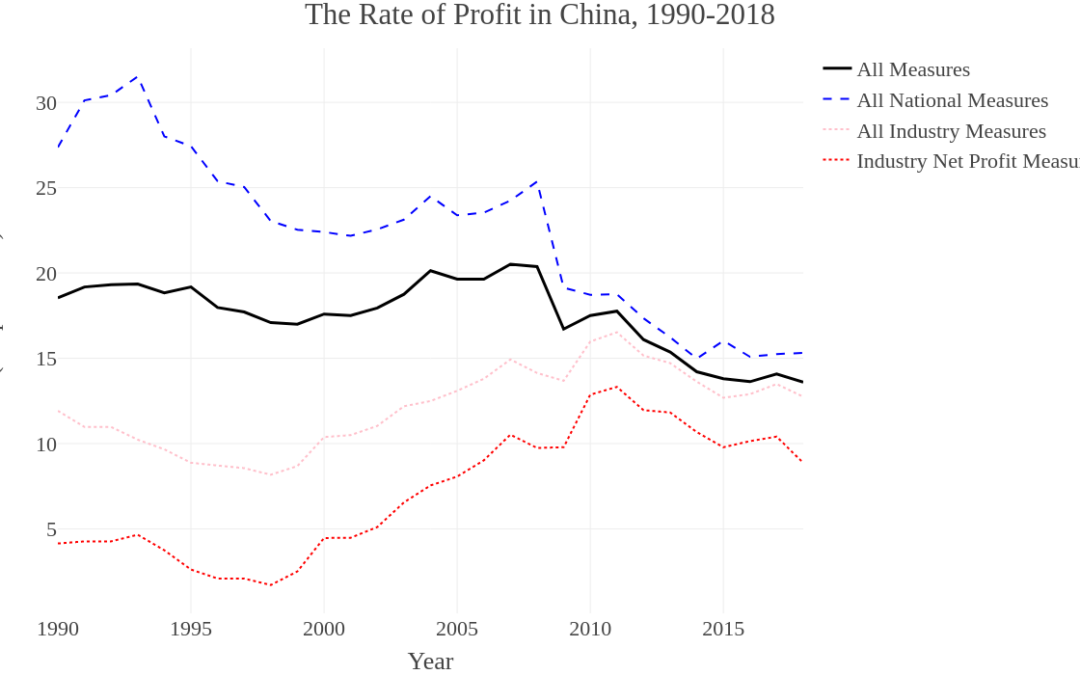
Italian translation: Misurare la redditività dell’industria cinese: sintesi dei dati https://www.infoaut.org/approfondimenti/misurare-la-redditivita-dell-industria-cinese-sintesi-dei-dati
French translation: Mesurer la rentabilité de l’industrie chinoise : Données en bref https://dndf.org/?p=18842