
In recent years, probably the central topic of China journalism has been the country’s slowing GDP growth rate, resulting in renewed predictions of looming crisis and impending political collapse. Though apparently tracking the cutting edge of economic trends, reports such as these in fact fall into a long tradition of catastrophist China journalism that has waxed and waned over the past twenty years, taking particularly strong forms in the years immediately following Tiananmen Square and then again in the early 2000s, when it was popularized by pundits like Gordon C. Chang and scholars such as Minxin Pei. At the popular level, journalists like Chang contributed to the recurring media spectacle by continually predicting China’s impending doom in major news outlets and books written for a general audience. Chang’s 2001 book, The Coming Collapse of China, ultimately proved laughable, but the rate of his predictions only increased: according to Chang, China was on the brink of collapse in 2006, 2011, 2012, 2016 and 2017—with no end in recent years either. At a deeper level, these continually inaccurate predictions have been bolstered by more serious scholars like Pei, who sat at the center of an early-mid ‘00s debate on China’s “governance crisis,” likewise predicting imminent collapse. Today, Pei joins with other right-wing thinkers to recast the same argument in the form of a critique of “crony capitalism” and a “new cold war.”

Such reports have taken on renewed strength in the years following 2010, when China’s nominal GDP overtook Japan’s to secure its position as the world’s second-largest economy. Confronted by the ’08 crisis (which hit hardest in ’09 in China when the Western collapse began to affect consumer demand for export goods), the government implemented an enormous (586 billion USD) stimulus plan that was largely poured into infrastructure projects in the country’s interior, often via loan agreements with local governments.1 The stimulus signaled a few key shifts, among the most important being the inflation of new rounds of public debt and the beginning of a cycle in which returns per unit of public investment have begun to dwindle (as we have discussed elsewhere). But it was also largely effective in averting a severe crisis and even stimulating a new, albeit more mild, economic expansion. While GDP growth had dipped from 14.2 percent in 2007 to 9.4 percent in 2009, this stimulus helped to lift growth back up to 10.6 percent in 2010. But from there, the returns on investment began to decline, debt began to grow and growth began to slow, all contributing to this renewed round of China catastrophism. From 2011 onward, the growth rate has steadily descended, though almost always more slowly than predictions made by Western think tanks, sitting at 6.6 percent in 2018. Predictions of imminent collapse have begun to increase just as fast.
It’s important to keep a few things in mind here. First, the way that China reports GDP still bears the imprint of the planned economy, and often works as more of a target than an actual record of growth. Even if we were to deflate the figure by a percentage point, however, this is still a much higher rate of growth than the global norm, especially for such a large economy and such a populous country. Regardless of all the structural problems mentioned above, if the economy continues growing at 5-6 percent for the next several years there will still be substantial leverage to alleviate the effects of the slowdown and to dampen the severity of any coming recessions (though again, diminished returns means that the ’08 stimulus cannot simply be repeated). This places China in a structurally better position compared to Japan, Europe and, to a lesser extent, the United States, where secular stagnation at low rates of growth has been the norm. At the same time, with respect to lower-end production, it will now easily be outcompeted by poorer countries like Indonesia, Bangladesh and Ethiopia. Any discussion of potential crisis needs to be founded on a realistic appraisal of such trends, and should of course emphasize a more rigorous Marxist approach to crisis theory based on an analysis of system-wide profitability and overproduction. That said, such attempts also need to be wary of catastrophism. The right-wing predictions of Minxin Pei have, after all, been accompanied by a similar (albeit more modest) series of failed predictions from the left, embodied most strongly by the work of Li Minqi.
Second, the ’08 crisis was global in character, and it was integrally connected to long-term sequences of industrial competition between the world’s largest economies, as detailed by the economic historian Robert Brenner. This means that the crisis cannot be understood separate from global changes in productive infrastructure and was itself a key trigger for new transformations in the world’s industrial geography. As Western export demand dipped, China used the opportunity to begin a new cycle of industrial restructuring. With rising wages in coastal production hubs, profitability was already being pressed, particularly in labor-intensive export industries concentrated in places like the Pearl River Delta (PRD). The crisis therefore simply forced a wave of already approaching factory closures to begin in a single burst—and these closures have continued apace, despite a recovery in demand, alongside trends toward automation and offshoring.2
There were two key spatial patterns that followed from this. The first was an international relocation of production to newly emerging coastal production hubs further afield, primarily in Vietnam and Cambodia, but also to Myanmar, Indonesia, Malaysia and increasingly across the Indian Ocean (Bangladesh has, in the most recent years, become a particularly strong site for Chinese investment). This movement is important in and of itself, and is particularly pronounced in the lightest, most labor-intensive industries such as textiles and leatherworking, but we will not address it here. Instead, we will focus on the second, primarily domestic spatial consequence of this restructuring: the rapid development of China’s interior (meaning both the non-coastal provinces and the non-coastal areas of coastal provinces), made possible by mass infrastructural investment and the relocation of lower-wage industries.
One reason such areas had been underdeveloped by the growth of the coastal logistics hubs was that their physical geography had not been conducive to the easy movement of goods—in contrast to the river delta cities, which could easily connect to consumer markets on the other side of the Pacific Rim via container ship. This is the major reason that the ’08 stimulus package placed such emphasis on infrastructure development, and why it poured so much of this funding into the interior (another reason was simply a degree of market saturation in the developed coastal cities, so civil engineering firms, concrete and steel producers, etc. were all seeking new domestic markets). New roads, rail lines, housing complexes and business parks were all meant to facilitate a massive shift of productive infrastructure into the Chinese interior in order to help even out the divided economic geography of the country. The state argued that this was needed to build internal demand as well. It would ultimately act as an economic boon to producers serving the domestic consumer markets, the argument went, because access to good electricity, road systems and other basic features of modern infrastructure would facilitate inland consumption.
Though driven by the same structural pressures that have encouraged offshoring, the inland relocation of Chinese enterprises does not allow for the exploitation of differentials in currency or interest rates, and the interior-coastal wage gap tends to be less than, say, the difference between prevailing wages in Shenzhen vs. Hanoi (which is itself closer to the PRD in transit time). On the other hand, infrastructural investment can be funneled into the interior through state institutions at larger scales and with greater speed than is possible overseas. More importantly, the evening out of China’s double-divided economic geography (rural-urban and interior-coastal) has long been a policy goal of the state. But how effective has this relocation been?
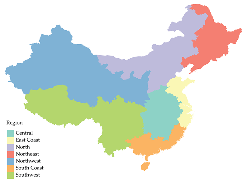
In what follows, we utilize some simple data on industrial enterprises by province to explore the changing geography of production. The question is worth a more thorough investigation, ideally at a scale allowing for the comparison of individual cities, with a combination of demographic, industrial and infrastructural data on urban growth, as well as the full range of employment in each city. But for the sake of a quick overview of broad industrial trends, the more limited data used here will suffice.3 We aim to measure the rough patterns of industrial relocation, as well as downsizing and increasing productivity, by looking at the number of industrial enterprises4 located in each province, as well as their gross output.5 The data is gathered for each province and each centrally administered city (Beijing, Tianjin, Shanghai and Chongqing, similar in administrative status to Washington DC in the US, though Chongqing is much larger and has a substantial rural hinterland). We further divide the provinces to explore regional patterns, using a slight modification of the normal administrative divides in order to better capture the difference between “Central” and “Coastal” China:
The Long View
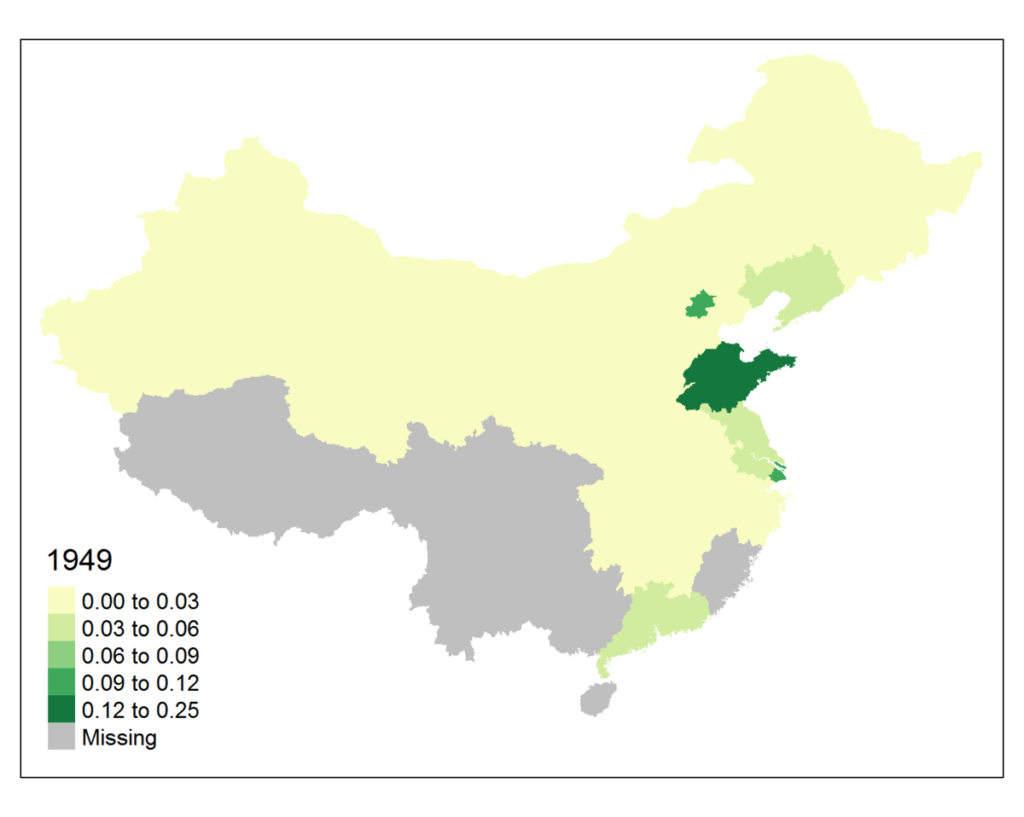
It will be helpful to approach these questions first at a larger scale, looking both at long-term temporal trends and the changes in their spatial distribution over the course of the PRC’s history. On the one hand, this will help to identify potential secular patterns in the data and tease out truly distinct changes from any sort of historical norm. On the other, this data will also help to illustrate a few key points from Sorghum & Steel, the first part of our three-part economic history of China, as well as our forthcoming second installment, Red Dust. The data we draw from dates back to 1949 (albeit with many missing values in years of political turmoil during the time of the socialist developmental regime), and this allows for comparisons between the basic industrial geography of the socialist era, the transitional period, and contemporary China. The definitions of what constitutes an “industrial enterprise” and how “gross output value” is measured certainly changes over this period, but each still measures effective economic weight in the system, regardless of the time period. Though it makes little sense to compare the absolute values, then, relative comparison is still useful in the long view.
First, let’s look at changes in the sheer number of enterprises over time in each province, here in chart form, with provinces colored by region:
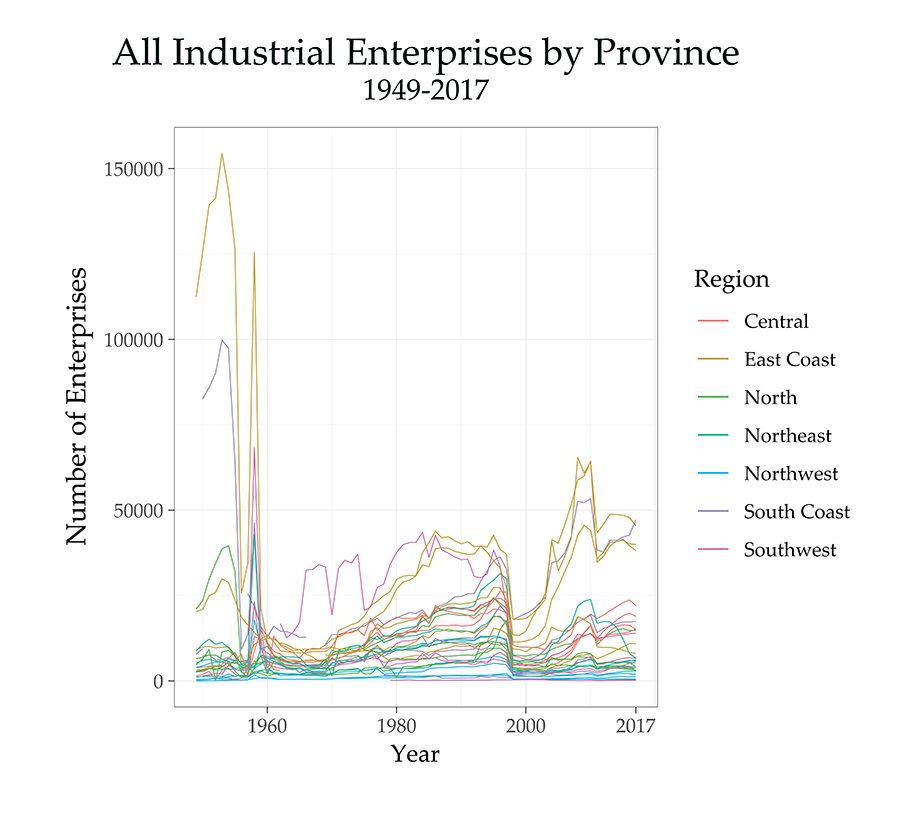
A few things stand out immediately. First, on the far left side of the chart we can see the effects of industrial consolidation early on in the socialist developmental regime. As described in Part 2 of Sorghum & Steel, while nationalization proceeded throughout the 1950s, an abundance of smaller “handicraft” producers were organized into larger and larger co-operatives. What we see here are the effects of this process of consolidation, as what would have previously been considered individual enterprises are increasingly brought under a single umbrella enterprise. This phenomenon was particularly strong in cities like Shanghai and Guangzhou, as well as Beijing, and those three (although the purple line includes all of Guangdong, the overwhelming majority of enterprises were in Guangzhou) account for the three early peaks on the left of the chart. In Shanghai and Guangzhou, private enterprises (domestic and foreign-owned) were particularly common, while Beijing was known for its abundance of peddlers and artisans. The combination of nationalization and co-op formation radically changed the number of enterprise units in the country. As we described the process in Sorghum & Steel:
This transformation spanned the New Democracy era and the beginning of the First Five-Year Plan, with handicraft co-op membership increasing from 89,000 in 1949 to 250,000 in 1952. By the end of 1955, this number had increased to about 2.2 million, but still only encompassed “29 percent of the total handicraftsmen in the country.” Finally, in 1956 a nationwide campaign was launched to systematically organize artisans into larger co-ops, and the membership jumped from 29% of all artisans to 92% by the end of the year.
That sharp turn in 1956 is clearly visible in the chart. But then there is an immediate second peak toward the end of the 1950s—this is the Great Leap, when small and medium size enterprises briefly proliferated, before being forced to consolidate again in the retrenchment following the famine. In addition to these sharp spikes, we see the rise of Sichuan (the pink Southwest line) ascend in the later 1960s and early 1970s. This tracks the movement of the Third Front industrialization drive, during which investment was directed to China’s interior. Following the Sino-Soviet split, this was the height of the developmental regime’s focus on “self reliance,” and new enterprises tended to be founded in the mountainous territories of the Southwest, where they would be at less risk from coastal attack by the US or attack across the northern land border by the USSR.
Looking ahead to the reform era (roughly ’78 onward), we can then see the revival of a multitude of smaller enterprises, particularly in the coastal provinces over the course of the 1980s.
Enterprise Location in Recent Decades
But for more detailed trends it will help to rescale the series. More detail becomes visible if we limit the time period to 1990 onwards:
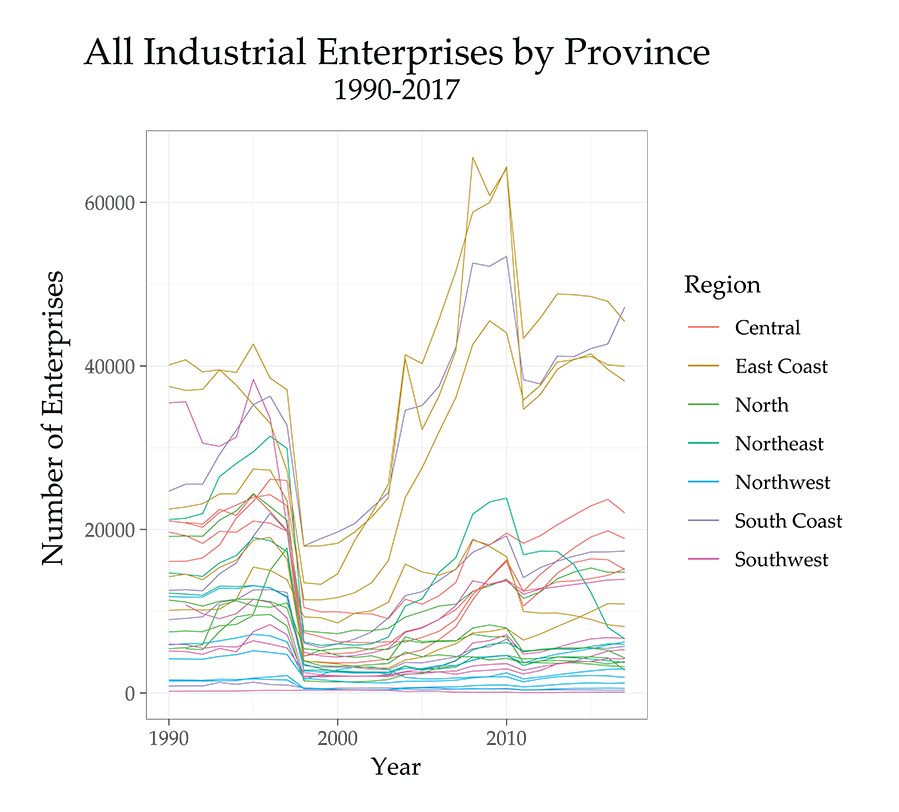
By far the most striking feature here is the massive dip in the late 1990s. This tracks the wave of factory closures that accompanied the dismantling of the socialist era industrial belt, as described in the work of Ching Kwan Lee. Though it’s a bit harder to see, both the North and Northeast provinces tend to dip the furthest, while the coastal provinces suffer more subdued closures and recover much more quickly. Aside from a handful of Eastern coastal provinces (plus Guangdong), most provinces never regain the same number of enterprises that they lost in the restructuring. On the one hand, this might signal greater efficiency through consolidation, rather than outright closure. On the other, in places like the Northeast, the result was the creation of a sizable rust belt that persists to this day. Finally, it should be noted that this dip was almost certainly deepened by the Asian Financial Crisis in that same period. National GDP figures for 1998 are widely thought to have been falsely buoyed, and we might expect minor falsification for enterprises themselves, though it is either minimal or simply lost in the overall enterprise declines due to other factors. Nonetheless, we’d expect the portion of the dip affected by the Asian Financial Crisis to largely appear in the coastal provinces, particularly in the south It cannot in any direct way account for the trough in the Northeast over the same time period.
Finally, there’s a dip following 2010. Partially, this does seem to represent a new, albeit less severe, round of restructuring following the crisis in 2008, since a dip is visible by 2009 (when the effects of diminished consumer demand in the West began to be felt). However, the bulk of this decline is actually an artifact of a basic definitional change in the statistics: 2011 saw the size threshold change for enterprises recorded in this series. While in the socialist era, the exact definition of what constituted an enterprise and was counted in these statistics tended to vary, by the 1990s a formal definition had been settled on: any enterprise with revenue above 5 million RMB would be counted. But, due to inflation, this figure was tending to capture smaller and smaller enterprises. In 2011, the decision was made to only count those above a 20 million RMB threshold. This alone accounts for a substantial portion of the dip we see after 2010. We’ll need to look at the data in a few different ways, then, in order to see whether or not any geographic evening-out takes place after the crisis, as this redefinition disrupts the comparability of the enterprise numbers. It will also unevenly affect provinces based on the size-composition of their industrial base (for instance, Zhejiang, with more, smaller enterprises, saw a more substantial decline than neighbors).
One way to see the relative regional weights will be to map these patterns out, keeping in mind the possibility of some unevenness deriving from the redefinition. Let’s first look at the absolute counts of enterprises, which we visualized in the charts above. Here is an animation covering the entire time period:
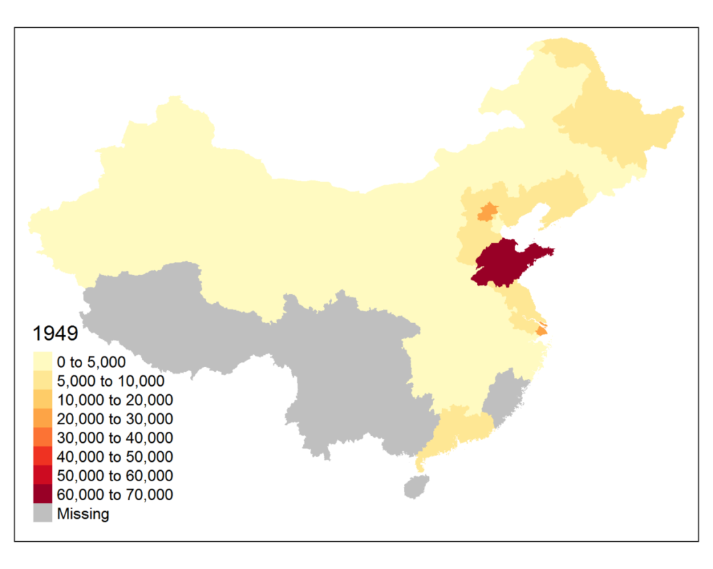
As the map moves through the socialist era, we see brief, rapid spikes over the 1950s and early 1960s, then a gradual consolidation, fairly well distributed but with a strong core in Sichuan from 1970s through the 1980s. We then see the rapid growth of coastal industries, and a sudden collapse in 1998 accompanying the dissolution of the final remnants of the socialist-era industrial structure. After 2000, we then witness the formation of a deeply bifurcated industrial geography, with a substantial concentration of enterprises on the coast. In the period following 2010, we see the effects of the statistical redefinition. But there does appear to be a very modest build-up of enterprises in central provinces relative to their coastal neighbors. Let’s compare four representative years back to back:
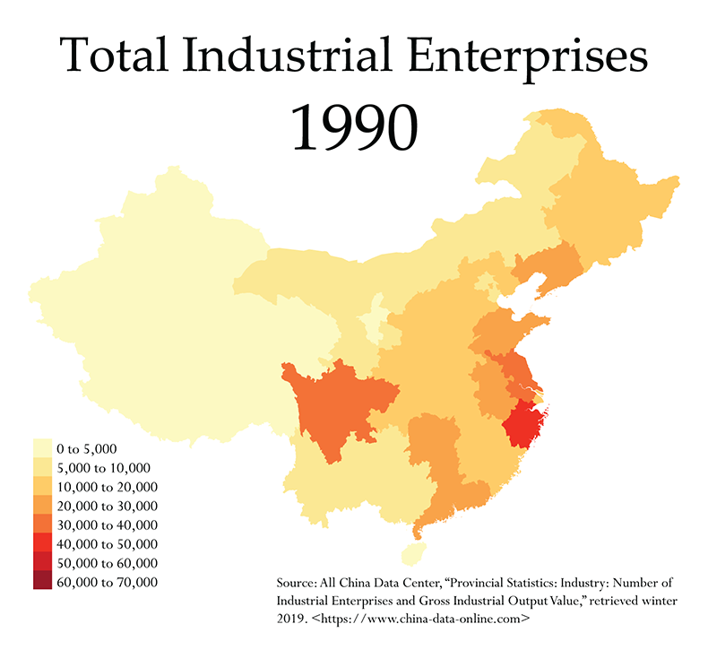
In 1990 we can still see a substantial heritage from both the socialist era and the rapid development that took place in the 1980s. Sichuan still stands out distinctly, and overall the map is much more balanced. In the East Coast region, we begin to see the concentration of industry that would come to define China in its capitalist transition.
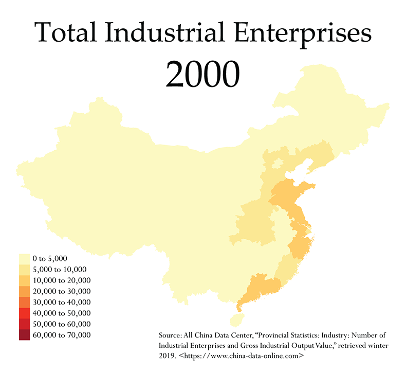
Once we fast-forward to 2000, we get a snapshot of the country in the years immediately after the restructuring of the Northeastern industrial belt. We see a substantial loss in the overall number of enterprises, and those that remain are now clearly concentrated along the coasts.
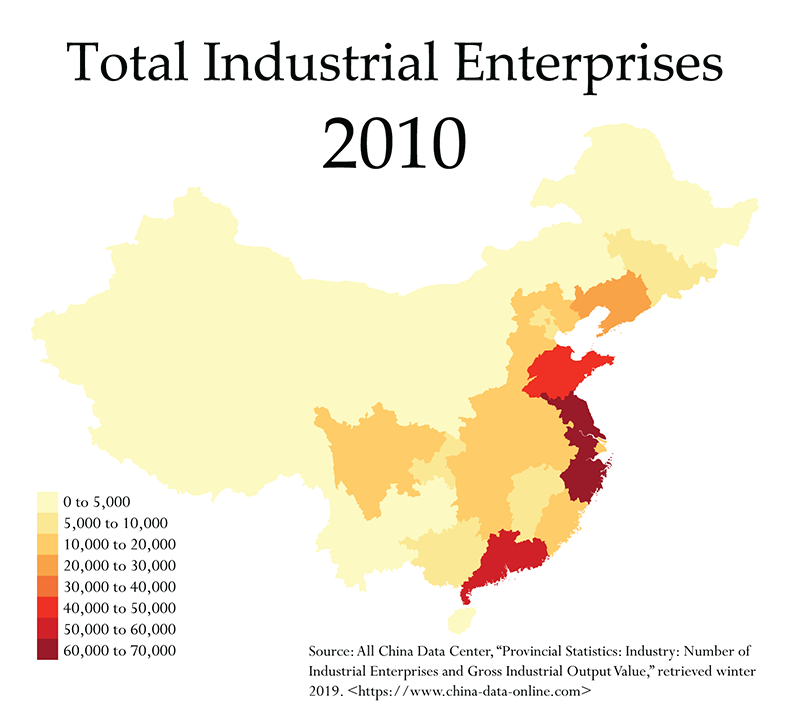
In 2010, we see the map prior to the statistical redefinition. There’s been some recovery in the number of enterprises found in the interior, but the coasts still clearly dominate the map.
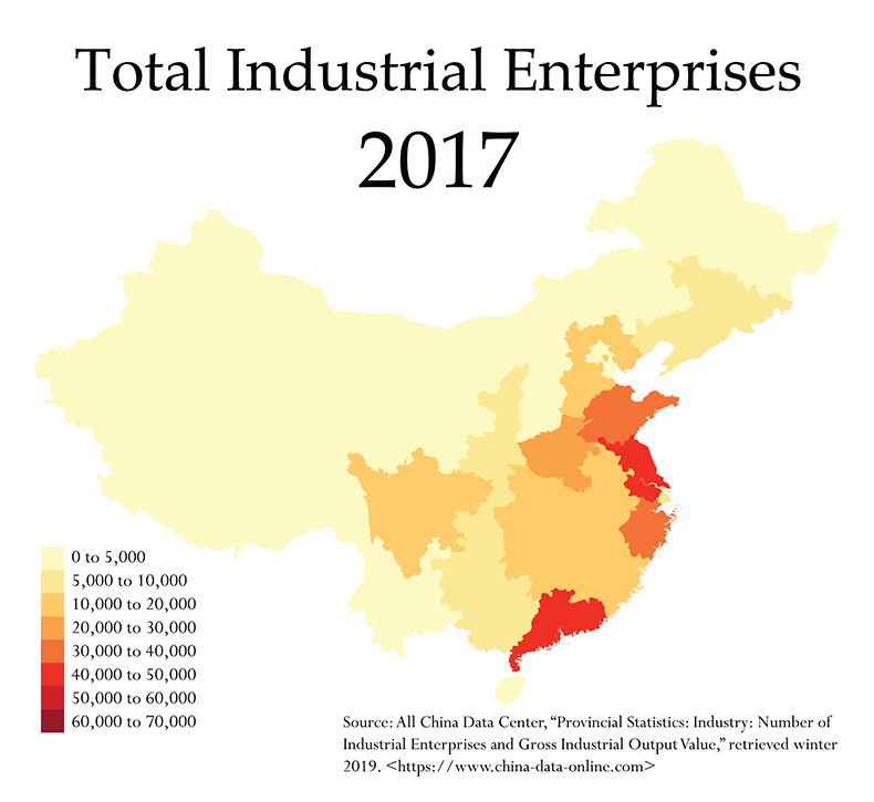
In 2017, the last year for which data was available, we see a lightening of the coasts, largely due to the statistical redefinition. But we also see some more darkening of the interior. This is particularly important, because an increase in enterprises in this period goes against the downward trend caused by the redefinition of enterprise size. What that means is that, if anything, this growth is understated. At most, though, it still seems to be more modest than the stimulus plan seemed to envision.
Enterprise Share
Another way to help us see the relative weights of industrial concentration is to show each province’s share of the national total. We can start with an identical animation:
The pattern is more or less the same here, though the spikes and dips are more subdued. Sichuan acts as a major center of gravity from the Third Front period onward, joined over the course of the 1980s by a broader array of provinces, before the restructuring in the 1990s and the definitive rise of the coasts in the 2000s. The patterns after 2010 are a bit harder to see, and we see basically no change in the relative position of provinces until the last couple years in the series. So it will help to look at a similar set of representative years:
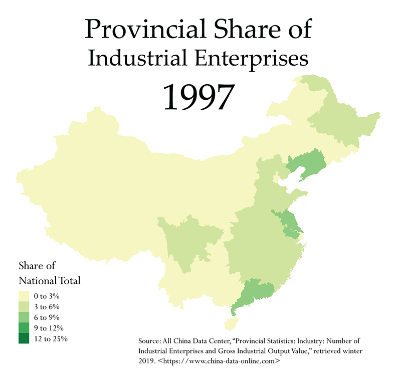
In 1997, a few of the coastal hubs are already visible, but industry is generally far more widely dispersed.
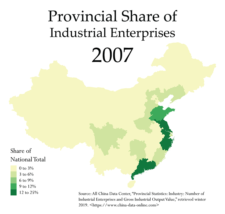
A decade later, the coasts are undeniably the center of gravity, while the interior and the northeast have begun to hollow out.
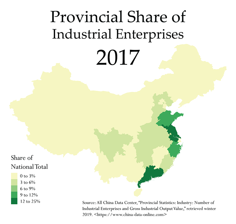
Do we then see any re-balancing in the most recent years? Yes, but only in a minor way. There is certainly not the same balance we see in 1997. Also important is that even as enterprise numbers tend to increase in the central provinces, they continue their decrease in the Northeast. The rust belt has never recovered.
Finally, let’s look at these enterprise totals and shares in different regions side by side, focusing only on the ‘00s and ‘10s, and removing the Northwest, which has numbers too low to adequately compare to the others:
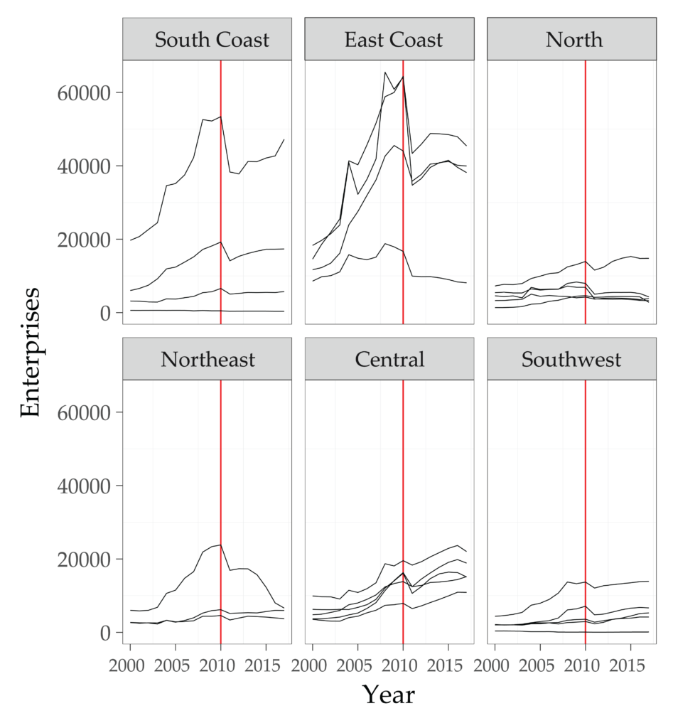
On each of these faceted charts, the year 2010 is marked in red to designate the definitional change in the statistics while also acting as a rough marker for when we’d start looking for the effects of the stimulus to appear. While the dip in the coastal provinces is clearly associated with this definitional change, it’s notable that the central provinces in particular seem to dip only slightly and then almost all recover, often exceeding their previous peak. Since this is against the deflating effect of the redefinition, we can conclude that this does represent a bit of rebalancing relative to the coasts. Let’s look at the same thing for each province’s share of enterprises:
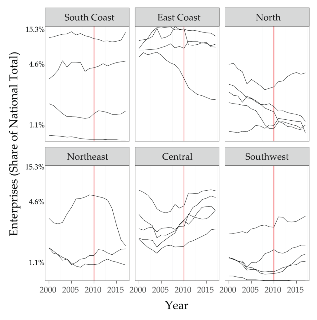
Here we see essentially the same patterns, but a few key differences are worth noting. First, the dip entirely disappears for most of the central provinces, all of which saw declines in the ‘00s and since 2010 have recovered their shares. Note, however, that for the sake of visibility this y-axis is not scaled linearly, so the central provinces’ 4-5% shares seem more visually significant relative to the coasts than they actually are. Some other details also become evident here: the Southwest also appears to be slowly gaining enterprises following 2010. In addition, one province we’ve categorized as “North,” Hebei, seems to be going against the trend, which is a clearly visible decline. Finally, the Northeast has one province acting as a clear outlier. Let’s look at the North and Northeast in more detail:
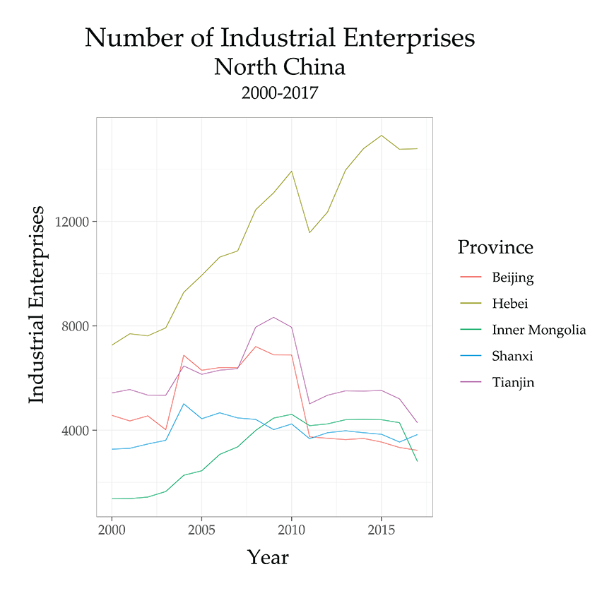
Here it is clear that the outlier is Hebei, which makes sense, as much of the province borders the central provinces, and it appears to follow the same patterns as these neighbors. The rest of the North seems either stagnant or clearly declining. Inner Mongolia shows a distinct decline in the last few years of data, signaling that it’s not an artifact of the statistical redefinition. Tianjin and Beijing have both seen intentional efforts to shut down and relocate heavier industries, so the decline is likely real. Shanxi appears essentially stagnant.
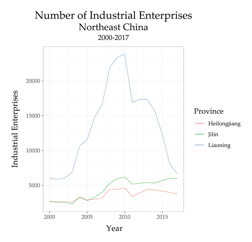
We see some modest recovery in the Northeast after the closure of many factories inherited from the socialist era (not visible in this chart), though there is reason to be suspicious of this. The state launched a “rejuvenate the Northeast” program in 2003, but the effects here don’t appear substantial. The pattern is extremely exaggerated in Liaoning, however. It’s hard to determine exactly what is causing this, but it’s certainly at least in large part a result of statistical inflation. Liaoning was also one of the provinces that admitted some of the most extreme manipulation of GDP statistics, so it’s almost certain that the exaggerated degree of this overall pattern is due to some statistical sleight-of-hand, followed by a forced correction. It is unlikely, however, that Liaoning saw no growth in this period, so there is likely a real component of the peak driven by a combination of inflated demand for steel, construction materials and coal (all of which are major products of the province) triggered by the stimulus construction projects elsewhere, as well as an earnest recovery-then-decline in Dalian, a higher-tech coastal city sitting across from Tianjin on the Bohai sea.
Correlating with Output
Enterprise numbers alone can’t quite tell us everything we need to know, however. Adding gross industrial output figures can help put enterprise growth into perspective. In particular, we want to make sure that the enterprise counts actually represent relative economic gravities in the overall geography of production. So we’d expect the rough patterns to be more or less the same. If we notice particular outliers, it’s a signal that there may be substantial productivity differentials between provinces, or simply that the output numbers are being falsified upwards. This latter issue is of particular concern, as provincial GDP figures have been admittedly over-reported in a number of provinces in the past. The practice has been widely recognized, so much so that the National Bureau of Statistics (NBS) measures national GDP separately from the provincial numbers, and currently does not even list Gross Regional Product for any provinces other than Guangdong, Hainan and Fujian.
Given these issues, we use a number that ties more directly to the industrial enterprises in question. Gathered from the All China Data Center, its exact sourcing is somewhat opaque. On the one hand, this is just a characteristic of many Chinese statistics—exact definitions and methodology can often be surprisingly hard to find. On the other, an additional layer of murkiness is added by the fact that the All China Data Center does not only source their data from the NBS, but also from other sources. That said, the industrial output figure we are drawing from seems to essentially match the movement of the NBS’ “Revenue from Principle Business of Industrial Enterprises above Designated Size (100 million yuan)” (规模以上工业企业主营业务收入(亿元)), and the two often differ by negligible amounts. The All China Data Center figure ends in 2011 and, rather than using the NBS Revenue figure to fill in the missing years, we will first let the dataset end in that year.6 None of the main trends we identify seem to change radically after this, but we will use the revenue figures separately to interpolate the missing data in a few select cases below.
First, we need to check to see if the industrial output figure tends to track the growth in number of enterprises, just to make sure that the enterprise data examined above does, in fact, tell us something about the relative economic gravities of different provinces in terms of output. So we will plot them against one another. Here is the scatterplot, for the year 2000 onward,7 excluding NA values (which means excluding most provinces after 2011):
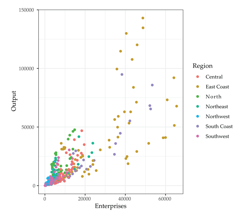
We can see a rough upward trend that appears linear, but with a much greater dispersion as we move to the right. It’s also apparent that the East Coast and South Coast provinces dominate both the high-enterprise and high-output ranges. Though it’s harder to see, the Northwest provinces are clustered in the lower left, with low output and few enterprises.
But we don’t just have to check for a visual pattern. We can also run a few quick statistical tests to see how strong the correlation is.8 First, a basic Pearson’s Correlation Coefficient:
The Pearson Coefficient tests for a linear correlation between two variables, but is not quite as complex as building an actual linear regression model. We get a value of .81, which indicates a fairly high covariance. The test also gives us a p value well under .05, which indicates that we probably aren’t just seeing a random correlation here.9 Since it’s fairly quick to do, we can test a full linear regression model as well:
Again, a sound p-value for the overall model, and a strong p-value for the slope of our model. But a few things have changed. The R-squared and Adjusted R-squared both sit at around .66, meaning that about 66 percent of the variation in output can be accounted for by the variation in enterprises. Also note that the intercept in the model is not statistically significant (p>.05). But this is not particularly consequential, as the intercept is not conceptually important here and we aren’t trying to use this for forecasting purposes. What this means for our purposes is simply that we can be fairly confident of a correlation, though with these numbers (and the visual pattern of the data) it’s safe to suspect that the relationship is not purely linear.
Now let’s return to the basic patterns we saw, zooming in on a few provinces. First, let’s look at one of the central provinces that appears more obscured in the larger scatterplot above:
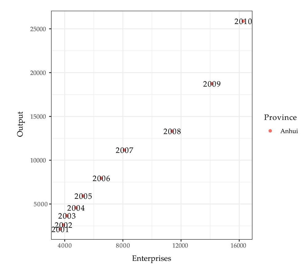
We see a strong linear pattern, with a mild bend in ‘08 and ‘09, the years when the effects of the economic crisis might have dampened output. Let’s compare this to the cluster of South Coast provinces, which are each of different enough size that they shouldn’t have too much overlap:
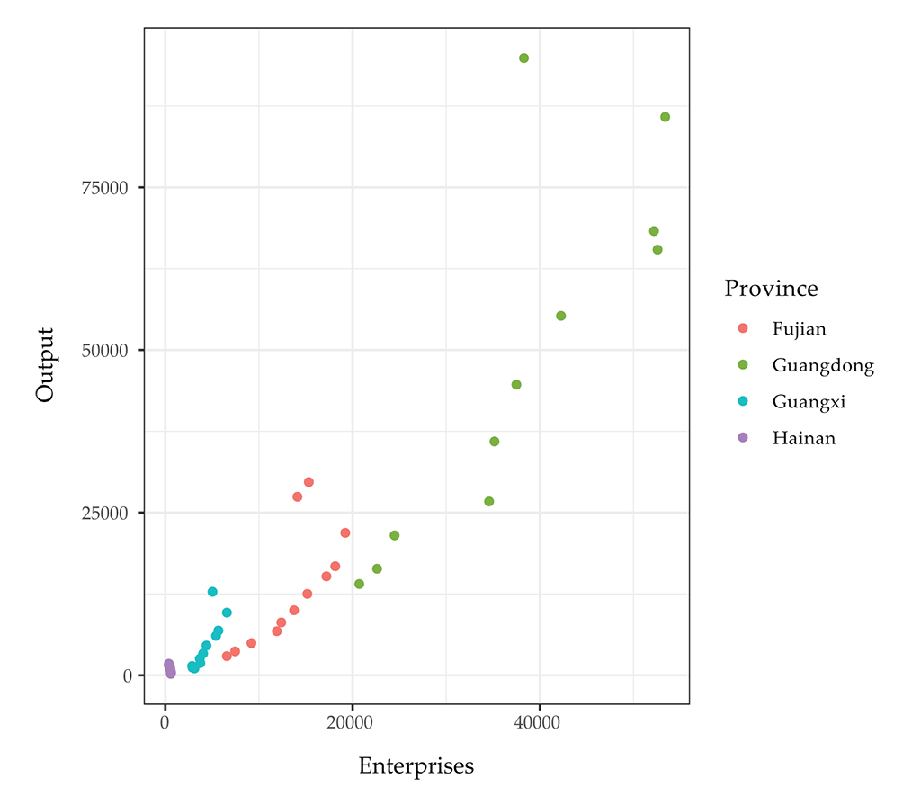
Essentially the same linear pattern is visible in each of the provinces at its own scale, though the case of Hainan is not particularly clear. There seem to be a few outlier values here, and these are largely caused by the redefinition in 2011, since several provinces in the South Coast have output data from after that year. What we’d expect to see would be the number of enterprises to drop, but essentially the same linear pattern being picked up afterwards. It’s not apparent that this is the case, however, if we look at Shanghai, the one province in which output data is available for all the years after 2011:
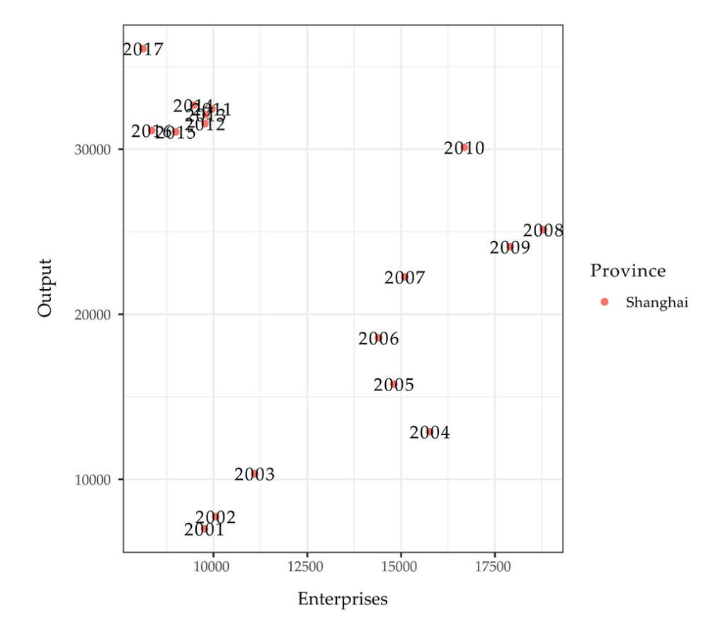
The data is messier here, but still roughly linear through 2010. After this, we reset at the new, lower number of enterprises following the redefinition. But no clear pattern is visible, and the latest year, 2017, actually makes a strong movement leftward. This could indicate a rapid industrial upgrading accompanying the closure of polluting heavy industries—a policy goal of the state in these years. It merits more investigation on its own, but is not necessarily relevant to our investigation here. We’ll simply need to keep in mind that the relationship may be a bit shakier in the years after 2011, something that seems specifically prominent in all the coastal centrally-administered cities (all of which have data available after 2011)—Beijing and Tianjin both show the same pattern as Shanghai, but Chongqing, an interior directly-administered area of greater size, continues the linear pattern after the 2011 discontinuity, as do coastal Jiangsu and Shandong provinces. It should also be noted that, when looked at in more detail, the provinces with some of the lowest numbers of enterprises and lowest output actually appear to exhibit an almost inverted linear relationship—this is true on the island-province of Hainan, as well as in Tibet and Gansu in the Northwest, but their neighbors all follow the linear pattern seen elsewhere. So despite the overall correlation, there are important geographical and temporal outlier trends.
Output Patterns
Now that the basic linear relationship has been established, we can look at the overall movement in output. First, we’ll look at a few animated maps, just to see the rough geographic patterns, beginning with absolute output. Here, we start the series in 1990, since it’s only in this decade that the output figures truly become comparable in absolute terms:
Patterns are hard to identify, other than the general increase in output over these years and the strong concentration in the coasts. On top of this, the loss of data after 2011 is abrupt and notable. We can confirm all of this with some static maps:

In order to pull out the patterns, we should instead use output as a share of the national total, which better shows the relative weights of each province in the national economy. Since this normalizes the data according to each year’s total, it also allows for us to look at a longer series, comparing the basic output geography throughout the socialist era to that in more recent decades:
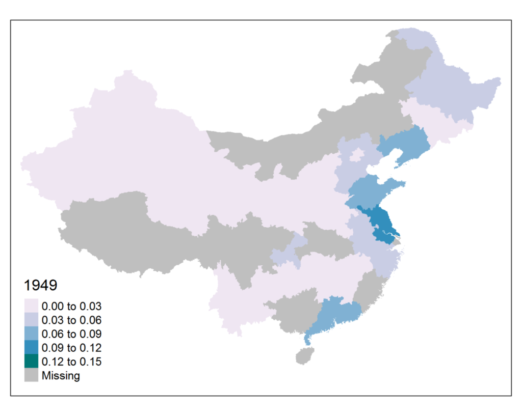
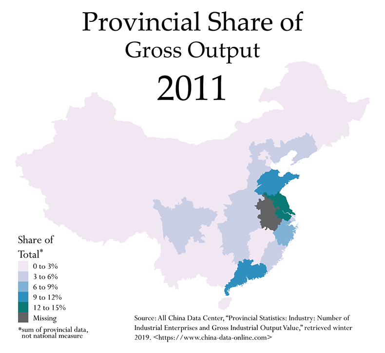
Throughout much of the socialist era, we see the prominence of the Northeast, and Jilin province in particular. Shanghai also stands out as a major production center until it’s overtaken by the surrounding coastal provinces in recent decades. Data for Sichuan is unfortunately missing in much of the socialist period, but what is clear is the greater distribution of lower-level contributions across the interior, with many provinces contributing some 3 to 6 percent of total output well into the reform era. Then, after the year 2000, the geography of output bifurcates sharply, many interior provinces’ contribution dropping to somewhere between 0 and 3 percent, while Guangdong, Jiangsu and Shandong each periodically sit between 12 and 15, signaling a major shift of gravity. Finally, we do see in this data some evidence for a shift back to the interior provinces in the final years preceding 2011: the central provinces in particular (accompanied by southwestern Sichuan) return to 3 to 6 percent of the total, while the coastal hubs decline in importance somewhat.
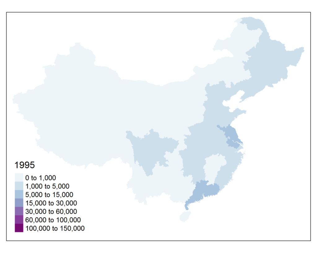
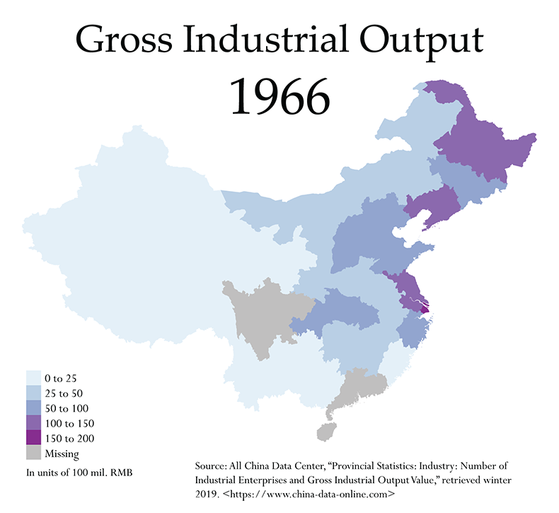
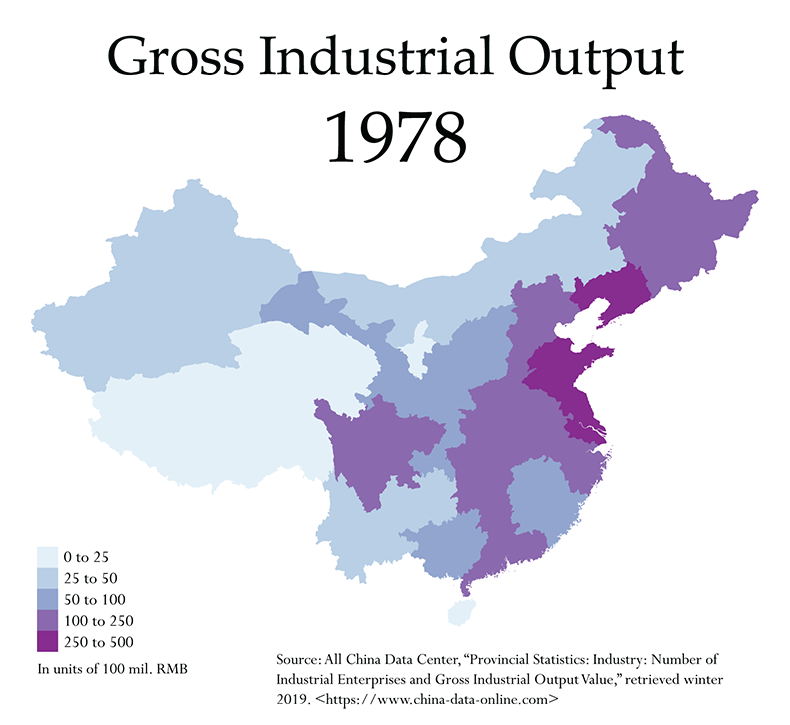
To zoom in on this, we can look at a few maps. First, let’s just glance at the gross output figures at the beginning of the Cultural Revolution, in 1966, and at the opening of major reforms in 1978. Note, however, that these are material measures, not comparable to the later output data. (Also note that the scales differ slightly.) We are simply using them to better display the relative distribution of industrial capacity in the socialist era versus today:
Finally, we can look at the maps of output share, selecting a few representative years from 1978 to 2011:
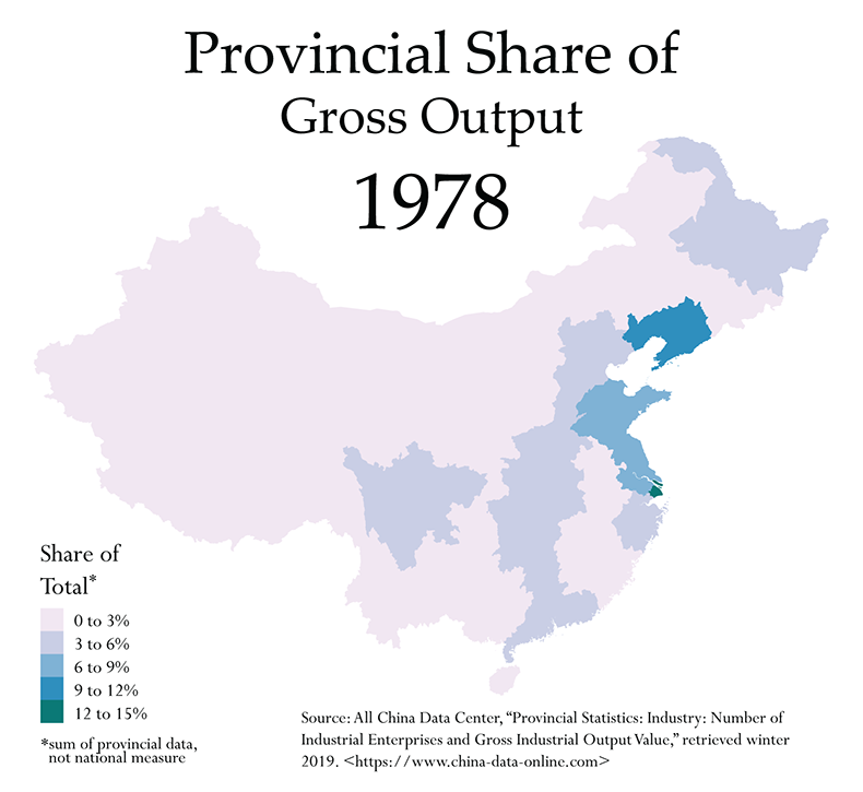
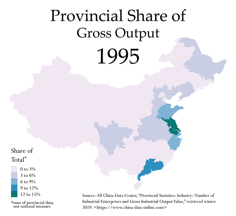
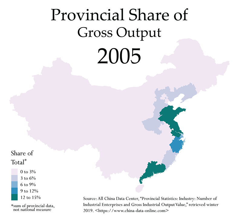
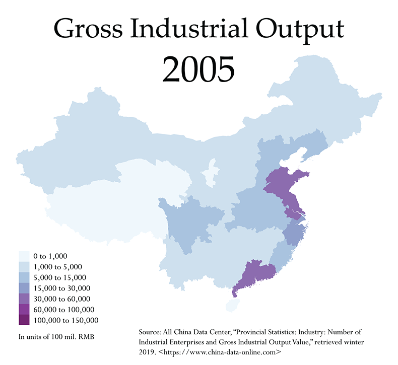
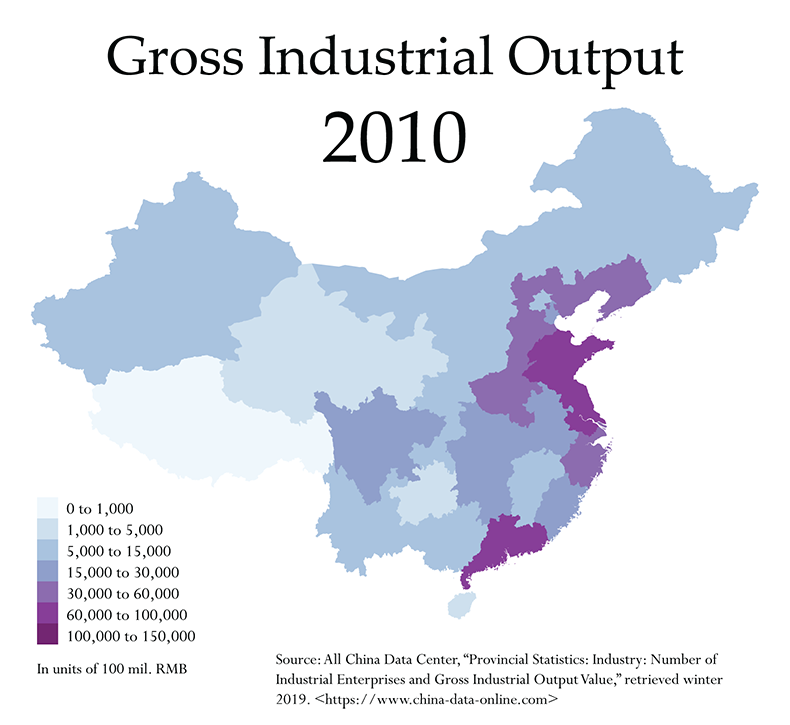
In 1978 we see a relatively broad distribution, with light dominance in the Northeast and East Coast. By 1995 there is a distinct shift toward the coasts, now including the South Coast, but there is still comparably larger productive capacity in the northeast and interior (remember, this is prior to the gutting of socialist-era industry). By 2005, the restructuring of the old state-owned enterprises has been completed and coastal dominance is distinct. Meanwhile, much of the interior is contributing very little to overall output. But by 2011, we do see a slight return of the interior, as mentioned above. Nonetheless, the coastal provinces retain their dominance.
It is hard from this to tease out the real scale of these output differences, however, or to see the absolute trend over time. For that, it will be better to turn to a non-spatial visualization:
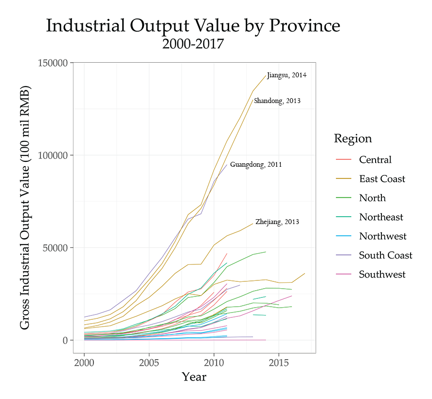
The general trend is clearly upward, but some of the provinces that do have data available after 2011 exhibit a slow flattening of the trend in these years. This is particularly visible in Shanghai, the lowest of the dark-yellow lines. We can also see the clear, continuing dominance of the major coastal production hubs. Even with some of the data missing, it’s clear from the pre-2011 trend lines that the interior provinces would still have quite a bit of ground to cover if they were to catch up with Jiangsu, Shandong or Guangdong.
Without much data after 2011, we can’t explore the output patterns of the interior provinces very thoroughly. Chongqing, which has the most complete data of interior provinces post-2011, continues its strong upward trend, and begins to approach the level of Shanghai, with its more stagnant trend in industrial output. (Chongqing is the pink line extending out of the middle of the distribution.) Just how universal the output declines have been in the established production hubs is not entirely clear, with data ending in 2011, 2013 and 2014 for the major producers (though exhibiting no flattening prior to this). However, the North is the one region for which output data is more complete, and at least in this region, a flattening seems apparent, though again Hebei seems to be following its own, much higher trend that runs parallel to that seen in the central provinces.
We can assume that many of these previously dominant production hubs are seeing at least a flattening of output accompanying the economic slowdown of recent years. But its severity is not visible in this output data.
Interpolating Recent Years
These trends will become a bit clearer if we use the NBS revenue data in order to interpolate the final years up to 2017. First, however, it is important to note that the past five years have seen much more open criticism of output and revenue figures, especially as reported by local and provincial authorities. This means that a process of deflating these inflated figures is likely underway, and in some cases—that of Jilin, as above—it is clearly visible in the data. Second, we’d also expect to see a slight dip associated with the redefinition of enterprise size in 2011, but it should not be nearly as substantial as we see in the enterprise numbers themselves—because it’s likely that a huge portion of output is accounted for by the larger producers, so cutting off enterprises below the 20,000 RMB threshold likely did not depress output substantially.
We can update the two figures above with these interpolated years. Here is all output value from the year 2000 onward, stopping in different years for different provinces, with revenue added for all provinces starting in 2012 (note that this does create a one-year gap for many provinces):
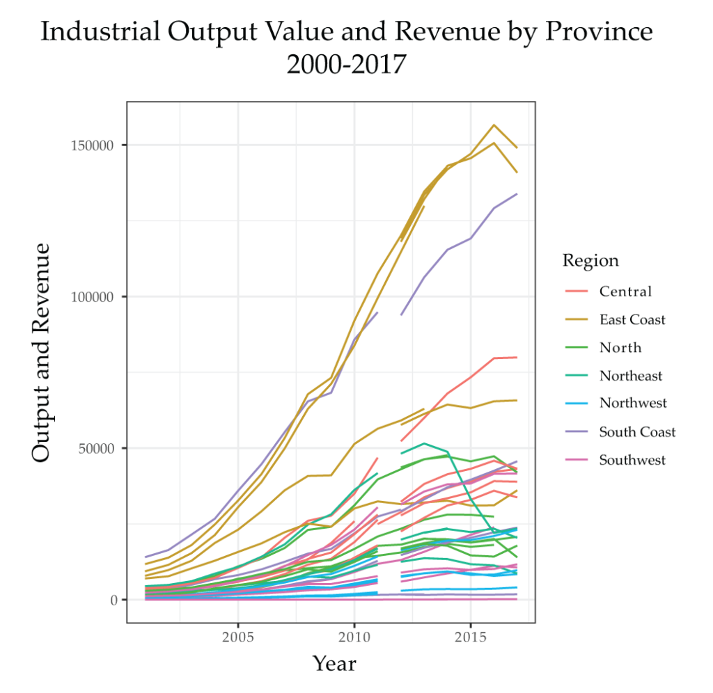
As predicted above, we do see a slowing and then flattening of output among the major producers, at least those on the East coast (the top three dark-yellow lines are Jiangsu, Shandong and Zhejiang). Guangdong, the one purple line trailing Jiangsu and Shandong, has apparently seen no real slowdown, though it seems to have either dipped in 2011 due to the redefinition of enterprise size (this is possible, given that the average size of Pearl River Delta firms still tends to be smaller), or this apparent dip is simply an artifact of the divergence between the output and revenue figures. Either way, the upward trend is clear. But one thing that does stand out in this new series is the fact that the central provinces do seem to continue their upward trend, even surpassing an East Coast province (Zhejiang) in one instance, before flattening somewhat in the midst of the recent economic slowdown. Let’s look at the central provinces in more detail:
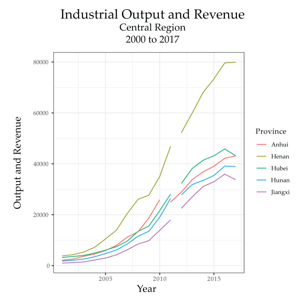
Henan is the province that is outperforming Zhejiang, a clear indication of at least some substantial changes in relative economic gravities. Hubei, Anhui, Hunan and Jiangxi have seen similarly consistent growth in output and revenue, with a mild peak in 2016 and some slowing afterwards. If you look carefully at the series with all provinces, you can see these four central provinces (the red lines) slowly separating from their previous trend and surpassing the nearby northern provinces (the green lines), as well as Shanghai (the lowest of the dark-yellow lines), in the years following 2008. All of this is further evidence that there has been at least a modest shift in the location of Chinese industrial production to the central provinces, but it has not been accompanied by truly substantial declines in the dominance of Jiangsu, Shandong and Guangdong. Only Henan has been able to surpass any of the major coastal provinces. If anything, it appears that some of the industrial capacity of the North may have been lost to the central region. Though it’s not particularly clear on the larger series, Hebei, the largest producer of the North, was overcome by Anhui and Hunan in 2017 in terms of revenue.
Efficiency of Production
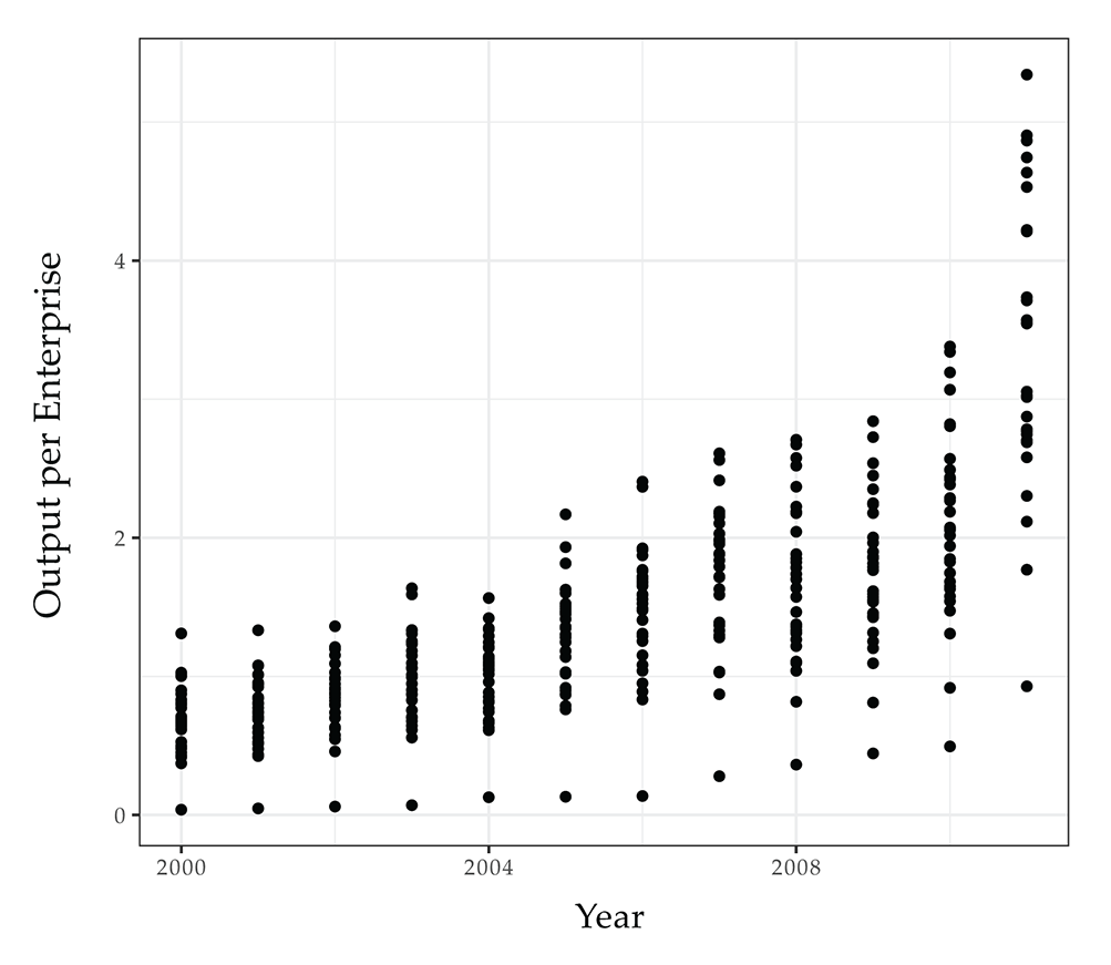
Finally, we can use the enterprise and output numbers in combination in order to estimate rough trends in the efficiency of production by calculating an average output per enterprise figure for each province. These numbers will only be comparable to one another, however, after firms’ production began to generally take place on a capitalist basis, but before the 2011 redefinition. (We could calculate a revenue per enterprise for 2011 onward, but only 6 years of data would make any trend hard to identify.) We choose 1995 as a rough starting point for the series, since we would like to see if the dismantling of socialist industry has any effect on the numbers in the late 1990s, and we end in 2010. First, we’ll look at the data series in non-spatial form:
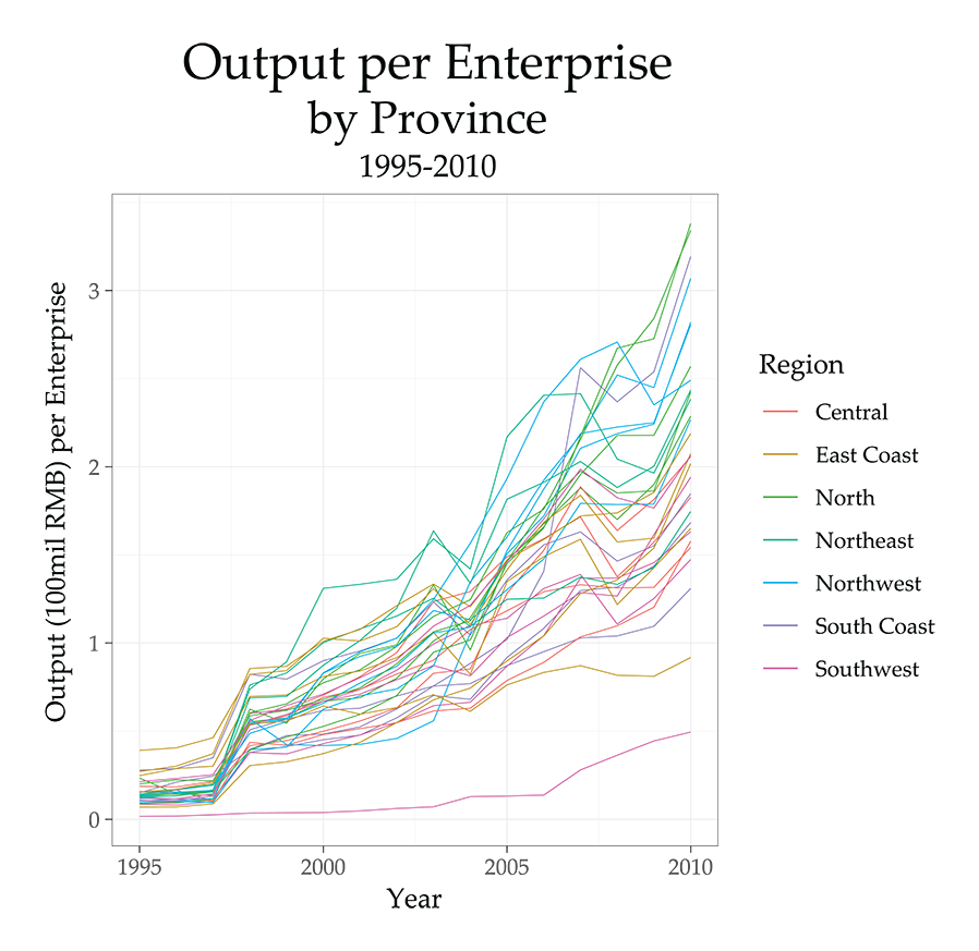
The overall trend is very clearly upward, with some shocks and dips. Note the dip around 2008/2009, followed by an even sharper recovery. This means that something is making Chinese industrial enterprises, on average, produce more output. It’s not clear from this data how many workers these enterprises employ (so this is not a measurement of labor productivity), but it does imply that the scale of the enterprises is likely increasing in some way. This could indicate further monopolization (especially if we see enterprise numbers flatten but output continue to rise), or it could simply show continuing growth in enterprise and output, with output tending to grow faster. (These are inflation-adjusted figures, so inflation is not a hidden variable). While output per enterprise is markedly higher in the East Coast provinces in the mid-1990s, after the dismantling of socialist-era industry, the North, Northeast and Northwest provinces grow to dominate, accompanied by Hainan (the harder to see purple line, taking third place in 2010). All of these provinces except for Hainan are known for their heavy industries, including resource extraction. These sorts of firms are as a rule larger than the lighter industries, and they became extremely lucrative in the years of rapid global economic growth leading up to the 2008 crisis, after which they became beneficiaries of demand generated by the infrastructure-oriented stimulus. Hainan’s growth in output per enterprise, on the other hand, likely result more from its small size and general stagnation in enterprise numbers.
In order to tease out some of these differences, it will be helpful to look at two representative provinces. First, Guangdong:
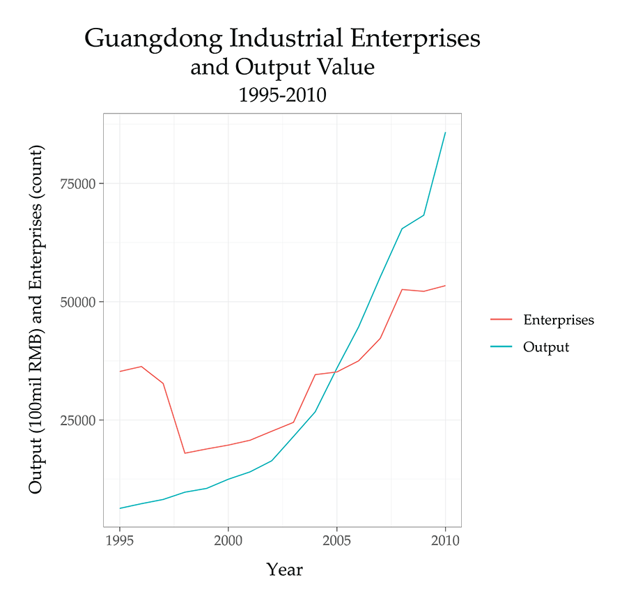
Located along the South Coast, Guangdong has historically seen a major concentration of light industry such as textiles, as well as electronics parts production and, more recently, an influx of higher-tech firms such as the contract manufacturer Foxconn. We would thus expect to see very little effect on output per enterprise, even while enterprise numbers decrease throughout the gutting of socialist era industry—because the Guangdong firms productive of output in the 1990s were likely not the old state-owned firms being closed down. Enterprise numbers recover slowly, but output grows much faster. Then enterprises begin to increase very rapidly in the years leading up to 2008, after which there is a general flattening. But the crisis hardly makes a dent in overall output. Guangdong is an extreme, but nonetheless representative, case of how output and enterprise numbers have grown together over time in coastal provinces.
A contrast can be seen by looking at the Northeast, where the dismantling of socialist-era industries hit the hardest. Each of the Northeastern provinces has been accused of doctoring their output numbers, but Liaoning’s figures are the only ones that seem almost completely useless. We can take Heilongjiang as a more modest case, where output is likely exaggerated but the trends visible here probably reflect actual realities. First, let’s look at Heilongjiang’s output-per-enterprise numbers in isolation, since they’re hard to distinguish in the total series above:
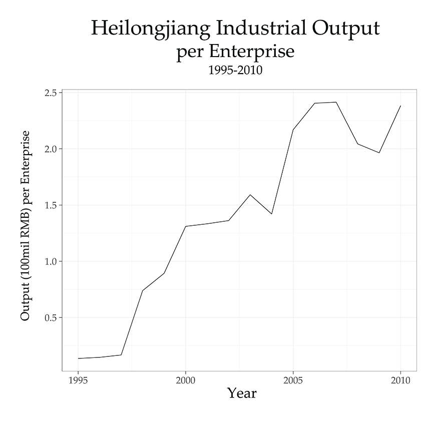
The trend is consistent with that seen in most provinces, though the mid-1990s seem particularly stagnant and the take-off after the economic restructuring is especially sharp. Let’s look at output overlain with enterprise numbers:
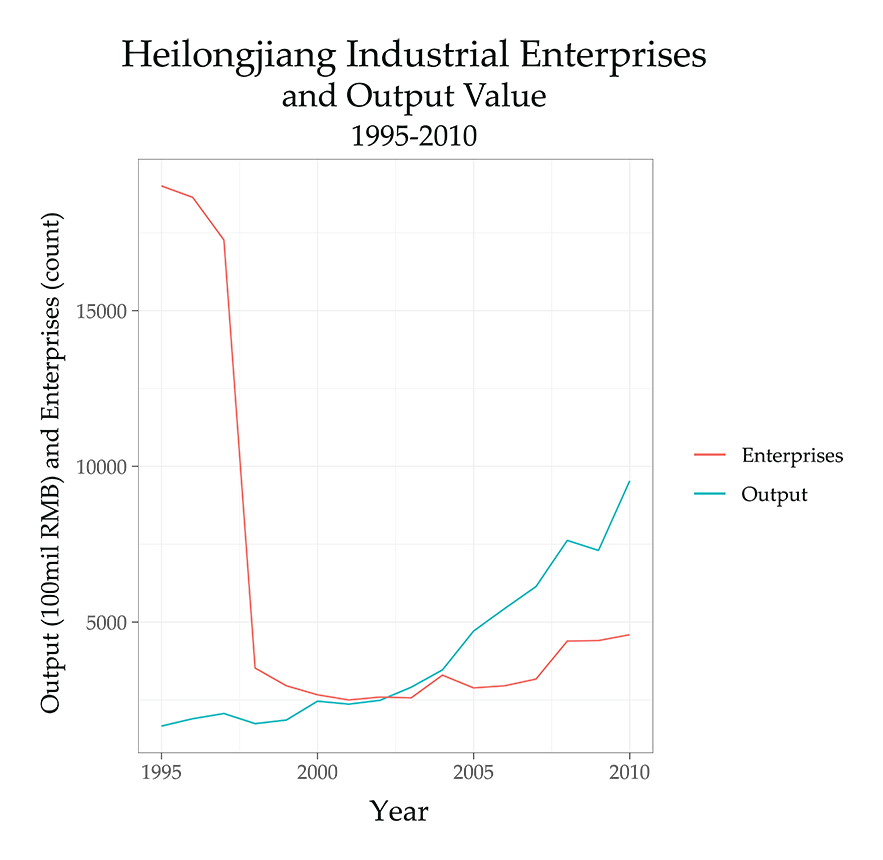
Here we see the stark drop in enterprises that came with the smashing of the iron rice bowl. Many of these enterprises had low output already, so we wouldn’t expect to see an output spike of symmetrical size. But output does begin moving up in the final years of the millennium, before taking off in the mid-2000s. Partially this is due to an exaggeration in output figures. But no matching growth is seen in enterprise numbers (whereas Liaoning seemed to falsify both), indicating that there probably was a real excess of output growth over that of enterprises in these years, even if it was exaggerated. Enterprise numbers pick up toward 2008, but then flatten again after, while output recovers rapidly. With its remaining industrial base still founded around heavy and extractive industries, it’s likely that the enterprises that did remain after the consolidation and closures of the late 1990s do, in fact, show a trend of growing output per enterprise due to changes in scale.
The overall trend, however, is very clearly upward in essentially all provinces. This is visible in the chart of all provinces above, but it becomes even clearer if we strip out the regions and use dots to show the distribution of each year’s values:
Finally, we should see if there are any spatial patterns that stand out, aside from those already visible in the regional divergence that was roughly observed above. To that end, we can compare maps of output per enterprise for each province in 2005 and 2010:
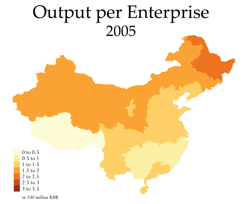
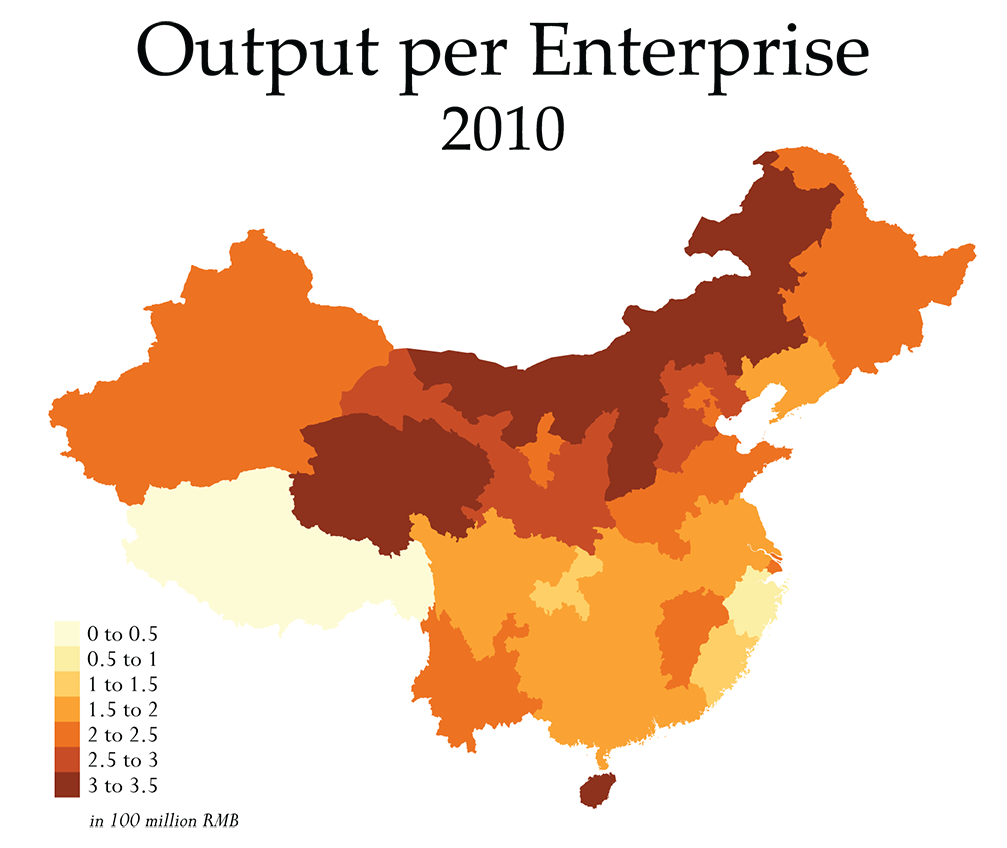
Overall, we see the same growth in the ratio over time, and the regional trends visible in the non-spatial series come out more clearly. Though the broad spatial pattern doesn’t really change between these years, there is a new unevenness to the map in 2010: on the one hand, while 2005 saw greater output per enterprise across the entire northern third of the country (with the highest value in the Northeast, in Heilongjiang), by 2010 a few North and Northwest provinces clearly dominate. The provinces in northern regions with the highest output per enterprise in this year are Shanxi, Inner Mongolia and Qinghai, in that order, each of which have smaller numbers of enterprises overall (4240, 4611, and 555 respectively) and all of which have a strong economic base in mining and resource-related heavy industries. High ratios are also visible in Gansu, Shaanxi and Hebei, which all have a broadly similar industrial composition—though Hebei is both substantially larger and more diversified than any of the others.
Elsewhere, some more modest unevenness is also visible in 2010 that did not exist in 2005. Guangdong’s higher output per enterprise ratio relative to neighboring provinces in 2005 has, by 2010, been met by its neighbors. Hainan’s, however, has increased well above that of Guangdong. Partially, this is due to Hainan’s small size and stagnant growth in its number of enterprises. But it is also due to the economic composition of the island province, which is dominated by tertiary industry (largely tourism and real estate speculation) and agriculture, with the number of industrial enterprises being both particularly low (497 in 2010, but with a population double that of Qinghai) and likely concentrated in only a few sectors. Other than this, Yunnan, Jiangxi and Shanghai all stand out with slightly higher outputs per enterprise, while Zhejiang stands out in both the region and the entire nation for its low ratio. Industry in Zhejiang, even as compared to other coastal provinces, has historically been associated with a diversity of smaller, wholly-private enterprises (known as the “Wenzhou Model”), so it’s not particularly surprising to see that, even after the economic crisis, the province seems to have not been as affected by the process of industrial consolidation seen in Guangdong and other coastal provinces. More recent revenue numbers, however, hint that this may finally be occurring alongside the national economic slowdown.10
Conclusion
This is an in-depth analysis of only a few variables in order to explore the simplest dimensions of a larger question about changes in the geography of production within China. From this, we can only draw mild conclusions that hint toward the direction that future research might take. This data brief, as well as others that we will release in the future, should not be seen as providing a full narrative. Instead, the analysis is largely exploratory and intended to illuminate aspects of the available data in a way that can later be referenced in larger narratives, such as the third part of our economic history, in which we will bring our analysis of China’s economic transformations up to the present day.
Overall, then, what can we conclude from this? In the data reviewed here, we see some evidence for a degree of industrial relocation, primarily to the central provinces, but also to Hebei. Henan seems to show particularly strong growth trends in both output and number of enterprises. But the increase in enterprises and output in the central provinces has not been matched by substantial decreases in enterprises or output in the coastal provinces of the East and South. Instead, we can say that enterprise growth rates may have, at best, been dampened on the coast, with relatively stagnant enterprise numbers after the redefinition in 2011, followed by a slight decline in many provinces concurrent with the economic slowdown of the past few years. As a share of the national total, however, the coastal provinces remain dominant, even while central provinces have seen consistently higher shares in the years since 2008 (minor growth is also visible in the Southwest, but the numbers remain small). Decreases in the share after the 2011 redefinition are largely in three of the four centrally administered cities: Beijing, Tianjin and Shanghai, as well as in all northern provinces other than Hebei (as well as Liaoning, due to the overreporting issue). In terms of output and output share, similar patterns are visible, though the continuing dominance of the coasts is slightly more prominent.
In
terms of hints toward future research, we can note a few things. First, the
overall output per enterprise ratio trend needs to be explored in more detail:
what exactly is causing this trend, and how does it look in the years after
2011? What does labor productivity look like? Capacity utilization?
Monopolization? And what does all of this have to do with trends in automation?
Second, the Hebei-Henan pair might be particularly interesting areas to pay
attention to in the future, as these two provinces showed especially strong
growth throughout the 2010s—is this simply an artifact of statistical
falsification, or does it reflect a real trend? Third, trends in the Southwest
and Northwest are not explored in great detail here, because of their smaller
role in the national economy as a whole. But in line with our analysis of
Xinjiang, a more focused look at Xinjiang’s economic data in
particular is warranted. While enterprise growth has been slow, the
interpolated revenue figures do seem to show a rapid increase in the past few
years. Though it’s not clear from this data what, exactly, is driving the
increase, it’s very likely related to the state-facilitated influx of Han settlers
into the area, alongside a redirection of investment funds. Only further
research will be able to illuminate these questions.
Notes
- About 38% of the total stimulus package, the largest single portion, was devoted to public infrastructure. But the second largest allocation was to the Western province of Sichuan to fund earthquake recovery: in effect, much of this recovery money was used for infrastructural purposes as well. The remainder was used for various smaller-scale efforts, including some reforms to social welfare policies, new housing construction (often in league with the bulldozing of poor urban districts), rural investment programs, and a technological advancement fund to help firms shift from labor-intensive, export-oriented production to higher-tech, capital-intensive production.
- We’ve discussed the social effects of this elsewhere. Also see “Picking Quarrels: Lu Yuyu, Li Tingyu and the Changing Cadence of Class Conflict in China,” Chuang 2: Frontiers, 2019.
- The data is sourced from the national statistical bureau, local statistical bureaus and private agencies, gathered by the All China Data Center (a partnership between the China Data Institute and All China Marketing Research) made available on their data portal. This data comes from their Yearly Provincial Macroeconomic Statistics, “Number of Industrial Enterprises and Gross Industrial Output Value & The Related Index.” The enterprise counts appear to have been derived directly from the National Bureau of Statistics’ (NBS) measurement of “Number of Industrial Enterprises,“ as a quick comparison of the two sources though it’s likely that the All China Data Center may have added missing values from other sources.
- Technically, these are “规模以上企业” usually translated as “Enterprises above designated size.” Presently, this only counts industrial enterprises with an annual main business revenue of 20 million RMB (just under 3 million USD) or more. But the 20 million threshold only came into use in 2011. Prior to this, the threshold was lower, at 5 million. This is important, because (as mentioned below), this redefinition almost certainly contributes to the decline in enterprises seen in these years, especially in the coastal provinces that had large concentrations of small-scale, labor-intensive workshops. Nonetheless, the “Enterprises above a designated size” constitute the bulk of industrial production in the country, and is certainly not a measurement of only the largest firms. In fact, the NBS records “Large and Medium Sized Enterprises” as a subset, and, to take a sample year and province, Guangdong in 2017 had some 47,203 “Enterprises above a designated size,” of which only some 10,102 were “Large and Medium Sized Enterprises” (this designation is derived from old planning era measurements of production in absolute volumes, such as kilotons for light industry or megawatts for utilities, with yuan values used for some producer goods). Finally, these values all relate specifically to Industry (工业).
- The Gross Output value used by the All China Data Center differs slightly from the “Revenue from Principal Business of Industrial Enterprises above Designated Size” used by the NBS, but the two figures are close and tend to move in the same directions. We believe that the All China Data Center numbers are more conservative and are likely derived in part from other sources, since many end in 2011, while the NBS dataset continues. The NBS values could be used to fill in the missing values (most provinces after 2011) below, but since the divergence between the two datasets could signal data quality issues or misreporting, we opt for the more conservative option and simply don’t analyze output numbers beyond 2011. This is important, due to persistent issues in the reporting of output figures within Chinese statistics. In absolute terms, most provincial and national estimates, particularly after 2008, should be deflated somewhat (see this paper for one possible method). But since we are tracking general trends and relative comparisons between provinces and regions, it does not matter as much if the exact values are inflated, so long as the trends and relationships remain roughly the same.
- Since it was not clear if inflation was accounted for (and it appeared not to be), we did correct all of the values for inflation back to 1993, taking 2015 as our benchmark year. The effect on the overall trend was negligible, but we use the inflation-corrected figures here. However, the revenue figures we add later are not adjusted for inflation.
- We use 2000 as the benchmark here both because more recent years are our real focus and because the various eras in between each industrial restructuring tended to produce their own trends in the overall data, creating two to three apparent lines in the plot. Output numbers in the socialist era were also extremely low by comparison, so the scales simply did not match well for the entire period.
- These are just the standard, automated tests run in R, using the cor.test() and lm() functions.
- Though note that the rote use of a .05 p-value threshold (the 95% confidence interval) is increasingly being called into question. We are basically using the standard practices here to very quickly examine the characteristics of our data to see if the two variables tend to move together, which is precisely what these tests do. The problems arise at more conceptual levels of what inferential statistics are then used to conclude.
- With this hypothesis, we would expect to see Zhejiang’s enterprise numbers move parallel to output numbers, but then drop sharply after the size threshold is changed in 2011, likely without much effect on output. This is precisely what happens, though it does seem that the more recent revenue figures no longer parallel the rate of enterprise growth. That means that consolidation may finally be occurring, from about 2015 onward.